The list of 2019 visualization lists
December 23, 2019
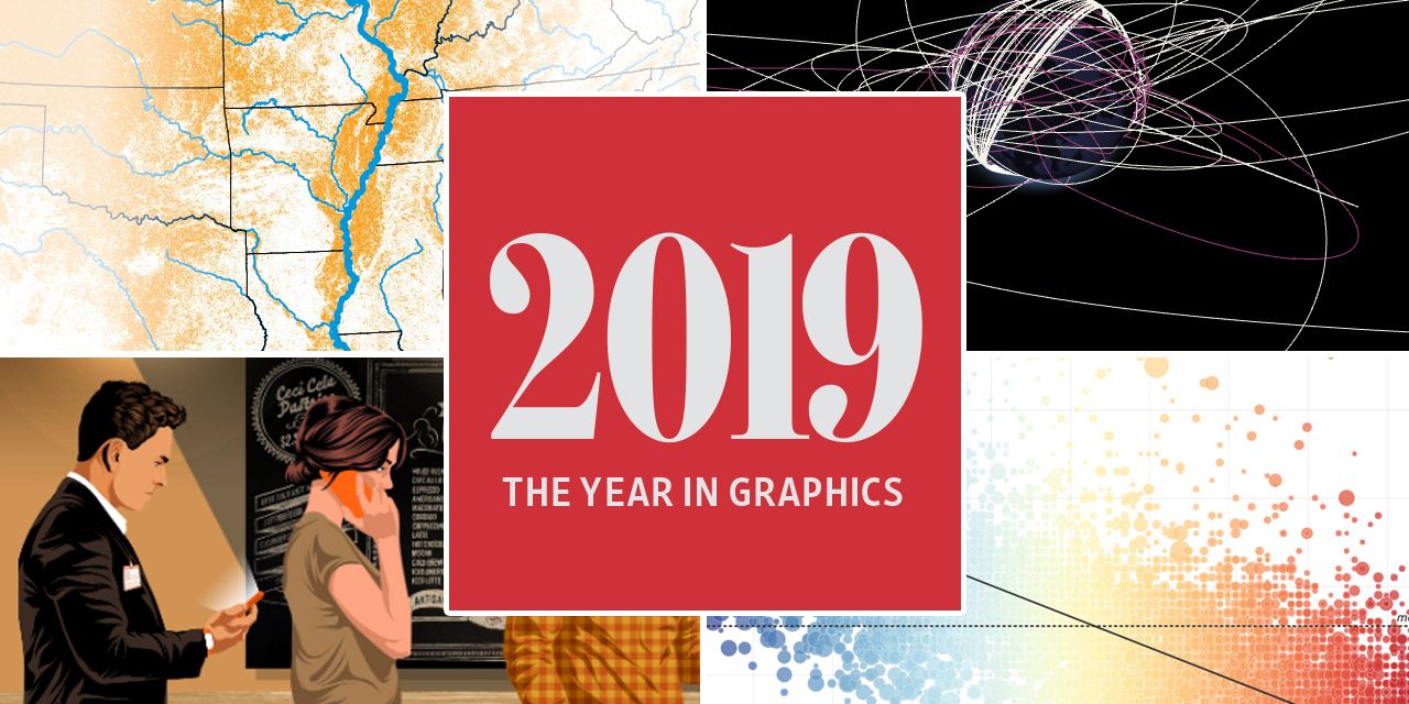
A classic by now: the the list of yearly visualisation lists. So here is my list of visualizations, charts, graphics, maps, satellite journalism and science photography lists, version 2019.
Lists of favourites
@FlowingData: Best Data Visualization Projects of 2019

@grafiti_io: Rounding up our favorite charts of 2019
@vismeApp: Best Data Visualizations of 2019

Portfolios
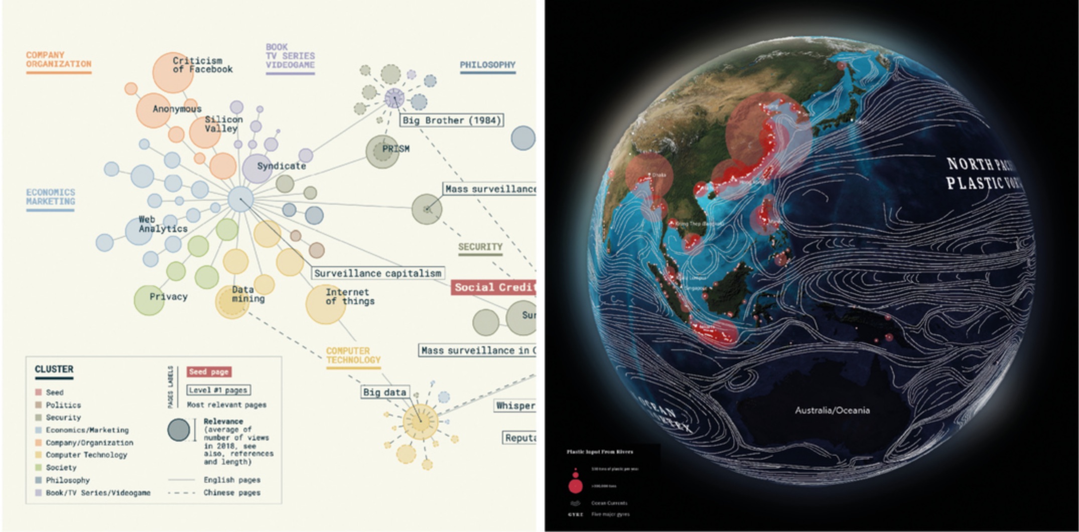
@SCMPgraphics: 2019 the year Hong Kong dominated the headlines
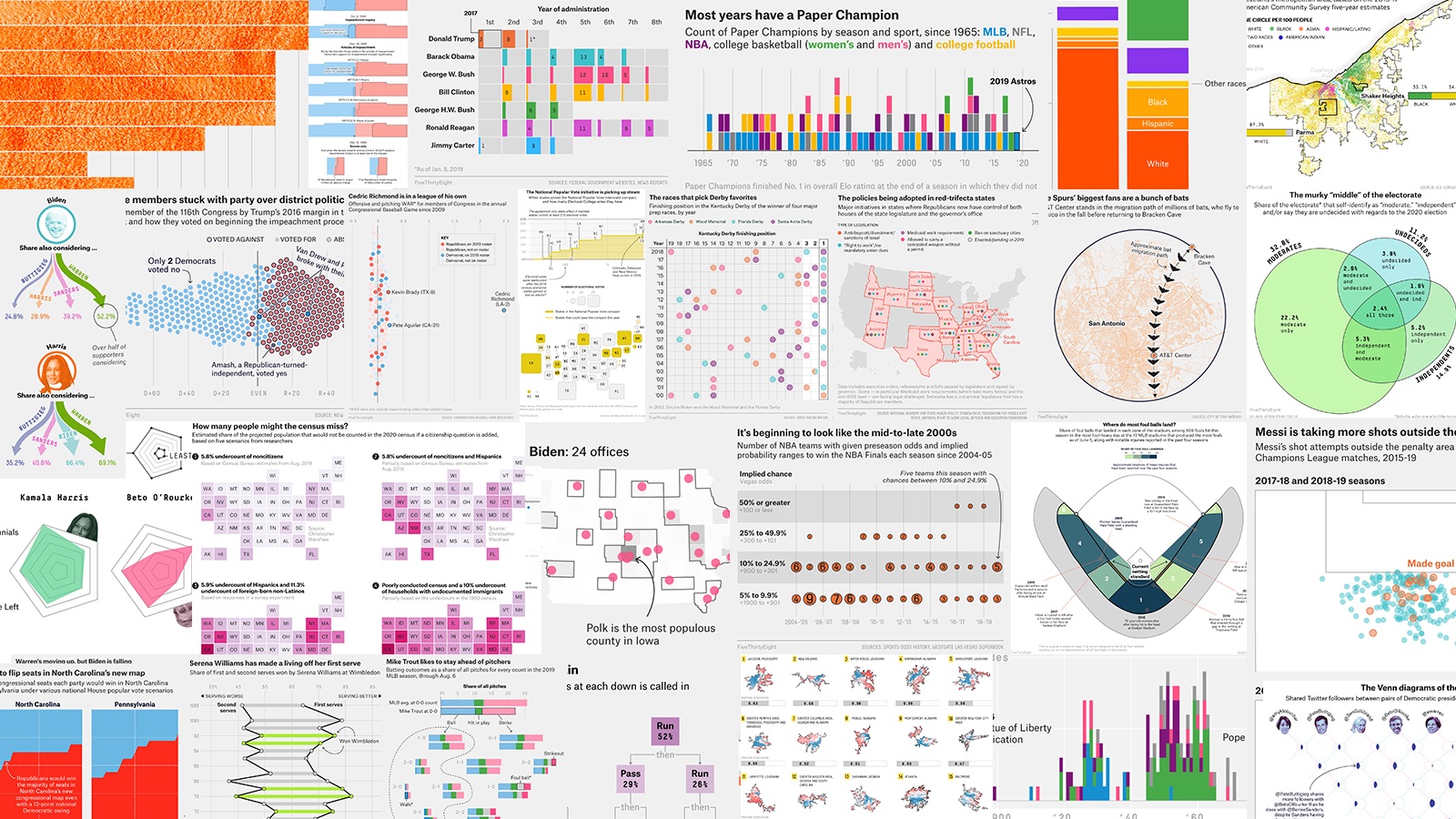
@FiveThirtyEight: The 56 Best — And Weirdest — Charts We Made In 2019
@nytgraphics: 2019: The Year in Visual Stories and Graphics
@reutersgraphics
1/9 As the year draws to a close, here are a few highlights from Reuters Graphics’ 2019 coverage https://t.co/GroxJAX2MA pic.twitter.com/9mKS0iDA6F
— Reuters Graphics (@ReutersGraphics) December 31, 2019
@postgraphics
To celebrate the end of the year, everyone from the @PostGraphics team is sharing their favorite projects from 2019.
— Post Graphics (@PostGraphics) December 17, 2019
Follow along in this thread for our favorite graphics, maps, illustrations and trackers of the year.
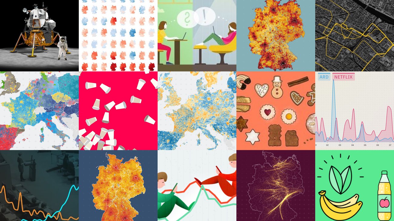
@ZeitOnline: Das Jahr in Grafiken, Karten und Illustrationen
@ftdata: Ten charts that tell the story of 2019
@EconDailyCharts: A year in Graphic detail (pdf, 49 MB)
@WSJGraphics: The Year in Graphics: 2019
@BBGVisualData: The Year in Graphics
@Irene de la Torre (BBC News): 2019 has been a busy year
@AtloTeam: Az Átlátszó adatvizualizációi 2019-ben
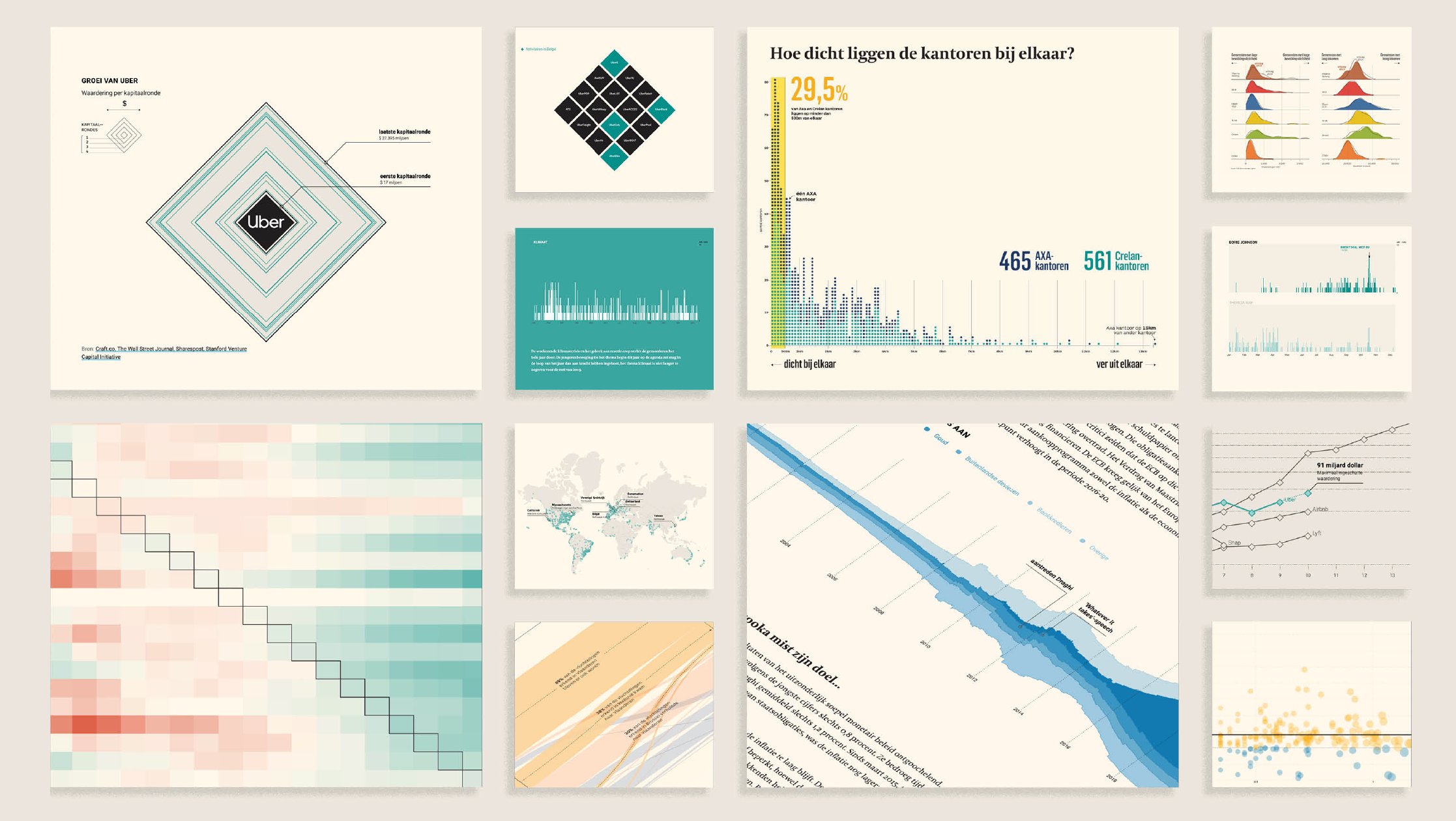
@tijdgraphics: Het jaar in interactieve datajournalistiek
@datagraphics: Our best data journalism of 2019

@VisualCap: Our Top Infographics of 2019
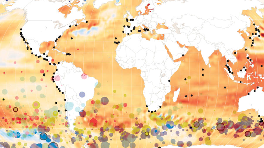
@nytclimate: The biggest climate stories you might have missed — but still have time to read.
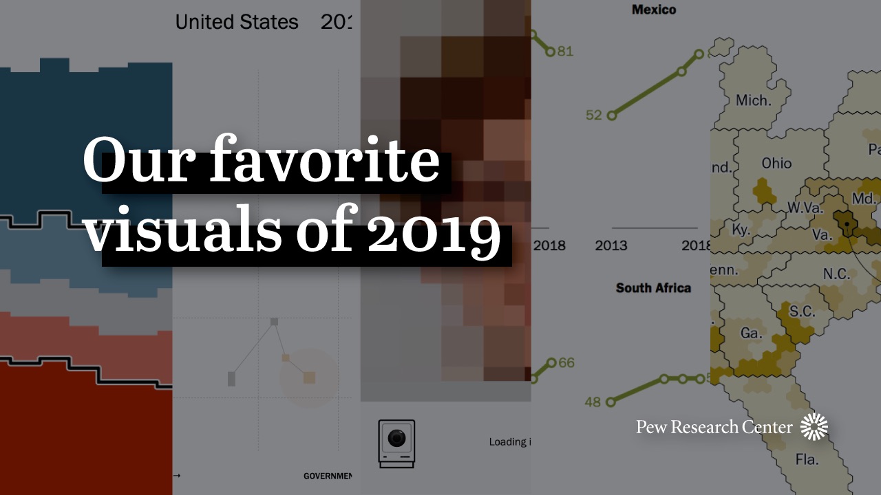
@FactTank: Our favorite Pew Research Center data visualizations of 2019
In review
@datastories: Datastories Year in Review 19

@Elijah_Meeks: 2019 Was the Year Data Visualization Hit the Mainstream
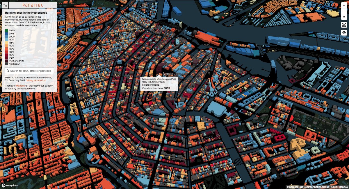
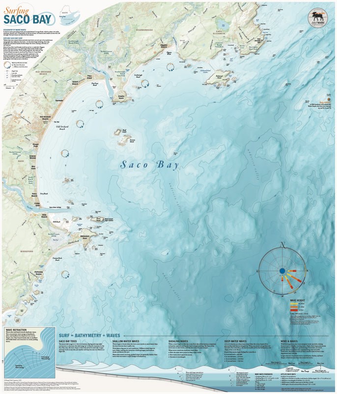
Maps
@cartonerd: Favourite maps from 2019
@mapbox: 19 amazing maps from 2019
@OrdnanceSurvey: The GeoDataViz team’s favourite maps of 2019
Awards
@infobeautyaward: Information is Beautiful Awards 2019: The Winners
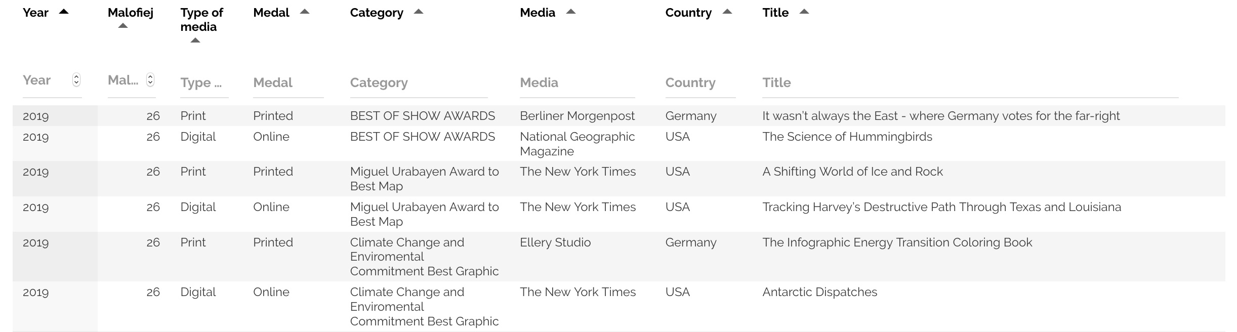
@Malofiej: Malofiej Awards List
@SND: Pieces that wowed judges last year
THREAD (1/14): In the run-up to SND Digital 41, we're looking back at pieces that wowed judges last year.
— Society for News Design (@SND) January 8, 2020
Let's talk graphics. @nytimes received two gold medals for information graphics design and seven organizations were given silver medals for graphic design. #snddigital41
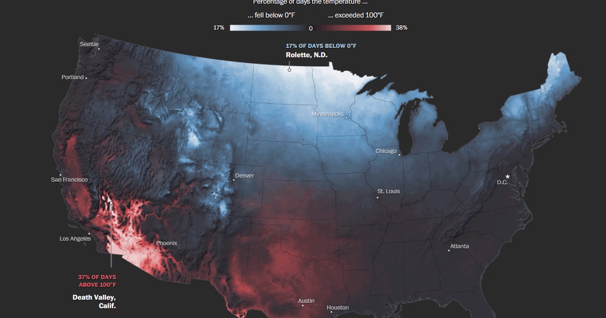
Remote sensing
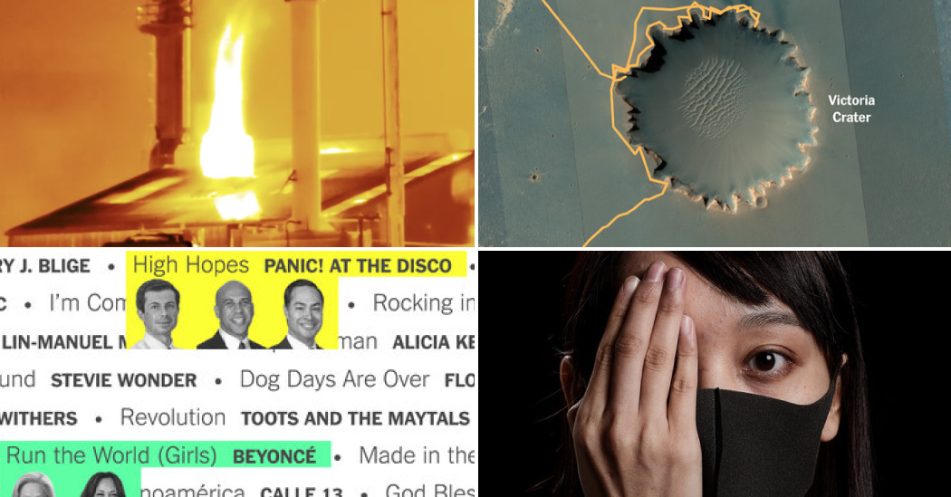
@planetlabs: Popular News in 2019, As Seen From Space
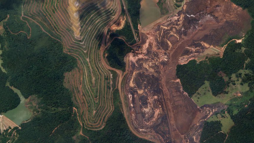
@maxar: A Decade of Change on Earth Captured From Space, 2010 – 2019
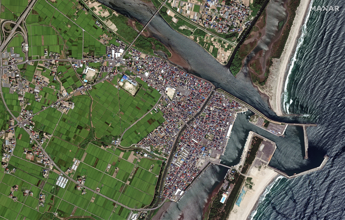
@blkahn: The Satellite Images That Show a Decade of Climate Change
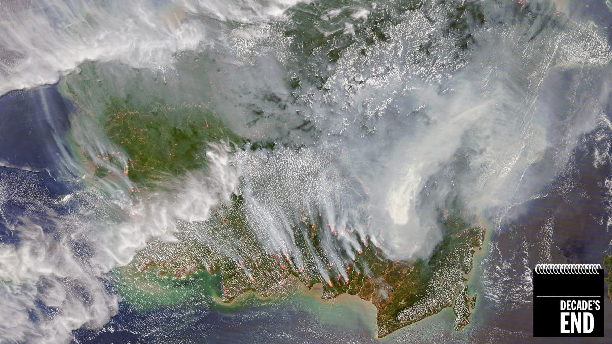
@NASAEarth: Best of 2019
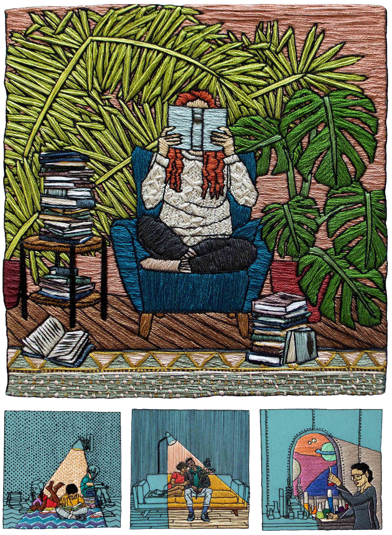
Illustration
@WaPoDesign: 2019: A portfolio of illustrations