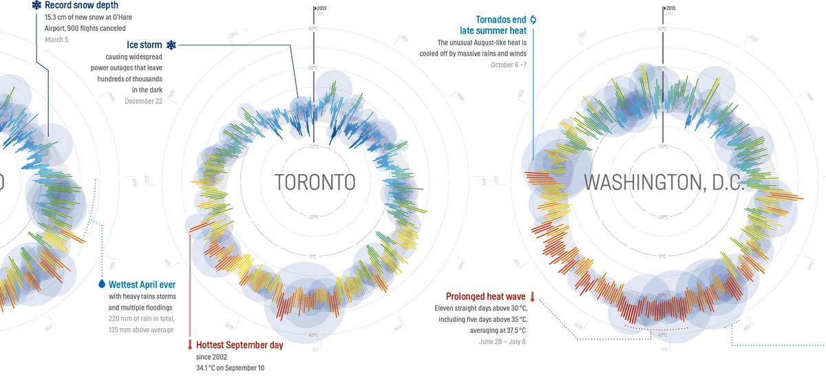
Introducing the Weather Browser
July 29, 2014
Just as I was getting ready for a long period of recovery from a knee injury, with some weeks of immobility and quite some time on my hands, climate data company Weather Analytics announced their visualization contest Climate Crush.

I decided to participate and, in the process, learn some more things about number crunching and interactive visualization.
The Challenge
The mission for the contest was simple: visualize some weather data.
Come up with something cool - a widget, a dynamic visualization, an infographic, ANYTHING, and you could walk away with $5,000 and the envy of all meteorologists and data scientists the world over.
Provided were 3 datasets. I went for the Global Comparison set: 5 years of weather data for 2 cities, Singapore and Cairo.
Initial steps
I wanted to have a good understanding of the data first. This was the perfect occasion to finally get a grip on R, an open source statistics software with basic visualization capabilities. I installed the excellent R Studio, loaded the data and dove into some tutorials.
After I had a basic understanding of the data, I started thinking about ways to visualize the data. My initial idea was to go for some classical line charts, histograms and density plots spanning the whole 2009-2013 period of the data to show the different climates of the two cities. But after reviewing some visualizations for some inspiration, especially the really superb weather-radials.com, I decided to go for daily data, visualized with circular diagrams to show cyclicality.
 Weather Radials.
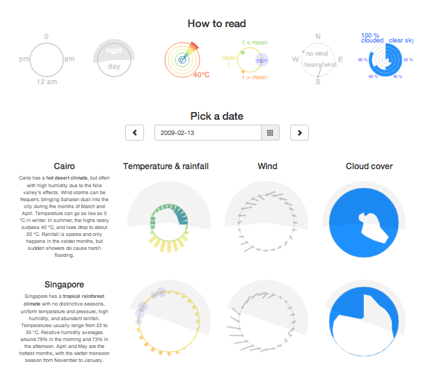
After a little sketching and some calculations, I had a good idea of the final product I wanted: a navigator showing 3 circular diagrams with visual information about temperature, precipitation, wind direction and speed and cloud cover for any selected date.
In R, I extracted the relevant data and converted all units to the metric system. To be honest: I found it a little strange that a dataset called 'Global Contrast' provided by a company that helps "organizations around the world" didn't offer metric data. I guess the main target for the competition must have been visualizers from the US.
I didn't want to build a backend infrastructure for the data (as I don't really know what the best way is to do that nowadays), so I went with Crossfilter.js. With Crossfilter I could let the browser do all data manipulation. This has some disadvantages, but one big advantage of Crossfilter is that it works quite well with D3.js, which I used to visualize the data.
The design
Now it was time for the design work. The basic idea was to build a date selector driving 2 series of 3 circular diagrams: one for temperature and precipitation (which I decided to group together in one, like the visualization from weather-radials.com), one for wind and one for cloud cover.
The daily precipitation-temperature graph looks like this:
A hot day in Cairo.
The radius and color of the circle show the daily average temperature of the selected day. So a big circle means a hot days, a small circle means a cold day.
Bars and their colors display hourly temperatures, with lower-than-average temperatures pointing inward and higher-than-average temperatures pointing outward. In this way, the diurnal rythm becomes very clear.
To make the visualization somewhat less abstract and to highlight the diurnal cycle even more, I added circle segments indicating night- and daytime. I calculated these with suncalc.js, but they are still a little buggy (I really didn't expect that working with dates and timezones was so messy in Javascript).
Hourly precipitation is visualized using blue circles, where area is proportional to the amount of rainfall.
A rare rainy evening in Cairo.
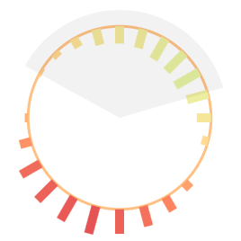
Hourly wind data is presented by 24 gauges. Angles show the direction where wind is blowing to (so they act like some kind of flags, attached to the circle), length shows wind speed.

Strong wind blowing from the east all day long.
I think the ressemblance with a persons face, with its hair blowing in the wind, is the main reason I like this design a lot.
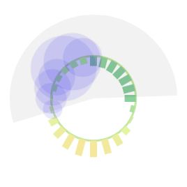
Cloud cover during the day is depicted with a radial area chart, with all blue signifying a clear sky and all white meaning 100 % cloud cover.
Reason for choosing this design is the resemblance of the area chart with a cloud: a small cloud means little cloud cover, a big cloud means a lot of cloud cover. Evolution of cloud cover during the day determines the shape of the cloud.

A cloudy day with clear sky in the evening in Singapore.
Readability and usability
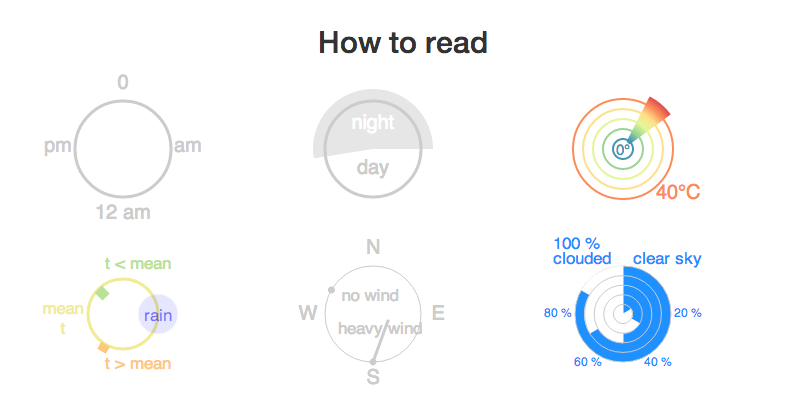
As I didn't want to bother the reader with all the above explanation, I provided a visual legend, with minimum text.
The arrangement of the Weater Browsers elements (done with Bootstrap) was driven by the following considerations:
- I wanted the reader to see the legend first, as an introduction to the somewhat exotic visualisations he or she would see further on.
- I wanted the datepicker (built with bootstrap-datepicker) to be central, as it drives the visualization and acts as a type of title above the graphs, indicating the selected date. Arrows let the user navigate from one day to the next (or previous) to see the weather change during multiple days.
- The datepicker and the 2 rows of visualizations are placed closely together, in order to see the changes in the data when selecting another day and in order to allow good comparison between the visualizations of the 2 cities.
- I wanted the Weather Browser to be responsive and readable on all screens, but optimization for small screens is still a little lacking.
Extremes and a little analysis
By the time I had built the visualization, I had a good understanding of the data. To compare the climate of Cairo and Singapore even better, I made some extra visualizations.
For the hottest, coldest and wettest moments, I just used the Weather Browser to compare values for both cities.
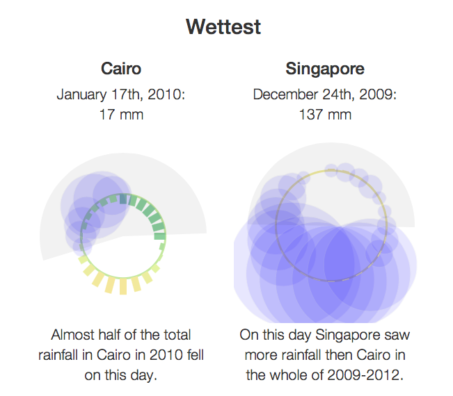
In the end I made some extra visualizations aggregating some data.
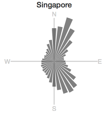
Dominant wind directions for 2009-2013
You can find the Weather Browser on maartenlambrechts.be/vis/weatherbrowser