Introducing: Rock 'n Poll
April 05, 2016
I was lucky enough to be invited as a judge and speaker at the 24th Malofiej Infographics World Summit, held in Pamplona, Spain, at the beginning of March. In preparation for my talk at the conference, I decided to take the opportunity to launch something I was working on for quite some time already: Rock 'n Poll. So what is Rock 'n Poll all about?
The reporting on political polls in my country has been annoying me for a long time. Statistically insignificant changes in political preferences are overanalyzed and margin of errors are not taken into account or even not mentioned at all. As a result, a lot of journalistic fire power is spent on analyzing randomness and readers are just plainly misinformed.
The slides of my Malofiej talk
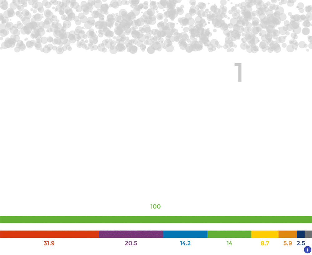
I decided to take the concept of Explorable Explanations and apply it to (political) polls in order to show the uncertainty that is inherent in polling results. So I built a stepped, interactive explainer that shows (some of) the statistics behind polls. I wanted an explanation without any statistical formulas at all and I wanted to make the explanation as visual as possible.
Sidenote: as Archie Tse explained in his great talk at Malofiej, The New York Times builds less interactives and steppers as they used to. The reason: people don't want to click to get to more content, they just want to scroll. But I think that when there is some kind of game element to the clicks, you can keep your readers clicking. Up until now 57 % of users who clicked through to the second step of Rock 'n Poll completed all 10 steps (which involves at least 30 clicks).
Rock 'n Poll also got some really nice comments on Twitter ("Brilliant data visualization", "Best interactive I've ever seen", "Great piece", "site génial", "creative and informative", "parfaite", thank you for all the kind words!), so I think I managed to show the power of Explorable Explanations and teach people with some fear for statistics (yes, I'm looking at you, journalists) the role of chance and uncertainty in polling results. Rock 'n Poll was also featured on Visualoop, Flowing Data, Fast Company en Zeit Online.
But as I explained in my Malofiej talk, Rock 'n Poll is also aimed at visual journalists and chart makers in the media. I think we have a pivotal role to play if we want better understanding of polling results in the media and in the general population. I think we have 2 roles to play:
- We should be evangelists: just as we should teach our readers, colleagues and the public in general the basic rules of good data visualization, we should be showing uncertainty where there is uncertainty and teaching others why this should be done.
- We should be pioneers: a lot of innovation in data visualization happens in the news room. We have a role to play there in experimenting in what are the best ways for visualizing uncertainty. We should also learn from academic research on this important topic.
In the final step of Rock 'n Poll, I included these 4 links to what I consider useful studies and articles for people interested in visualizing uncertainty: