Making-of: How expensive is your neighbourhood
April 19, 2016
When creating larger online projects, you sometimes just put things together that you’ve made and learned before. And there is lot of value in the combination of earlier work and knowledge. But inevitably you will learn and insert new things as well. With this post I gladly share what I learned from putting together one of my biggest data and mapping projects so far.
The project
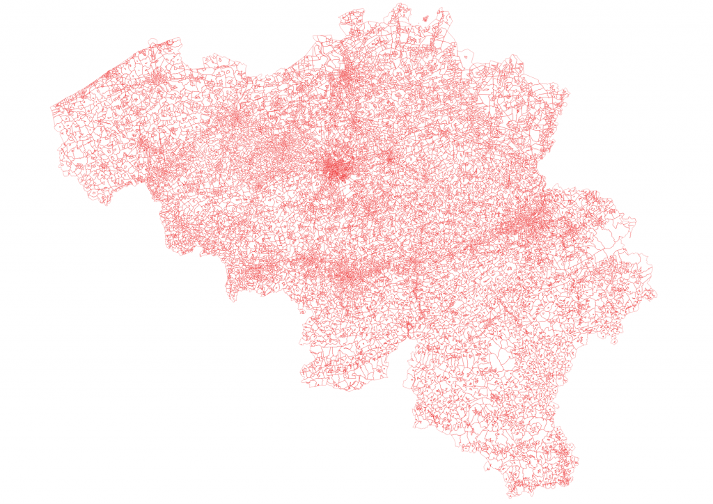
The most detailed level at which statistics in Belgium are collected are the so-called statistical sectors. Belgium has 19.782 of them, the average statistical sector has an area of just over 1.5 square kilometer and holds a little over 560 persons. That’s a lot of detail.
So when the geodataset on the statistical sectors was released as open data, I knew there was a lot of potential for making interesting maps.
After a tip from a friend, I was able to gather average home sale prices for all statistical sectors for the 2010-2014 period. As my employer publishes a yearly real estate guide, we decided to base part of the new guide on the statistical sector data.
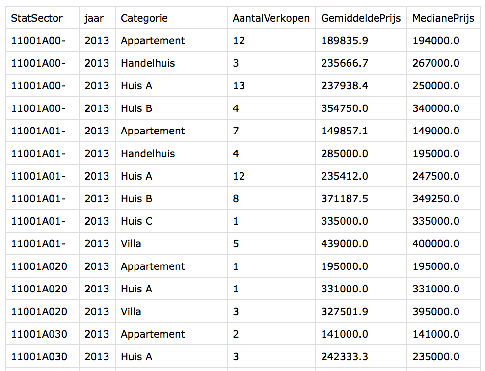
The data
The data consisted of 5 csv files (one for each year), with an ID, the real estate category (from apartments and houses over villas up to, yes, castles), the number of sales, the average price and the median price for every statistical sector.
I decided from the start not to use Excel for data manipulation and take the opportunity to sharpen my R skills. I got to know the dplyr and tidyr packages, which are enormously helpful. The RStudio data wrangling cheat sheet was my best friend. I used it to filter, summarise, unpivot and join data.
The geodata I started off with, was a shapefile of the statistical sectors, including the ID for every sector, along with the name of the sector in Dutch and/or French.
Initial steps
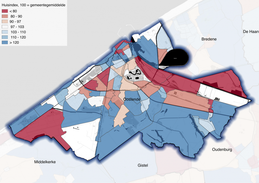
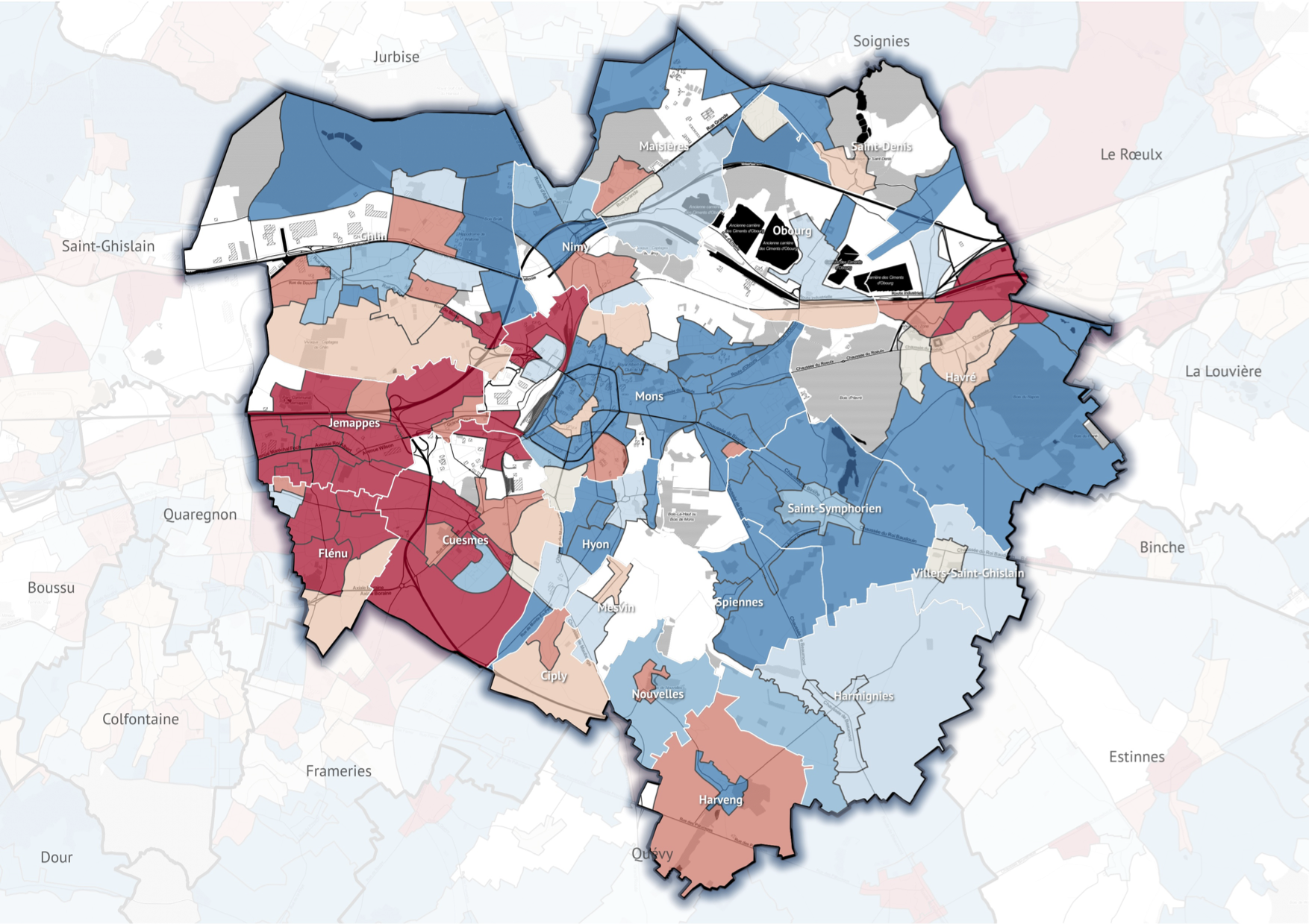
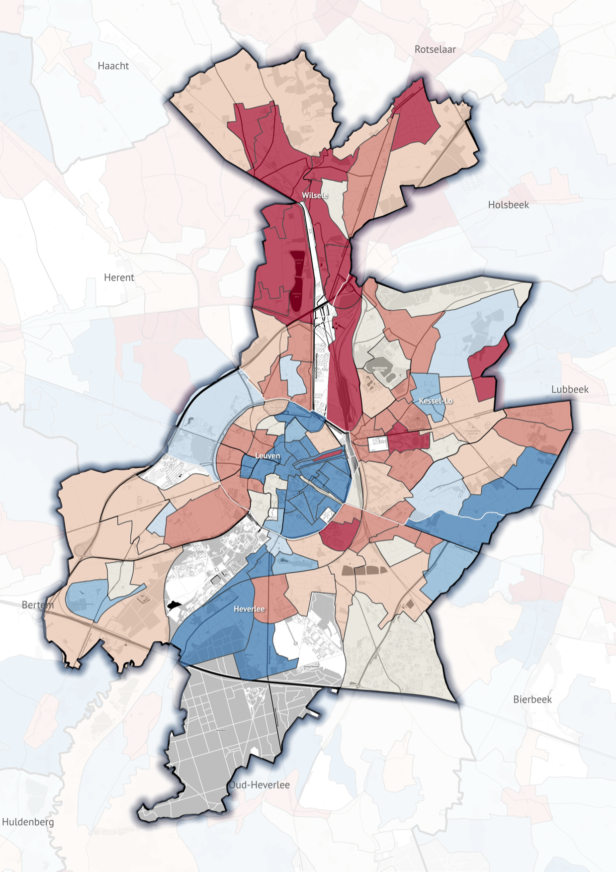
What I wanted to do first, was showing the data and the possibilities for getting stories out of it to my colleagues and bosses. I decided to focus on the spread of house prices within each municipality, becaus the majority of Belgians identify a lot with their municipality.
There are 589 municipalities in Belgium, so on average a municipality is divided into 34 statistical sectors. That is more than enough to show geographical trends for most of the municipalities. So I turned to R and
- filtered out the house sales in the data (so no castles, apartments, commercial buildings, …)
- calculated average house prices for all statistical sectors over the 5 years I got data of. This was necessary, becaus the geographical granularity of the data meant that house sales in single years in a lot of statistical sectors were quite low. In order to obtain a more or less reliable estimate of house prices in every statistical sector, I had to aggregate data from multiple years.
- I set the average house price in every municipality to 100 and calculated the index for every sector. So sectors with an index higher then 100 are more expensive then the local average, an indices lower then 100 mean cheaper houses.
After that, I joined the data to the shapefile and produced some maps with QGIS. 2 plugins were very helpful: the Mask plugin allowed me to show only the sectors from 1 municipality and setting the ones from neighbouring municipalities to the background. And the OpenLayers Plugin allowed me to pull in a background layer for my maps (I used Toner from Stamen Design). Also very handy: you can choose Colorbrewer pallettes right from the QGIS layer properties.
This is one of the first maps I shared with my colleagues:
The prototype
With this map, I could convince my colleagues and bosses that the dataset was quite valuable and we could base a lot of stories on it. Now I needed a working interactive prototype to give acces to the data in a user friendly format, so my colleagues could do their job well and report on the data without being data experts.
I wanted to see how far I could get with Mapbox GL and Mapbox Studio. I learned a lot about these beatiful technologies, but filtering and styling the data on the map proved to be a bit to cumbersome. So I switched to CartoDB to host the data. I uploaded all the data (a 55+ MB shapefile) there. Now I could query the data, get a GeoJSON out of CartoDB and let Mapbox GL zoom and render the map.
 Screenshot of the MapboxGL prototype.
This was ok as a prototype for my colleagues. But as they noticed it didn’t work in some browsers. Unfortunately, the world isn’t completely WebGL ready yet.
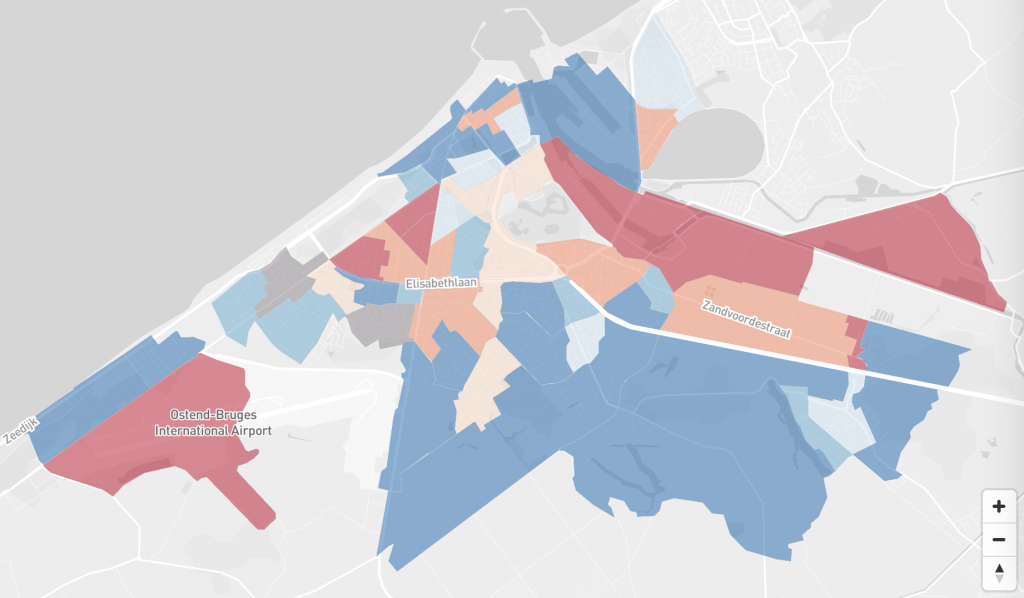
The interactive map
So for the final online map (Dutch, French), I switched to CartoDB.js completely.
So this is what happens in the final map:
- A CartoDB.js map is created with 5 layers:
- the Toner-background layer from Stamen (this is a layer without labels)
- the layer with the statistical sectors
- the layer with the municipality borders (only black lines, no fill)
- a layer with the outline of the selected statistical sector
- and a layer with labels (Positron from CartoDB, not visible initially)
- The user is presented with a search field, where he or she can search for a municipality. The search uses Twitter Typeahead to quickly find the name of a municipality
- When a municipality is selected, the map zooms in (still in the background), and a field for searching an address in the municipality appears. Zooming is done by sending a getBounds query to the municipality data in Cartodb and fit the map to these bounds with Leaflets fitBounds.
- After introducing a streetname and house number, I geocode the address (municipality, street and housenumber). I take the returned coordinates and send them to CartoDB as a query, which in its turn gives me the sector in which the coordinates are located.
- The selected sector is added as an outline to the map, along with a marker on the geocoded addres. The marker is styled using Leaflet.awesome-markers plugin. Data from the selected sector is shown in a tooltip, which updates on hovering over other sectors using CartoDB’s featureOver event.
Check it out below, or see it live.
The static maps
Offcourse, for the magazine, I needed static maps too. I made them from start to finish in QGIS and exported them as pdf.
Legends and additional annotation (labels in black boxes) were done by the layout people of the magazine.