Making-of: The Eurosearch Song Contest
May 03, 2017
This is the making-of of the Eurosearch Song Contest
I’ll never watch the Eurovision Song Contest with more attention than this year. That’s not really that hard: I never cared much about the contest, with its freaky and cheesy aspiring singers, its bad English speaking presenters and its endless voting. But I’ll be watching very closely this year, and I already know way more about the contest, the voting system and the candidates than I ever did.
I have Alberto Cairo and Simon Rogers to blame for that. Alberto is coordinating a visualization project for the Google News Lab, where Simon is working as a data editor. They invite data visualizers to play with Google data and to make beautiful and interesting visualizations with it. If you don’t know the project, check out the work produced so far by Nadieh Bremer, Shirley Wu, Jan Willem Tulp, Polygraph, Moritz Stefaner and others.
So when Alberto contacted me, I was both excited to be able to contribute to this project and a bit disapointed I would have to do that with data around the Eurovision song contest. But that changed quickly when I realized that the data I was going to work with was basically an origin-destination matrix. The idea was to simulate an alternative voting of the contest by looking at Google searches for other countries candidates in all participating countries. So you can think of this as a matrix of countries (the origins) awarding points to all other countries (the destinations). And by accident, this was a data structure I was actually working with at that moment.
My initial idea was to implement a very interesting but rare visualization form for this type of data: the Origin-Destination Map.
In an OD Map, flows within a geography are represented by nested, small multiple grid maps: each cell of the grid contains a small copy of the entire grid. They are both a matrix and a map at the same time and combine some advantages of both. Read the paper on OD Maps if you want to know more.
I still like the concept (it’s a bit like a fractal map!), but I realized that a) the dataset at hand (from country to country) wasn’t a good fit for this type of visualization (OD Maps shine when you have big, point to point data sets) and b) it would take a lot for Eurovision fans to ‘get’ the map. So I took another road.
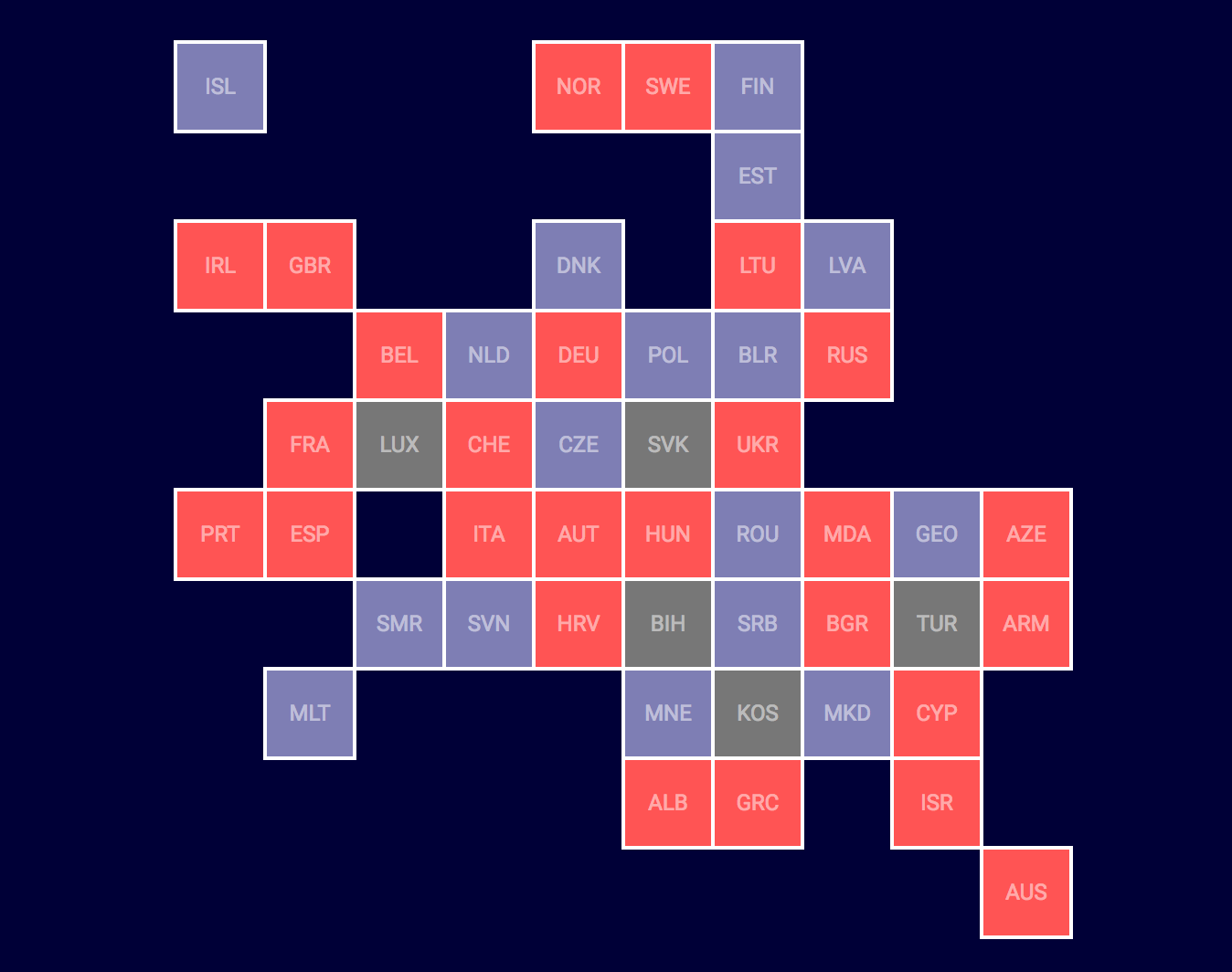
When scrolling through the list of participating countries, I noticed that Malta (430.000 inhabitants) and San Marino (only 32.000) are also taking part in the contest. And they have the same weight in awarding points as Germany (81 million) and the UK (65 million) do. I wanted to work with a map, but I had to come up with a map that would give equal visual weight to all countries. So enter Europe tile grid maps.
At first I wanted to go for a hexagon map. But I quickly realized that this would be an order of magnitude more difficult to work with than just plain squares (accept if you’re Nadieh Bremer, of course).
The only hexagon tile grid map of Europe I found, by David Taylor
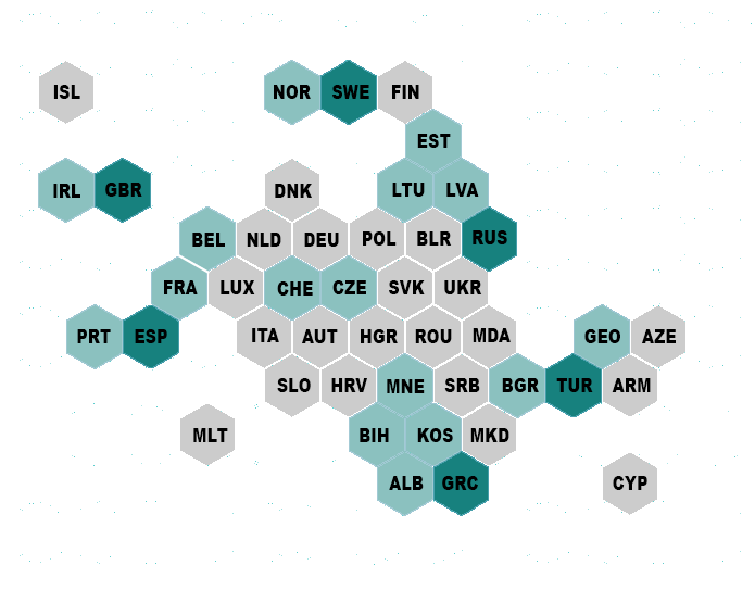
So I looked out for prior work on square tile maps of Europe. Comparing to the US, there is surprisingly little work available: I found literally none. So I was on my own and got to work.
A quick first sketch in Excel
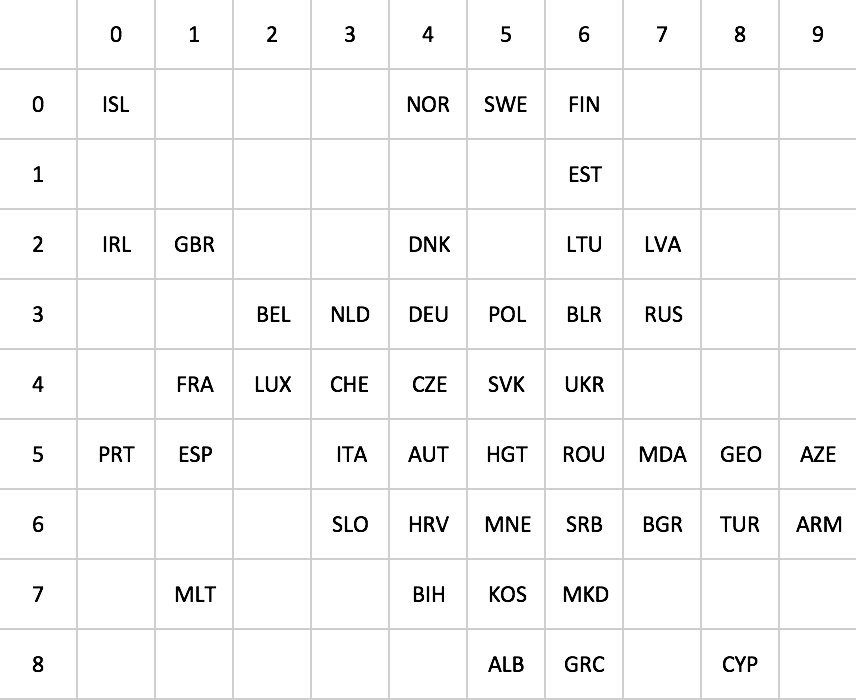
This was my first version, which I based on the hexagon map I found. But I had to adapt it quite radically for the final map: did you know that even Australia is participating in the Eurovision Song Contest?
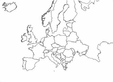
I didn’t want to shock readers with a strange map they were never exposed to before. So I wanted my story to open with a regular map of Europe, and then morph that map into a square tile map. A perfect task for geo2rect, a D3 plugin by Sebastian Meier. I took the world boundaries data from Natural Earth and filtered out the countries I wanted to appear on the map in QGIS. Then I played a little with the simplification factor in MapShaper to reduce the size of the final file to work with and exported a geojson file.
First working prototype with geo2rect
Now I knew that the main visual of the story would be this square tile map, I made some basic sketches on paper, which I then turned into a mobile first version of the project in Adobe XD.
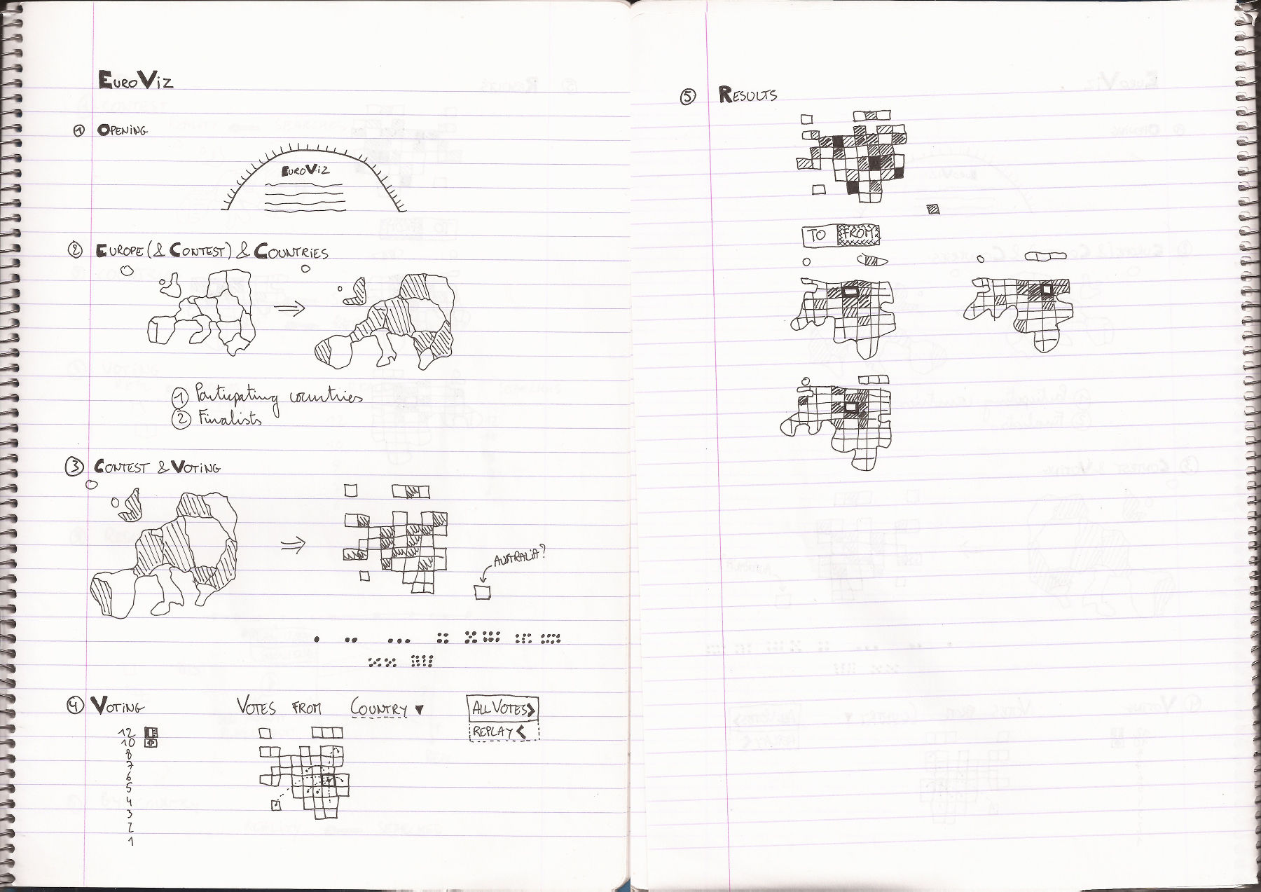

I was delighted that both Alberto and Simon quite liked the sketches. So then it was time to put everything in code. I took the Grayscale Bootstrap theme as a base and started building the visuals in D3.
I thought a lot about how the voting animations in the third part of the story should look like. My initial idea was to simulate the whole voting process, but this would mean that the animation would show 43 countries each awarding points to 10 other countries. This led to an animation that took at least 20 seconds to complete, which was simply too long. So I simplified it a little: in the final version it is up to the reader to select the country of his or her interest to show the animation for.
An interesting aspect of the project was that the Google search ‘predictions’ would be compared to the final results. This meant that I had to think about how the project would look like once the final results were in, without having the actual final data at hand. So I designed the final version with dummy data and then disabled (or changed) the parts which I would not have data for initially.
Some other interesting things I learned during building the project:
- R has a super useful package called countrycode that converts country names to various country codes and back.
- you can get the bounding box and transformation matrix of svg nodes with getBBox and getCTM. I used these to identify overlapping labels (the slopegraph I had in mind didn’t make the final design) and for showing labels on the morphed square grid tiles.
- for the small multiples at the end, I used the reusable charts pattern for the first time.
- with chained transitions you can build quite complex animations in D3.