Building the Reuters Polling Explorer
July 02, 2021
The Reuters Polling Explorer is the biggest project I did since becoming a freelancer. Thomson Reuters and Ipsos have been doing polls in the US on a wide range of topics for years. Poll results were published on polling.reuters.com, but because the old Polling Explorer was built in 2012 they felt the need to update the tech stack and simplify the design and the UX of the backend.
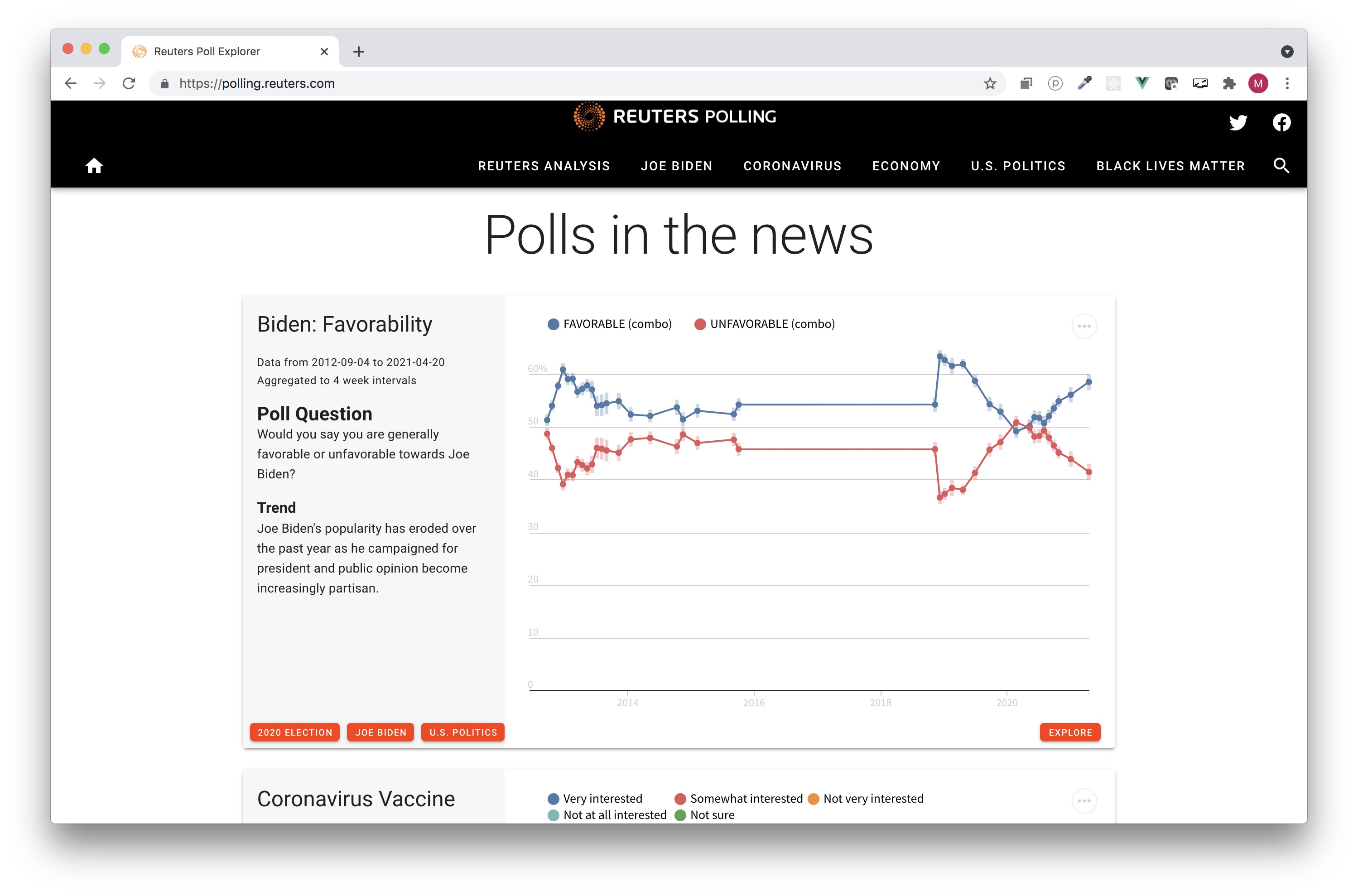
I know Reuters from their brilliant graphics, so I was delighted to be approached by Sarah Slobin and Matthew Weber for this project. In a nutshell, the requirements were:
- a backend that could consume and process the raw polling data
- a design for some 5 different chart types to show polling results
- a management system for publishing charts, including selecting a chart type, tagging charts, filtering data by date and demographics, and previewing charts
- a front end showing published charts, pages to collect charts with the same tags, and a page with demographic filters for each question in the polls
- search functionality to find charts and topics
At that time, I was considering learning the Vue framework and it seemed an excellent opportunity to make my first single page application with it. But I lack any backend skills, so I knew I had to team up with somebody else for this project. The backend of the old site was written in Django, and my brother Floris is a Python developer, so I asked him if he had any experience with it. It turned out that he had done already some work with Django, and he quite liked it. So I asked him if he liked to do some Django work outside of his full-time day job. To my delight, he said yes, and the Reuters Polling Explorer became our first family project (since then he also turned freelance).
Charts
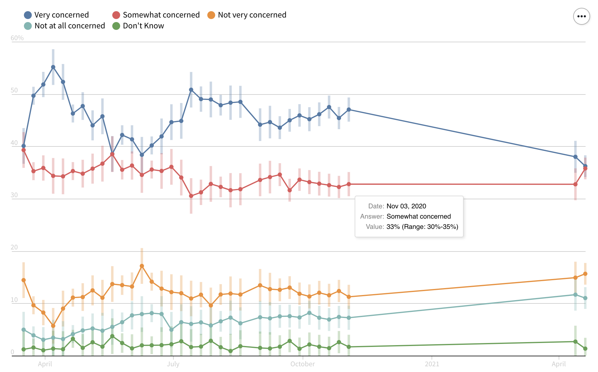
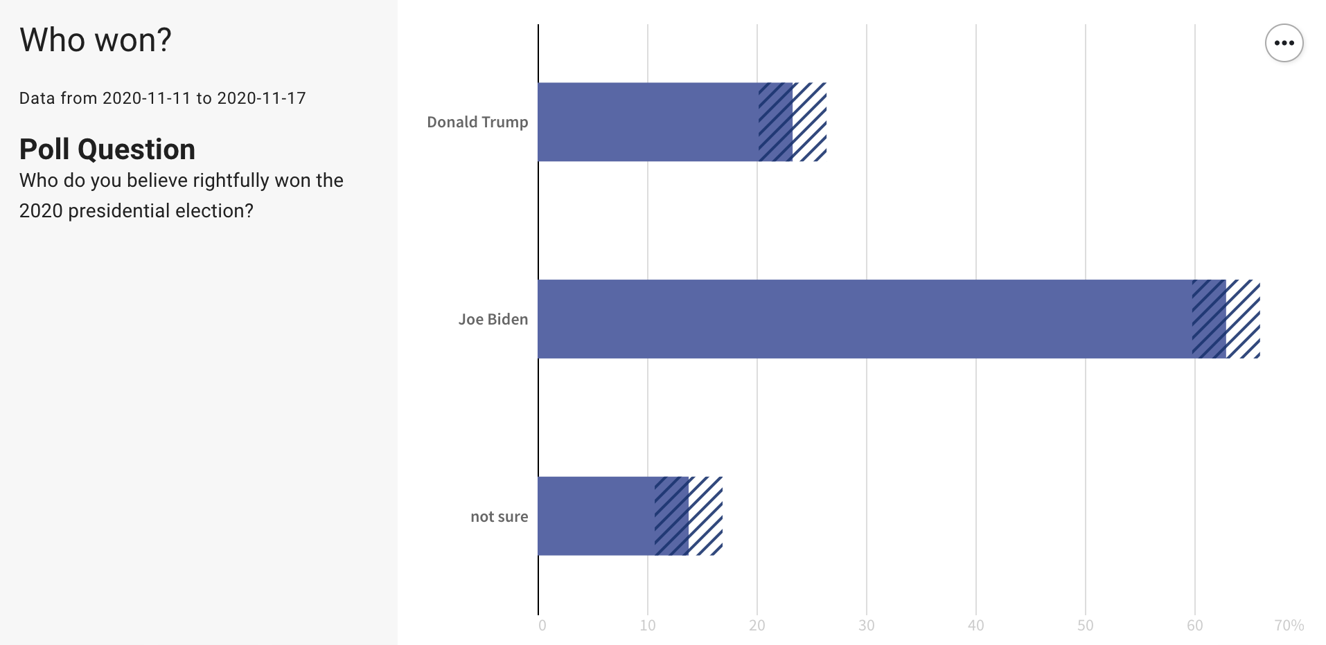
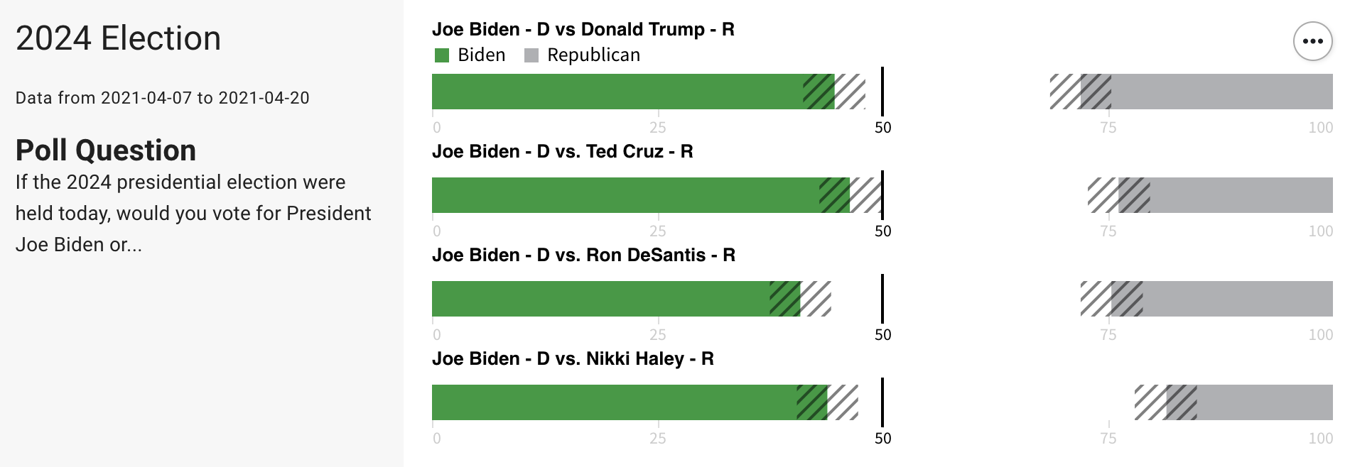
We first focussed on the chart types the polling explorer needed to have. The most important was probably a time series chart, showing confidence intervals. With real data downloaded from the old Polling Explorer, I made some design variations for these.
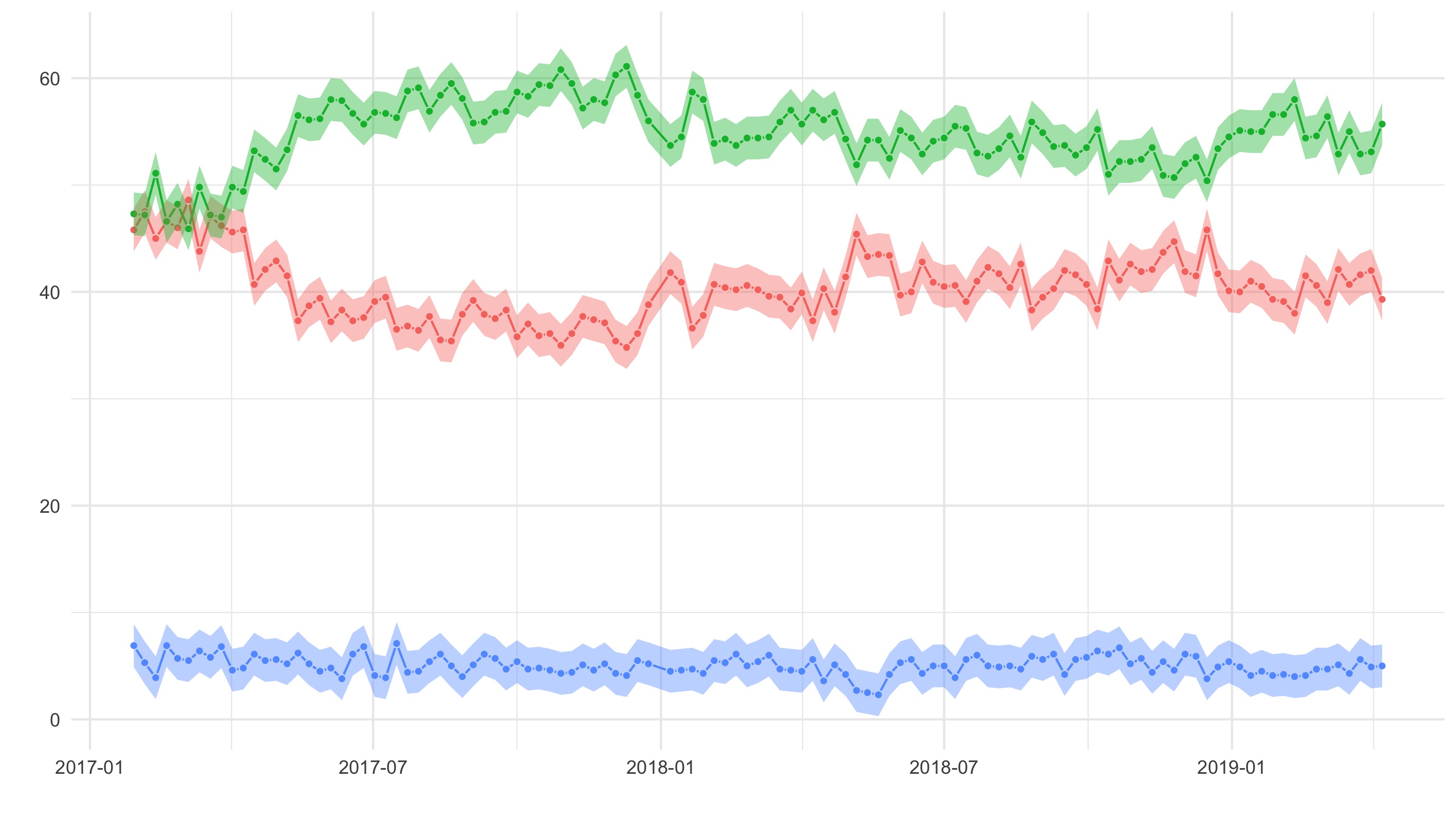


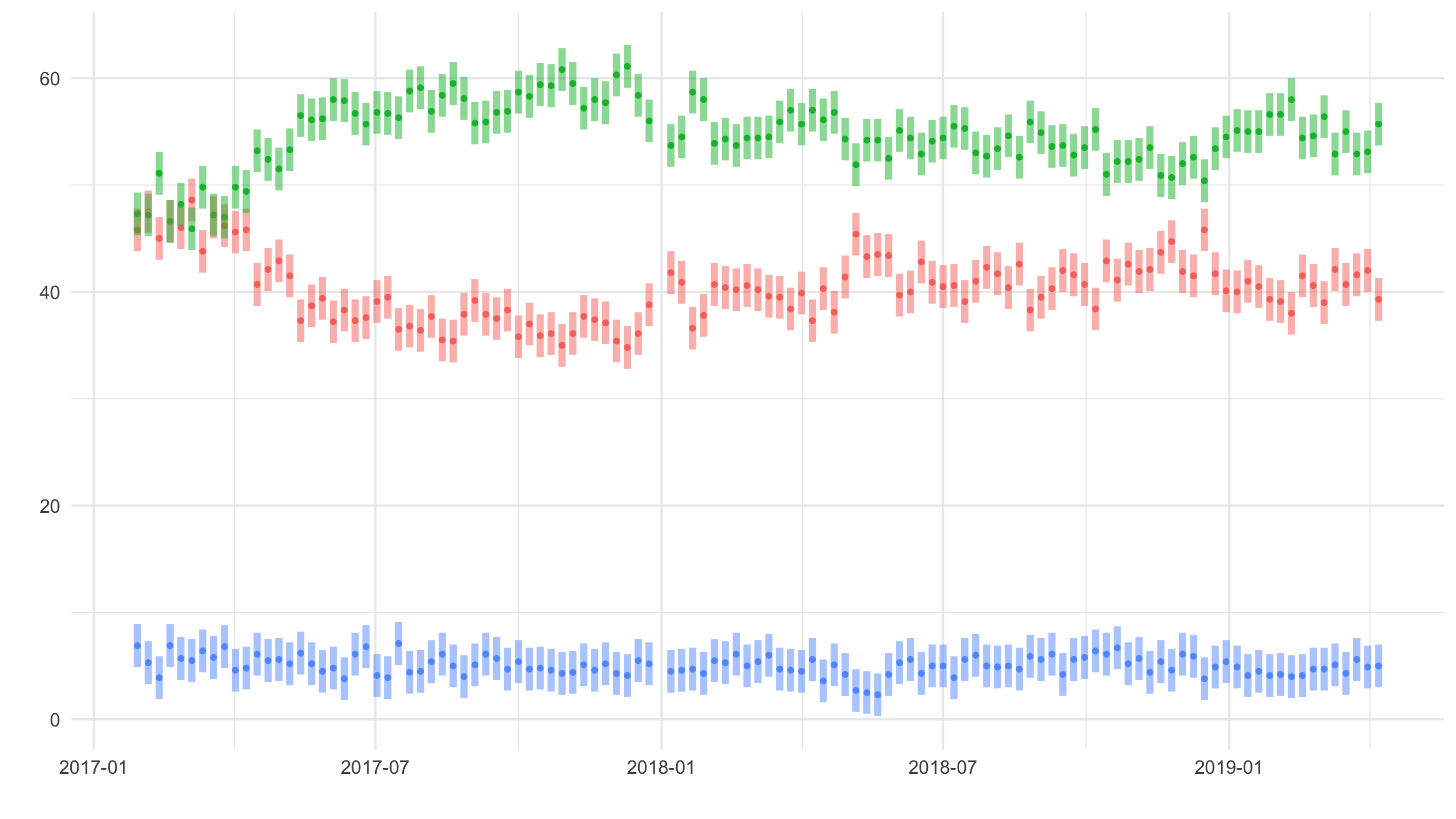

The last one was my favourite, but in the end, we went with the version with the dots:
Other chart types that we developed were a bar chart…
…a chart to compare demographics (this was called a “mosaic chart” in the old polling explorer, we stuck with that name)…
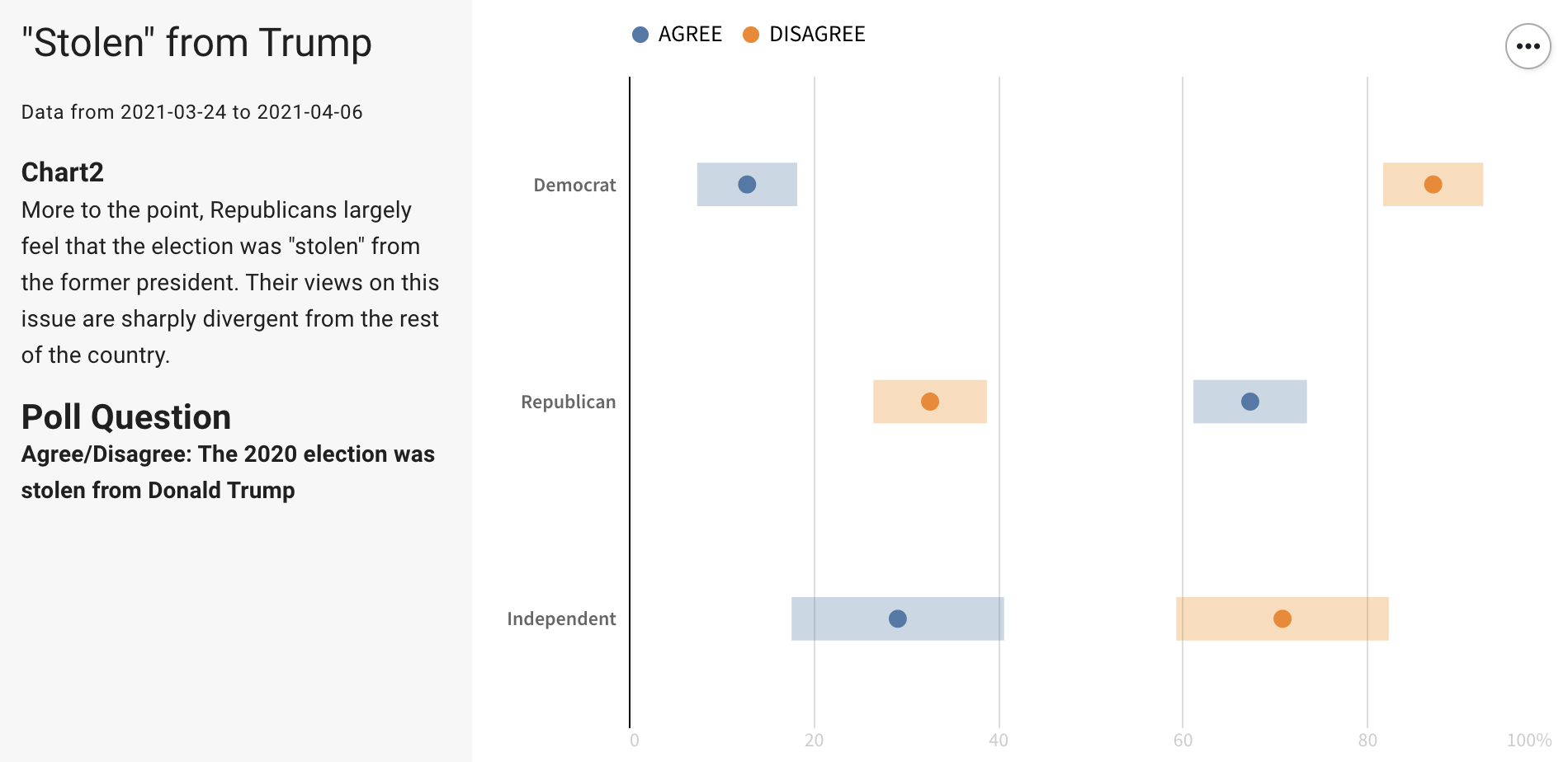
… and a chart to compare answers to multiple questions:
Wireframes
Because the features and functionality were going to be quite different from the old Explorer, I first made some wireframes.
The wireframes were quite handy to detect and discuss some loose ends. For example: should there be a search results page? (we decided not to have one), should the small cards have a description? (also: no). I also made wireframes for mobile, to see how everything would look like on small screens.
I decided to style the wireframes already quite a bit, to have a discussion about the design in one go with the discussion on the site structure and functionality. The design, based on Material, was received well, and the final design is not too far away from the wireframe designs.
Tech
My brother developed API endpoints for:
- the navigation menu
- the search
- the homepage charts
- charts on topic pages and
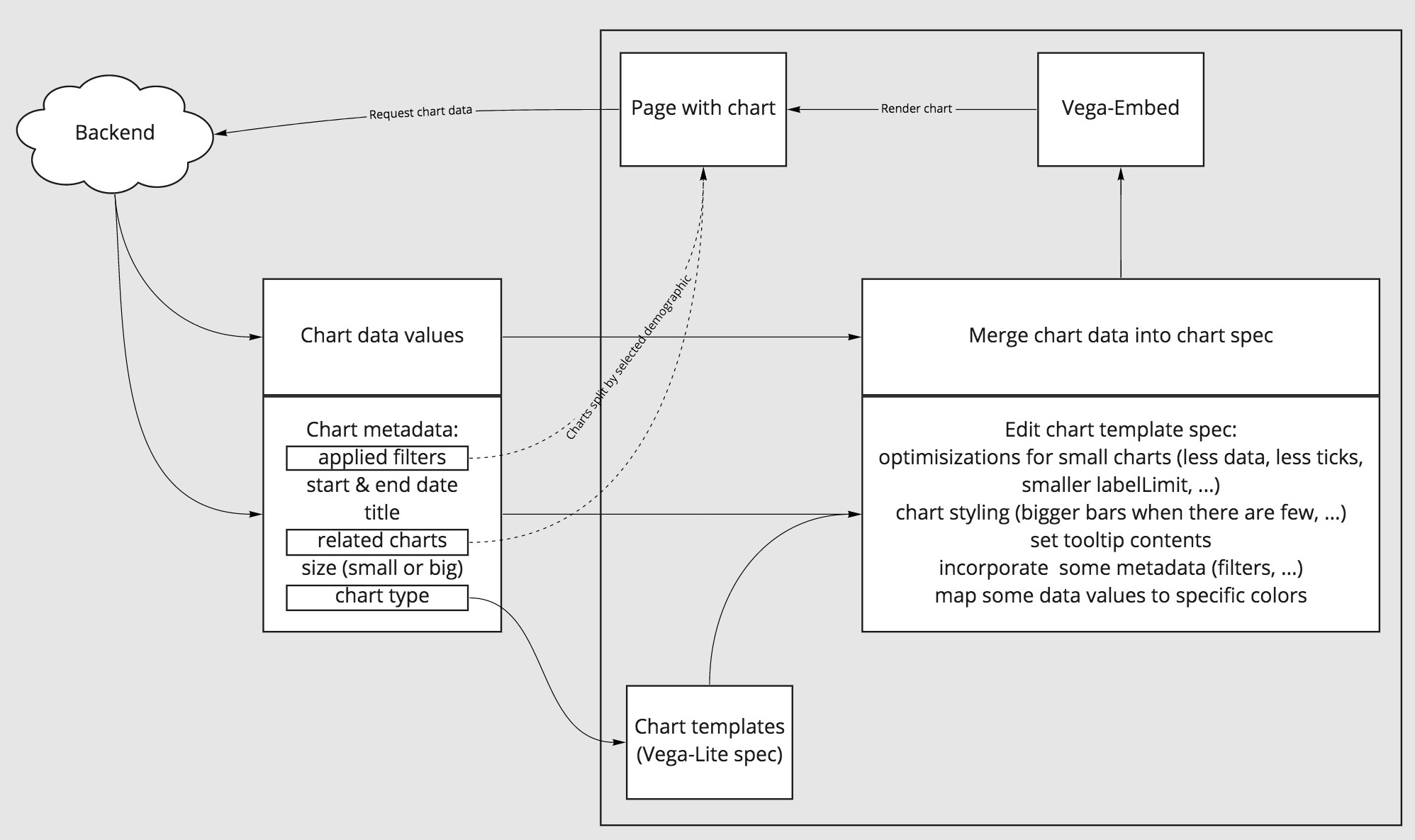
- data for individual question pages (including any demographic filter that the user applies to the data, see an example)
The front end is built with Vue and Vuetify. The charts are generated with Vega-Lite and embedded with Vega-embed. Here is a little schema of how everything ties together:
Wrapping up
The Reuters Polling Explorer redesign was a big project, spanning more than a year in total (but we didn’t work on it fulltime). From a distance, I consider my brother’s work on the data management, the API’s and the chart management system to be much more complicated than what I did for the front end. But it was nice working with Vue and Vega-Lite, which integrated quite well. I was quite pleased with my first single page application :)