Tutorial: a World Tile Grid Map in ggplot2
October 22, 2017
What if you want to make a map (of the EU, or of the whole world for example), but you want all countries to be clearly visible, including the very tiny ones? That was what I needed for the Eurosearch Song Contest and so I made a square tile grid map of Europe.
Using a tile grid obviously comes at a cost: geography is not respected. Big countries become smaller, small countries become bigger, countries are shifted away from their geographically correct position, neighboring countries are separated and non-neighboring countries can end up next to each other. But still, tile grids can help you show all countries, including the small ones, with an indication of their geographical location. If your main message isn’t the geography, I think these grids can be quite useful.
My Europe tile grid led to Jon Schwabish making a version for the whole world. A great effort, and because I had an idea for which this world map could work well, I decided to port Jon’s map from Excel to R for some experimentation. So in what follows, I explain how I remade Jon’s map with R and the ggplot2 package.
Starting point was the json file Mustafa Saifee derived from Jon’s data. I converted it to a csv file as the starting point for this tutorial.
library(ggplot2)

worldtilegrid <- read.csv("worldtilegrid.csv")
In RStudio you can inspect your data with
View(worldtilegrid)The data should look like this, with the grid x and y coordinates in the last 2 columns:
| name | alpha.2 | alpha.3 | country.code | iso_3166.2 | region | sub.region | region.code | sub.region.code | x | y |
|---|---|---|---|---|---|---|---|---|---|---|
| Afghanistan | AF | AFG | 4 | ISO 3166-2:AF | Asia | Southern Asia | 142 | 34 | 22 | 8 |
| Albania | AL | ALB | 8 | ISO 3166-2:AL | Europe | Southern Europe | 150 | 39 | 15 | 9 |
| Algeria | DZ | DZA | 12 | ISO 3166-2:DZ | Africa | Northern Africa | 2 | 15 | 13 | 11 |
| Angola | AO | AGO | 24 | ISO 3166-2:AO | Africa | Middle Africa | 2 | 17 | 13 | 17 |
A quick plot of the data using the 2 character country codes looks like this:
ggplot(worldtilegrid, aes(x = x, y = y)) + geom_text(aes(label = alpha.2))
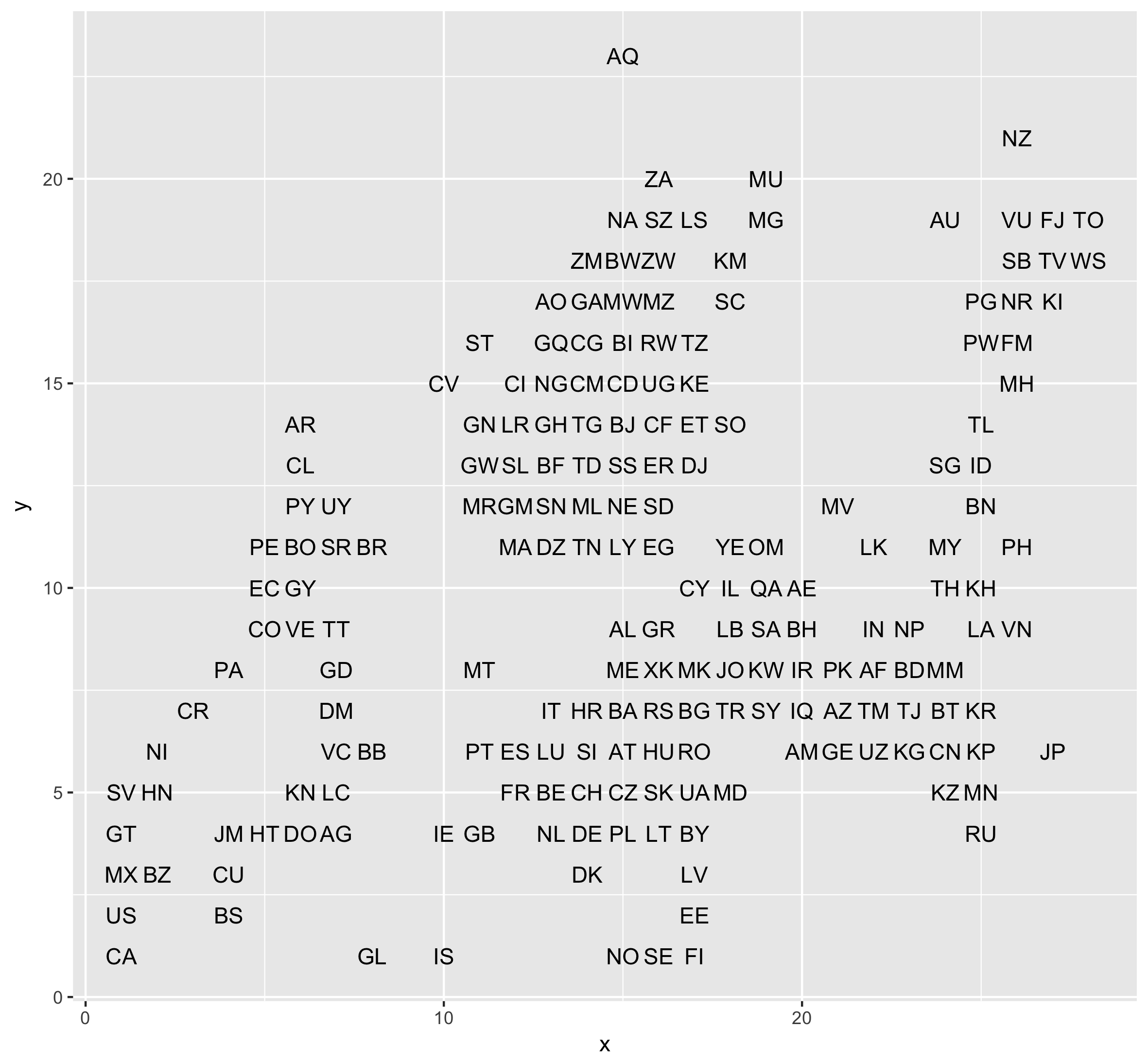
This tutorial is not meant to be an introduction to ggplot2, but what we’re doing here is using the x and y grid coordinates of the data to plot the country codes of all the countries.
Now let’s use rectangles instead of text to plot the countries. To do this, we use geom_rect(), which takes xmin, xmax, ymin and ymax as coordinates for every rectangle (note: we could’ve used geom_tile() or geom_raster() here too). Cells have a width and height of 1, so:
worldgrid <- ggplot(worldtilegrid, aes(xmin = x, ymin = y, xmax = x + 1, ymax = y + 1))
worldgrid + geom_rect()
Not quite a world map yet, but we’ve already got a grid working. Now let’s apply some basic styling:
mytheme <- theme_minimal() + theme(panel.grid = element_blank(), axis.text = element_blank(), axis.title = element_blank())
worldgrid + geom_rect(color = "#ffffff") + mytheme

Let’s add the country codes again:
worldgrid + geom_rect(color = "#ffffff") + mytheme +
  geom_text(aes(x = x, y = y, label = alpha.2), color = "#ffffff", alpha = 0.5)
The labels are plotted at the upper-left corners of the tiles, so we nudge them into their right positions. We also size them:
worldgrid + geom_rect(color = "#ffffff") + mytheme +
  geom_text(aes(x = x, y = y, label = alpha.2), color = "#ffffff", alpha = 0.5, nudge_x = 0.5, nudge_y = 0.5, size = 3)
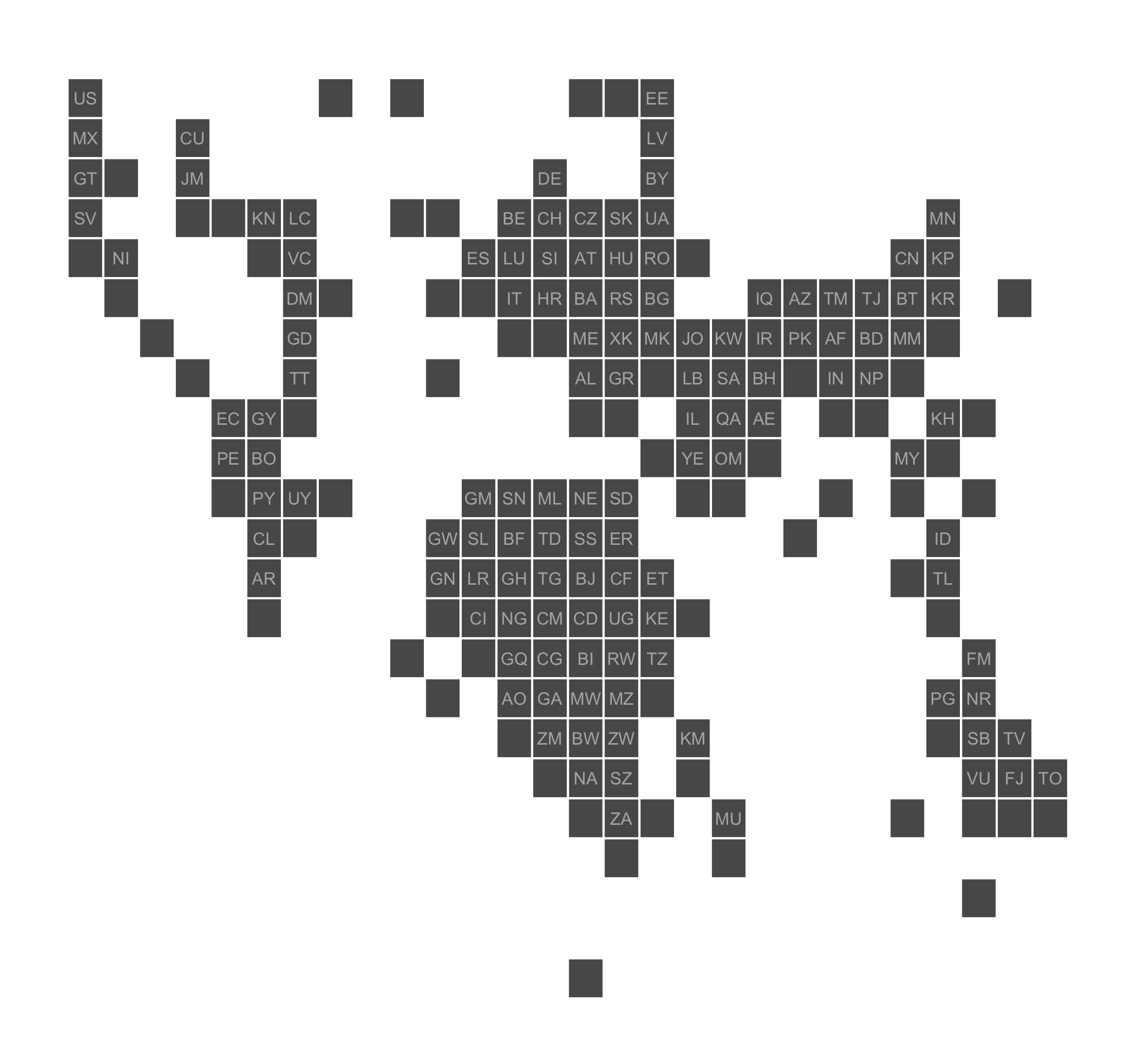
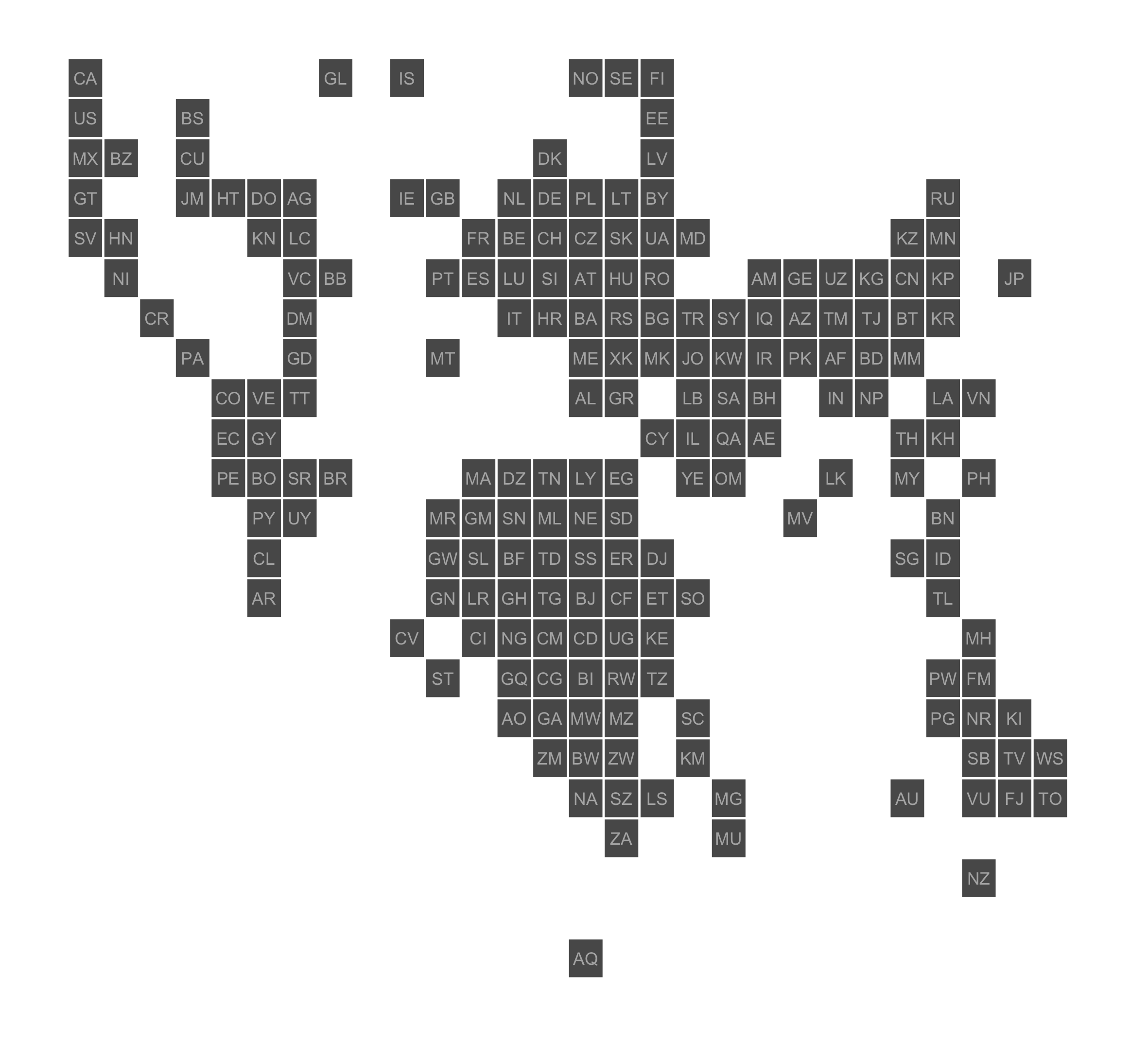
Nice. But by now, you’ve noticed of course that the map is upside down. Jon’s initial map was made in Excel, which starts counting rows from the top. From the axes in the first 2 plots in this tutorial, you can see that we’re plotting with a y axis running from bottom to top. So we need to switch that.
worldgrid + geom_rect(color = "#ffffff") + mytheme +
  geom_text(aes(x = x, y = y, label = alpha.2), color = "#ffffff", alpha = 0.5, nudge_x = 0.5, nudge_y = 0.5, size = 3) +
  scale_y_reverse()
Ok, north and south are in their conventional place now. But the labels are shifted. Because we reversed the y axis, we now need to nudge the labels down, not up:
worldgrid + geom_rect(color = "#ffffff") + mytheme +
  geom_text(aes(x = x, y = y, label = alpha.2), color = "#ffffff", alpha = 0.5, nudge_x = 0.5, nudge_y = -0.5, size = 3) +
  scale_y_reverse()
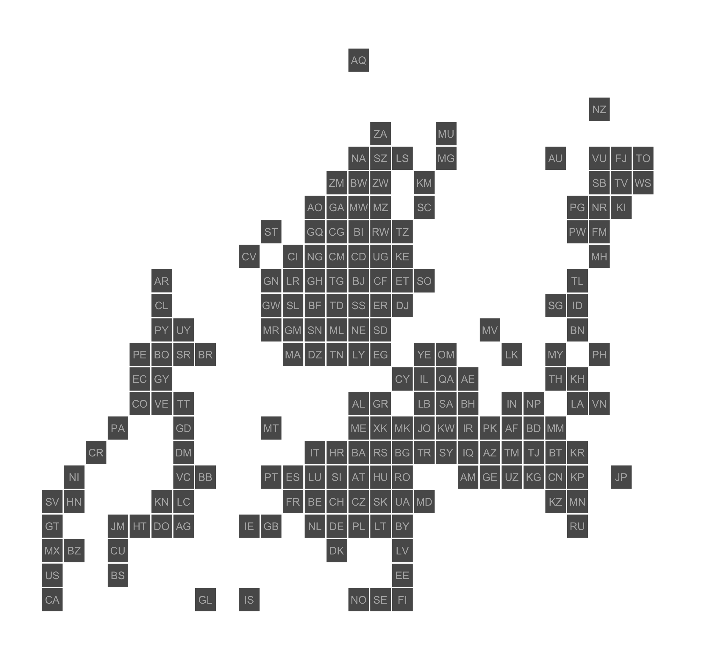
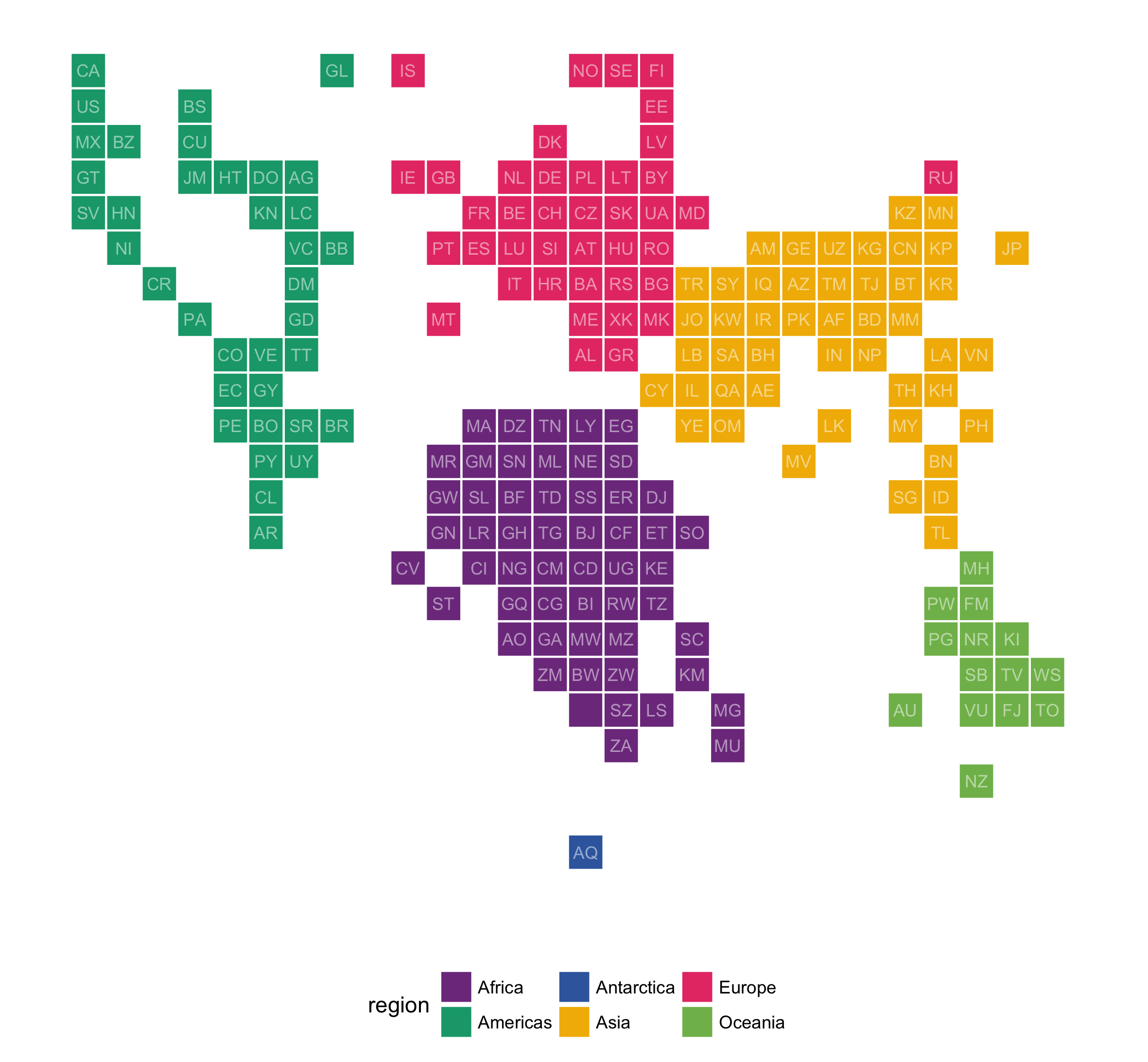
Now let’s add some color. Notice the added ‘fill = region’ in the plot aestethics.
worldgrid <- ggplot(worldtilegrid, aes(xmin = x, ymin = y, xmax = x + 1, ymax = y + 1, fill = region))
worldgrid + geom_rect(color = "#ffffff") + mytheme +
  geom_text(aes(x = x, y = y, label = alpha.2), color = "#ffffff", alpha = 0.5, nudge_x = 0.5, nudge_y = -0.5, size = 3) +
  scale_y_reverse()
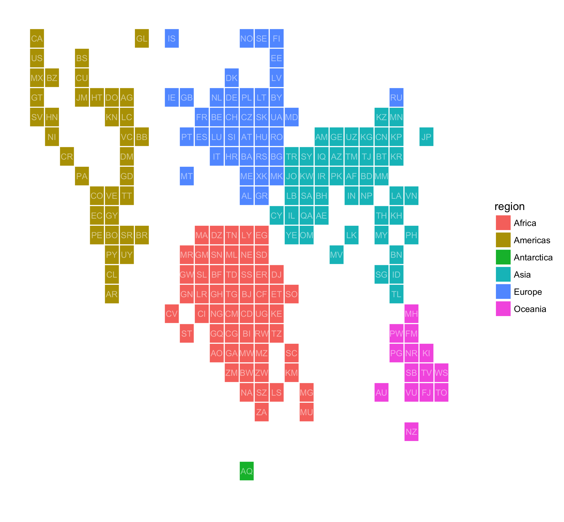
Country tiles are colored by region and ggplot adds a legend to the plot. Let’s move away from the default ggplot2 color palette and use some CartoColors.
colors <- c("#7F3C8D","#11A579","#3969AC","#F2B701","#E73F74","#80BA5A")
worldgrid + geom_rect(color = "#ffffff") + mytheme +
  geom_text(aes(x = x, y = y, label = alpha.2), color = "#ffffff", alpha = 0.5, nudge_x = 0.5, nudge_y = -0.5, size = 3) +
  scale_y_reverse() +
  scale_fill_manual(values = colors)
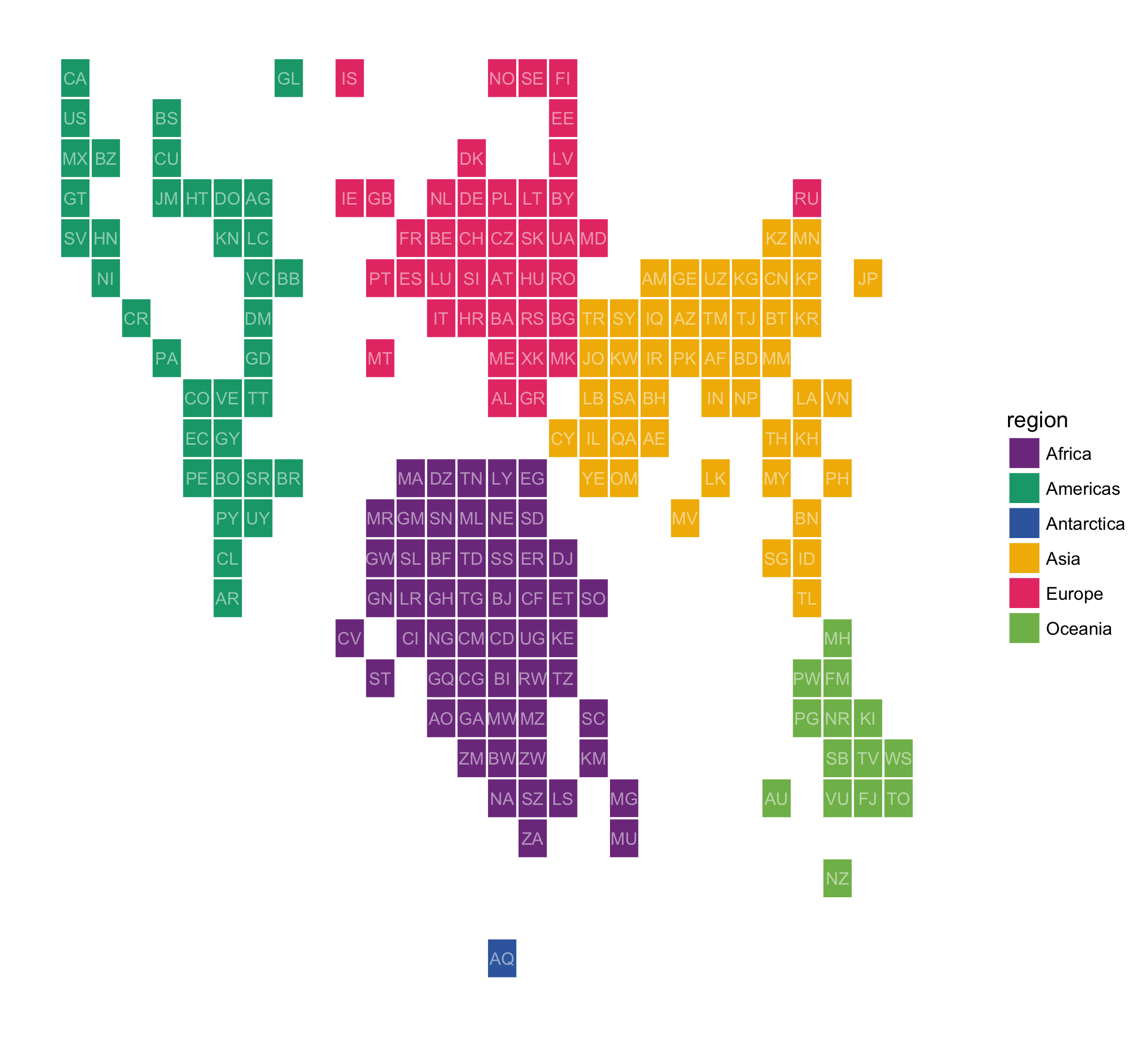
Good. But sharp-eyed readers will have noticed that adding the legend skewed the tiles to become rectangles instead of squares. Let’s move the legend to the bottom and make sure to always have square tiles with ‘coord_equal()’.
worldgrid + geom_rect(color = "#ffffff") + mytheme +
  geom_text(aes(x = x, y = y, label = alpha.2), color = "#ffffff", alpha = 0.5, nudge_x = 0.5, nudge_y = -0.5, size = 3) +
  scale_y_reverse() +
  scale_fill_manual(values = colors) +
  theme(legend.position = "bottom") +
  coord_equal()
The whole script (also on Github):
library(ggplot2)
worldtilegrid <- read.csv("worldtilegrid.csv")
mytheme <- theme_minimal() + theme(panel.grid = element_blank(), axis.text = element_blank(), axis.title = element_blank())
colors <- c("#7F3C8D","#11A579","#3969AC","#F2B701","#E73F74","#80BA5A")
ggplot(worldtilegrid, aes(xmin = x, ymin = y, xmax = x + 1, ymax = y + 1, fill = region)) +
geom_rect(color = "#ffffff") +
mytheme + theme(legend.position = "bottom") +
geom_text(aes(x = x, y = y, label = alpha.2), color = "#ffffff", alpha = 0.5, nudge_x = 0.5, nudge_y = -0.5, size = 3) +
scale_y_reverse() +
scale_fill_manual(values = colors) + coord_equal()
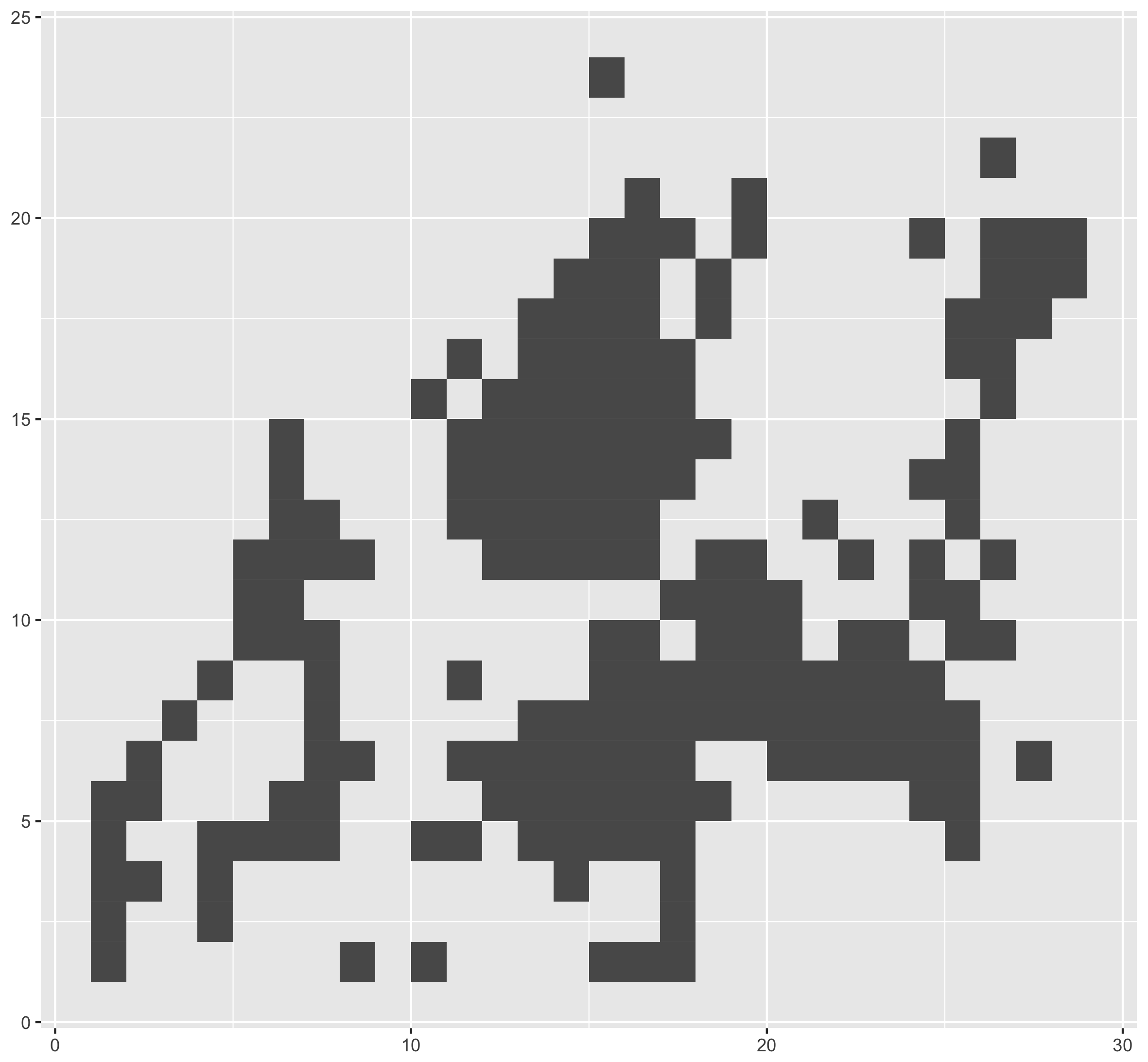
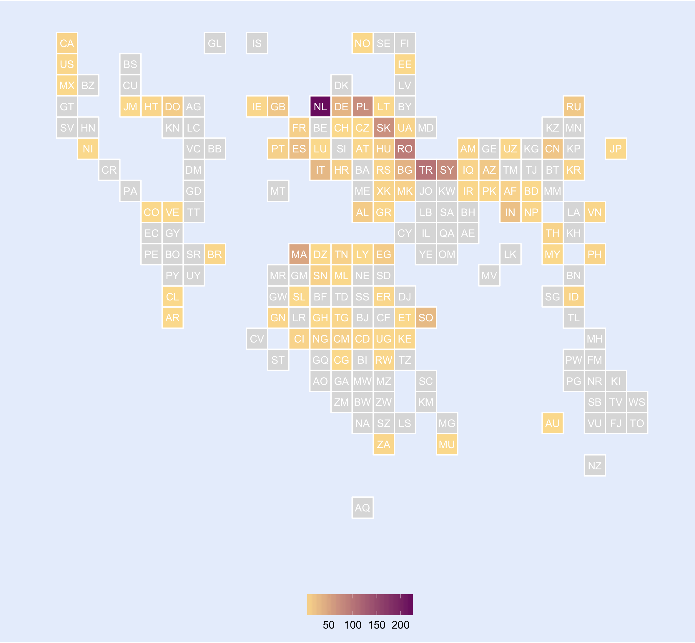
ggsave("worldtilegridmap.png", units = "cm", width = 20, height = 18.5)So what was my initial idea to use the World Tile Grid Map for? I got my hands on a data set with the number of foreigners registered in each Belgian municipality, by nationality. For Diest, the municipality where I live, the map with the nationalities registered looks like this (grey shading means no nationals registered):
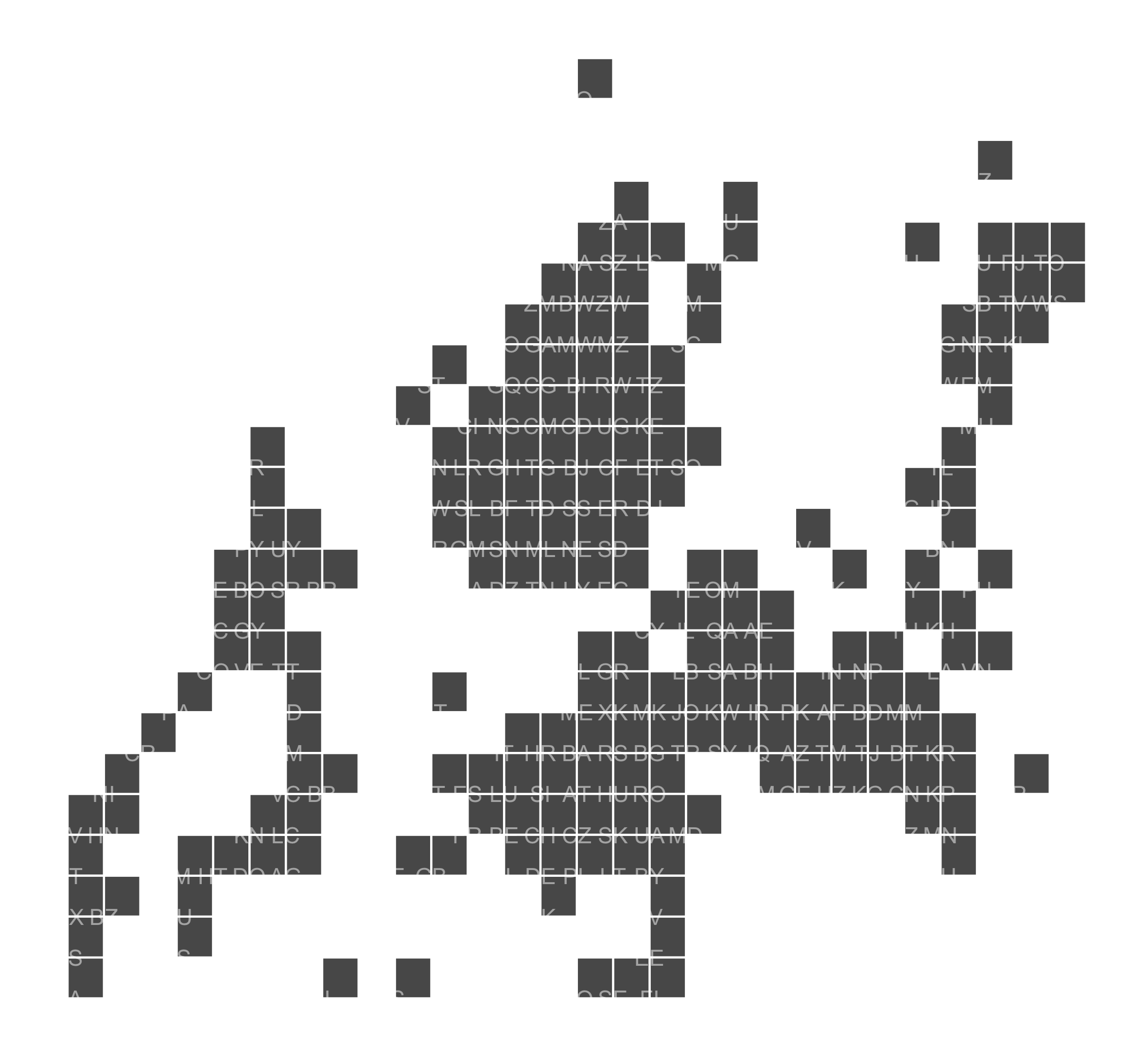
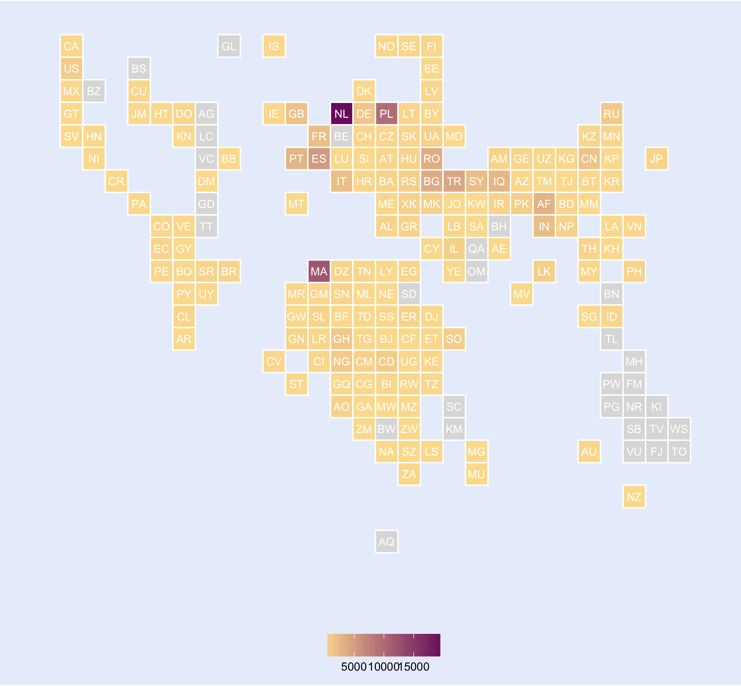
This is the map for Antwerp, where almost the whole world is represented:
I’ve got some more plans with this data set, so stay tuned!