My #30DayMapChallenge
November 01, 2019
After #Inktober, Finnish cartographer Topi Tjukanov launched #30DayMapChallenge, a challenge to make a different map each day of November.
Announcing #30DayMapChallenge in November 2019! Create a map each day of the month with the following themes 🌍🌎🌏
— Topi Tjukanov (@tjukanov) October 25, 2019
No restriction on tools. All maps should be created by you. Doing less than 30 maps is fine. #gischat #geography #cartography #dataviz pic.twitter.com/6Go4VFWcJB
I’m just going to have a go at this. I’ll probably wont make one each day, but it is a nice occasion to publish some half baked ideas I have lingering on my computer, to learn a thing are two, and most of all, just have some mapping fun :)
So whenever I make a new map for the challenge, it will be added to this page.
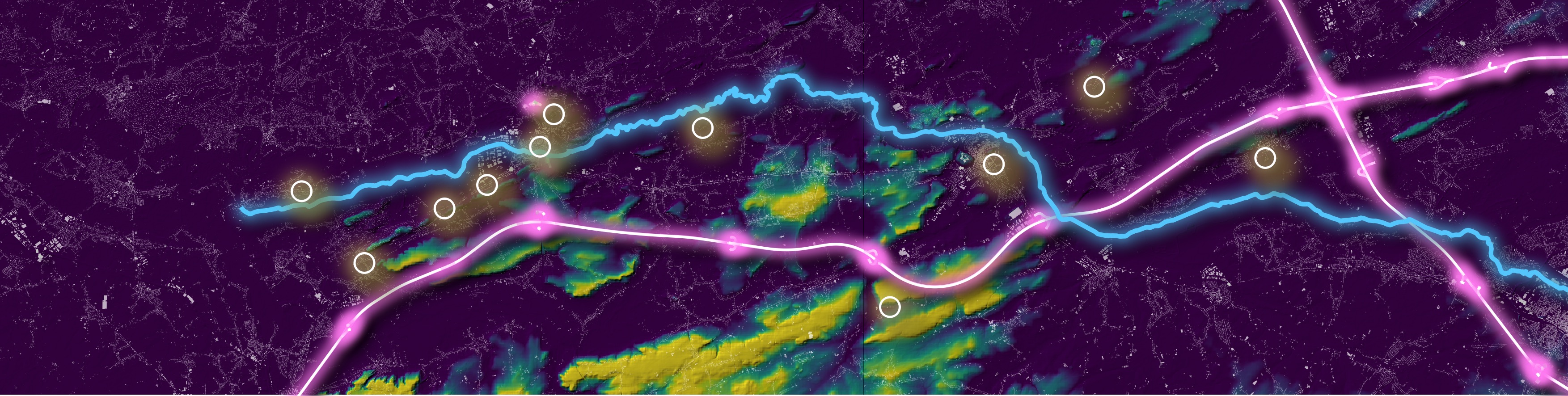
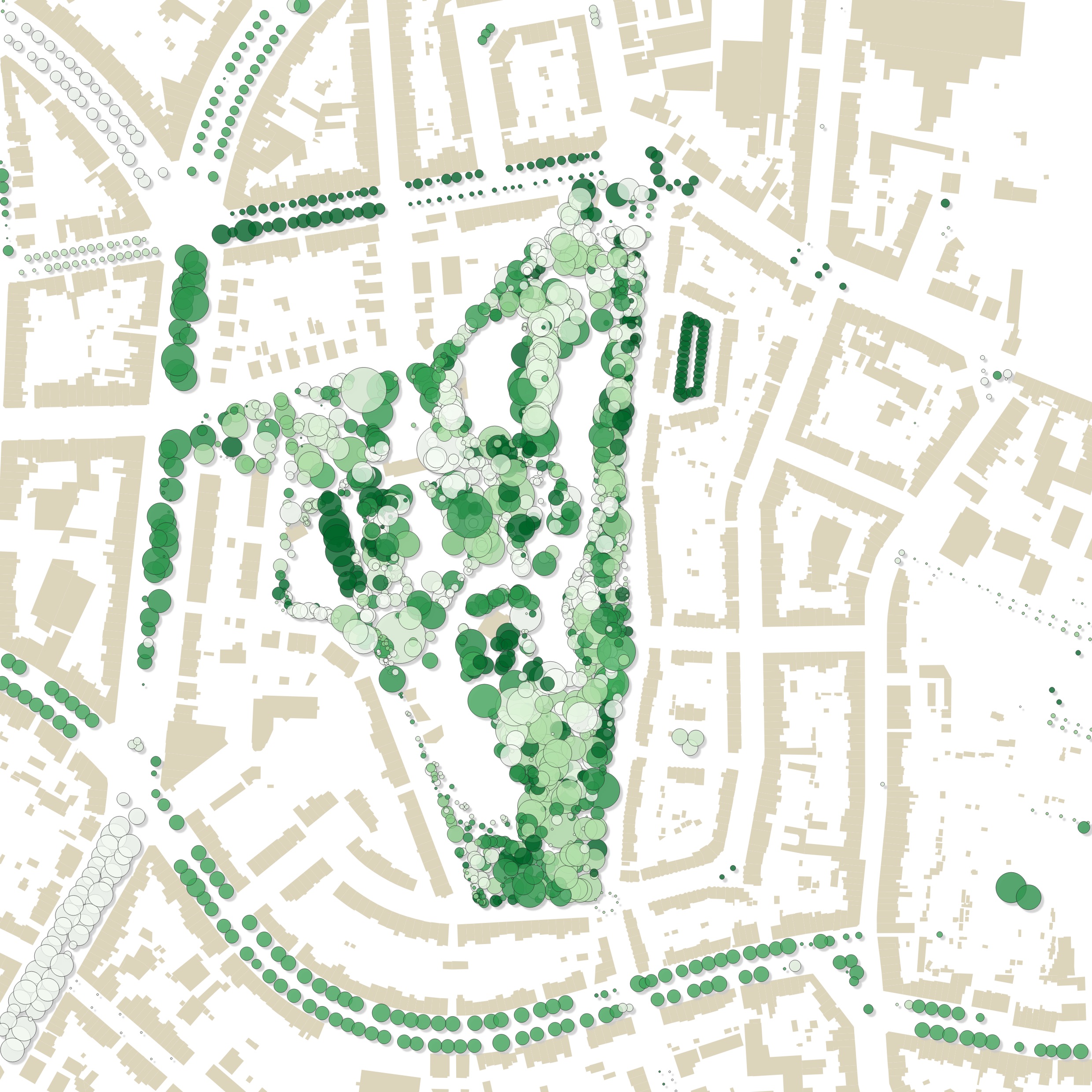
Challenge 30: home
Data: Adresses I lived at
Tools: I used geojson.io for quick geocoding and composing a geojson file, QGIS for making the map
Goal: I realised already long ago that the places I lived at throughout my life were somehow connected to the Demer river (blue) and the E314 highway (pink). It was finally time to map my homes (circles)s
How I did it: Layer composing in QGIS, with DEM hillshading and pseudocolor, building outlines, and neon layers for the river and highway
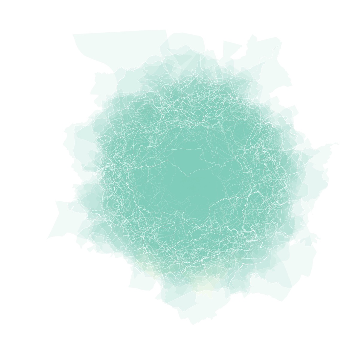
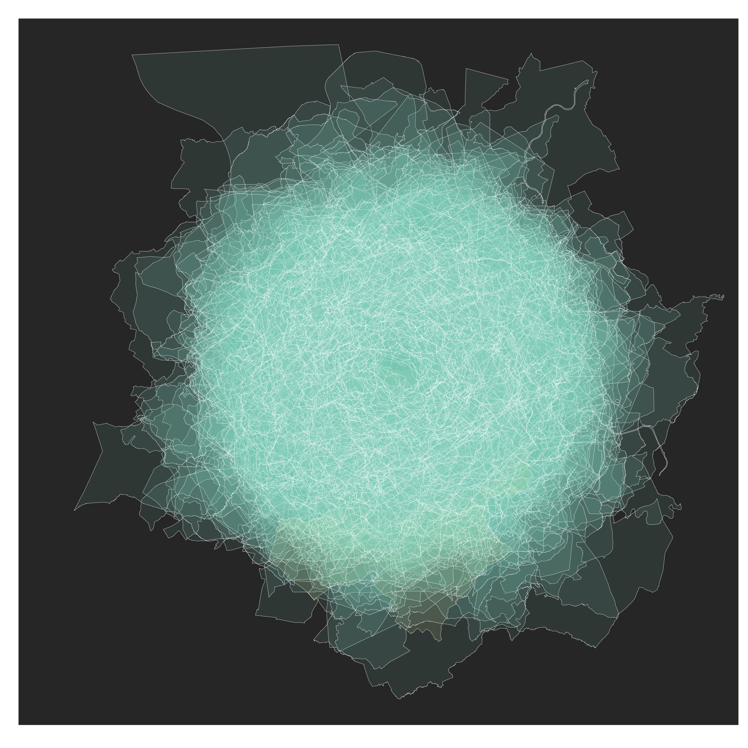
Challenge 29: experimental
Data: Belgian municipalities boundary data
Tools: R and the sf package
Goal: Experiment
How I did it: I calculated the centroid of each municipality and then subtracted the centroid coordinates from the polygon coordinates. Then I plotted all the municipalities on top of each other, with varying opacities and different orderings.
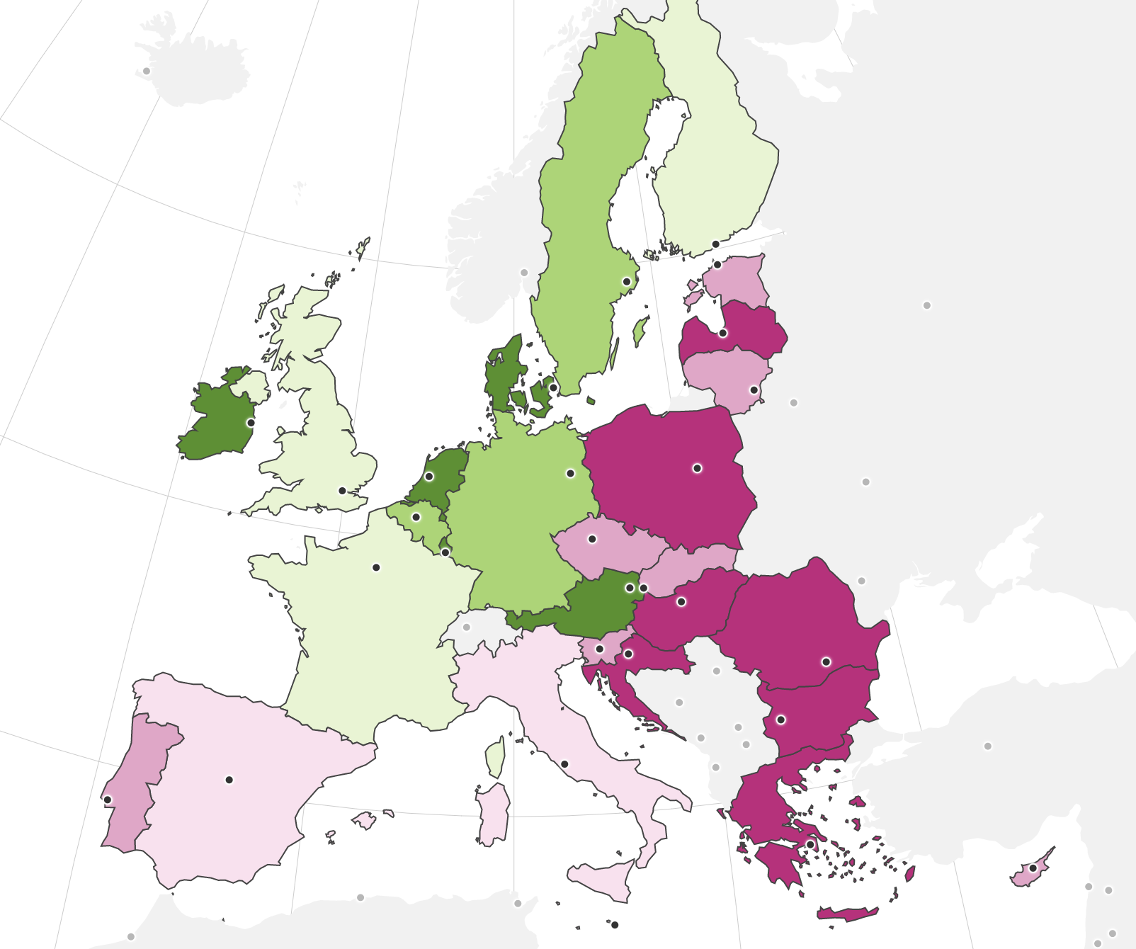
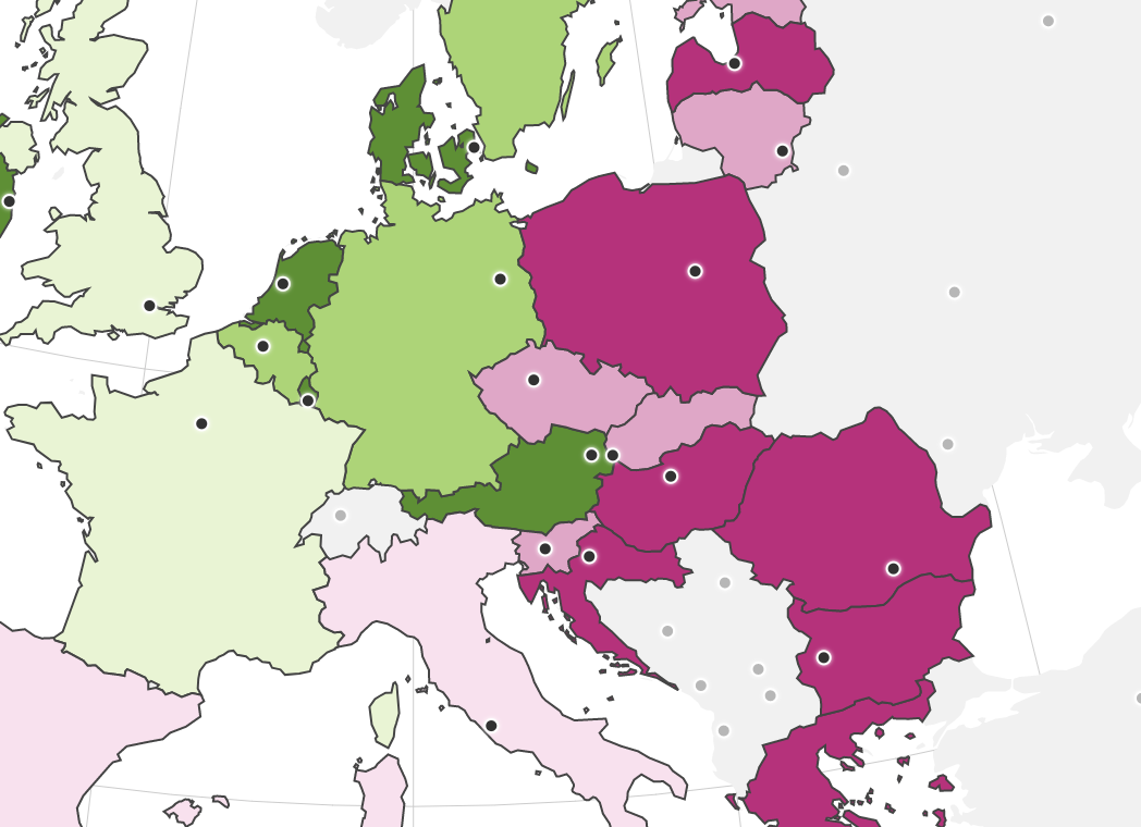
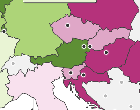
Challenge 28: funny
Data: EU country boundaries and capital locations
Tools: D3
Goal: Change the way you look at Austria, Vienna and Bratislava
How I did it: I made the map and a reader notified me about the Austrian worm.
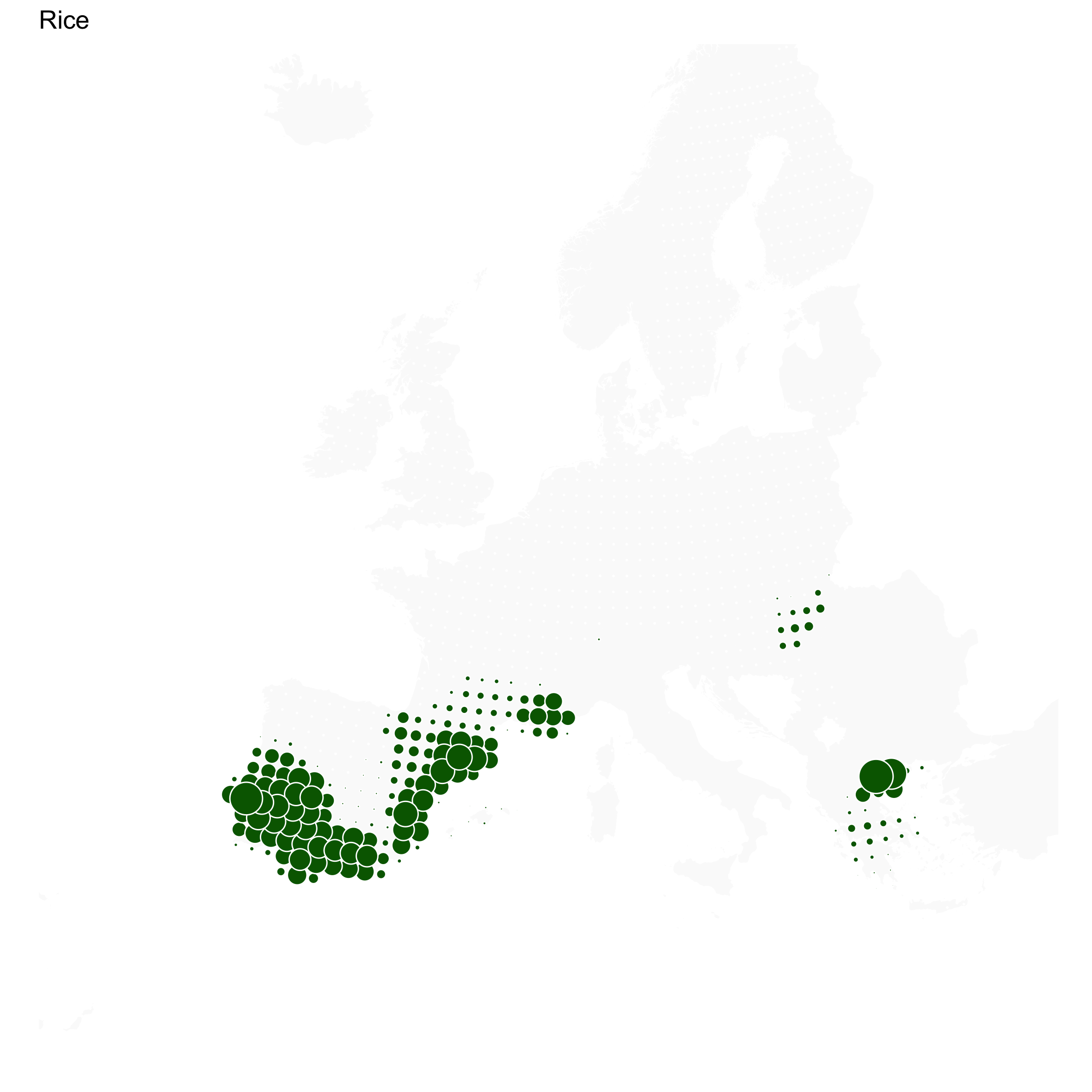
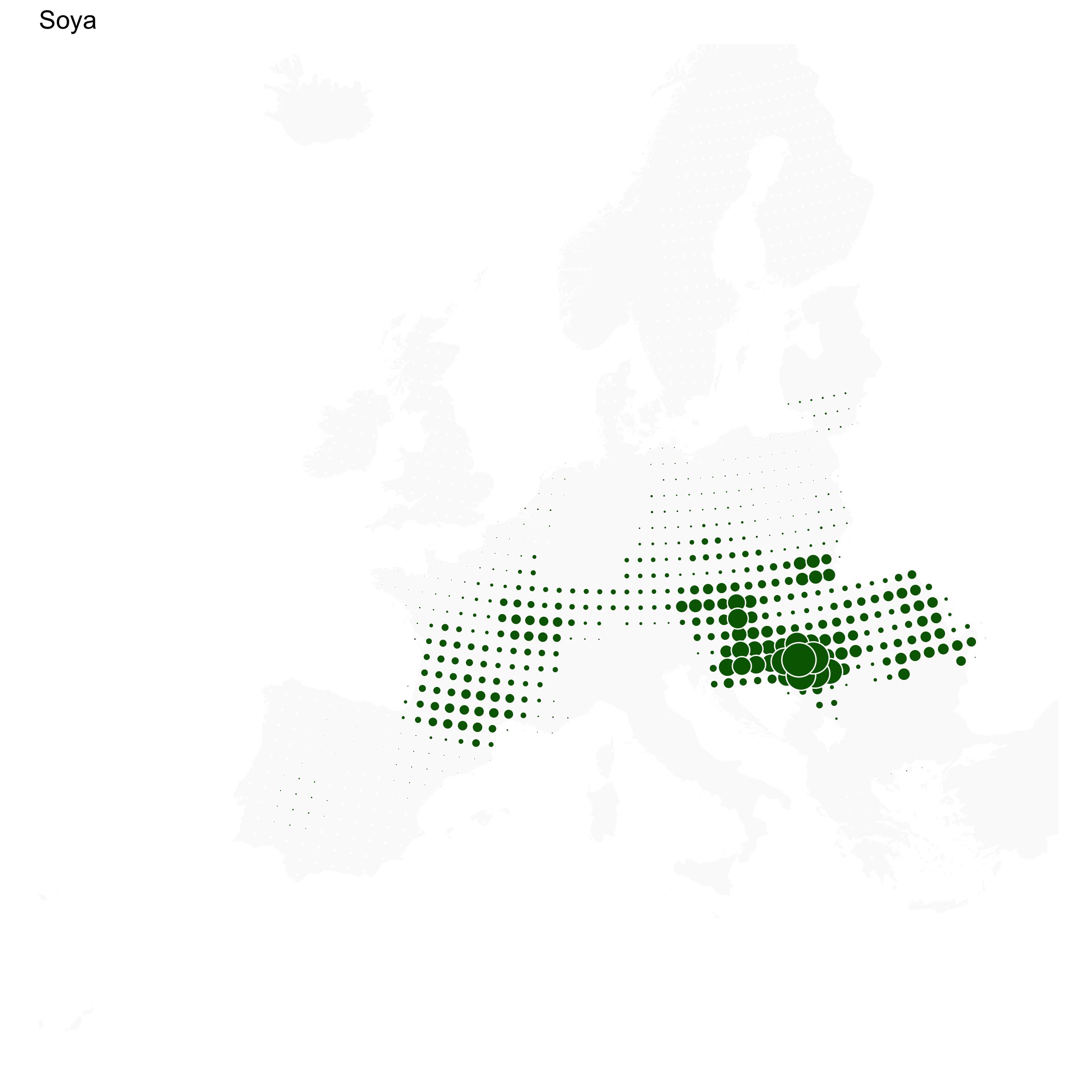
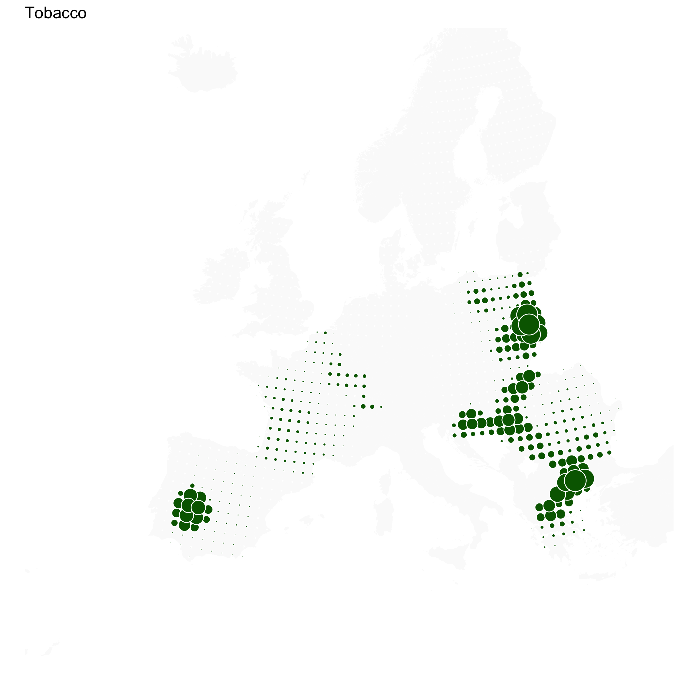
Challenge 27: resources
Data: EU crop production (Eurostat)
Tools: R and the eurostat, sf and ggplot2 packagas
Goal: Show regional distribution of different crops accross Europe, similar to The Herds of Europe
How I did it: Similar to this tutorial
area-19.png)
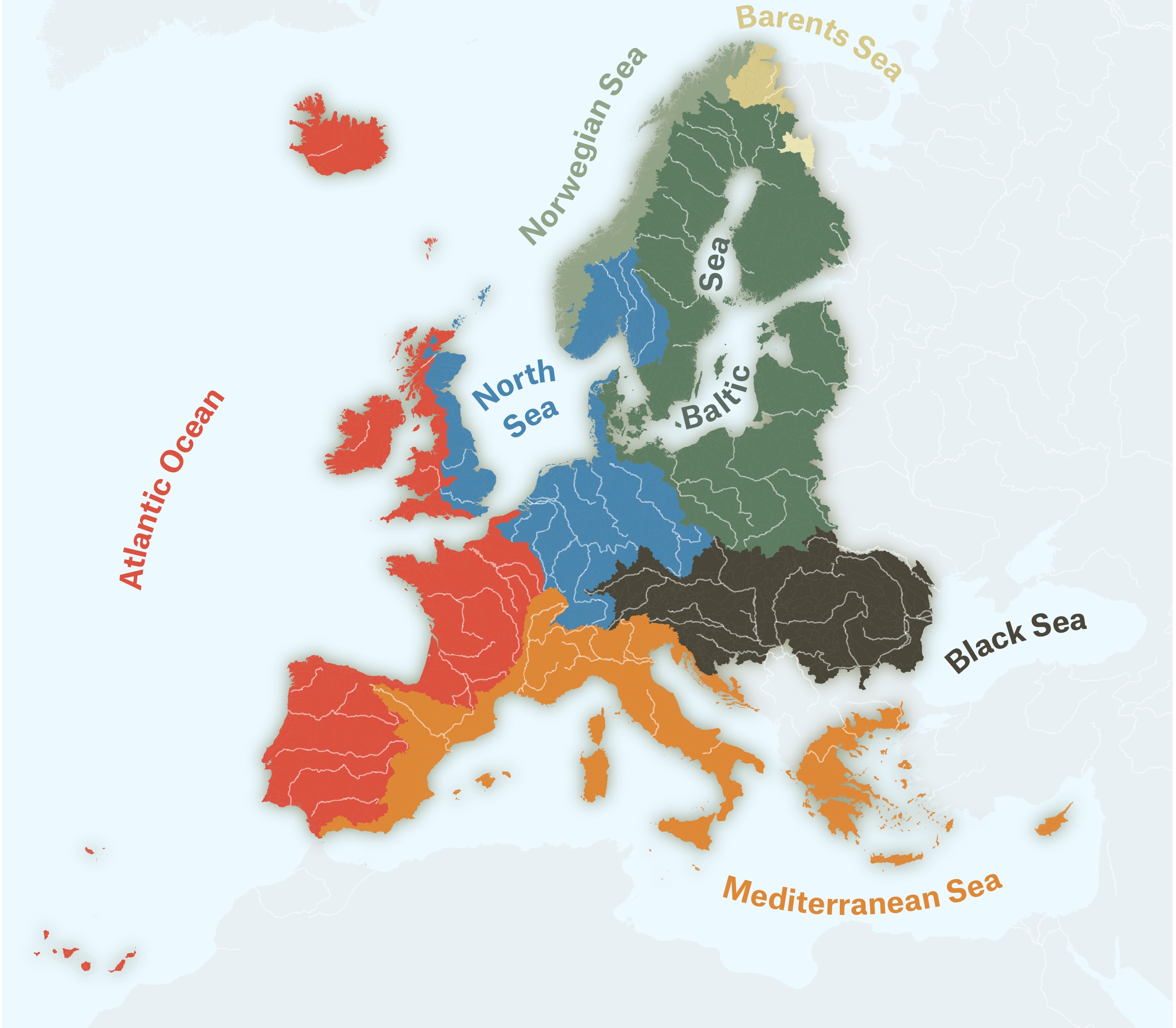
Challenge 26: hydrology
Data: European river catchments
Tools: QGIS and Illustrator
Goal: Show European ocean drainage basins (that is probably not the official term) and practice my Text-on-path skills
How I did it: Colored all the river catchment according to what sea they are flowing to, and added a little outer glow to these. The sea is a very light blue, and land area with no data is shown in light grey (this data comes from Natural Earth). The colors are my Tintin palette. I exported the map from QGIS to Illustrator and added the names of the seas with the Text on path tool.
Challenge 25: climate
Data: EDGAR
Tools: Datawrapper
Goal: Showing both the differences in per capita CO2 emissions and the total population of countries (but I’ll use any excuse to make cartograms)
How I did it: The hardest part was matching the country names in the EDGAR data to the names in Datawrapper. The values in the legend are the quartile values
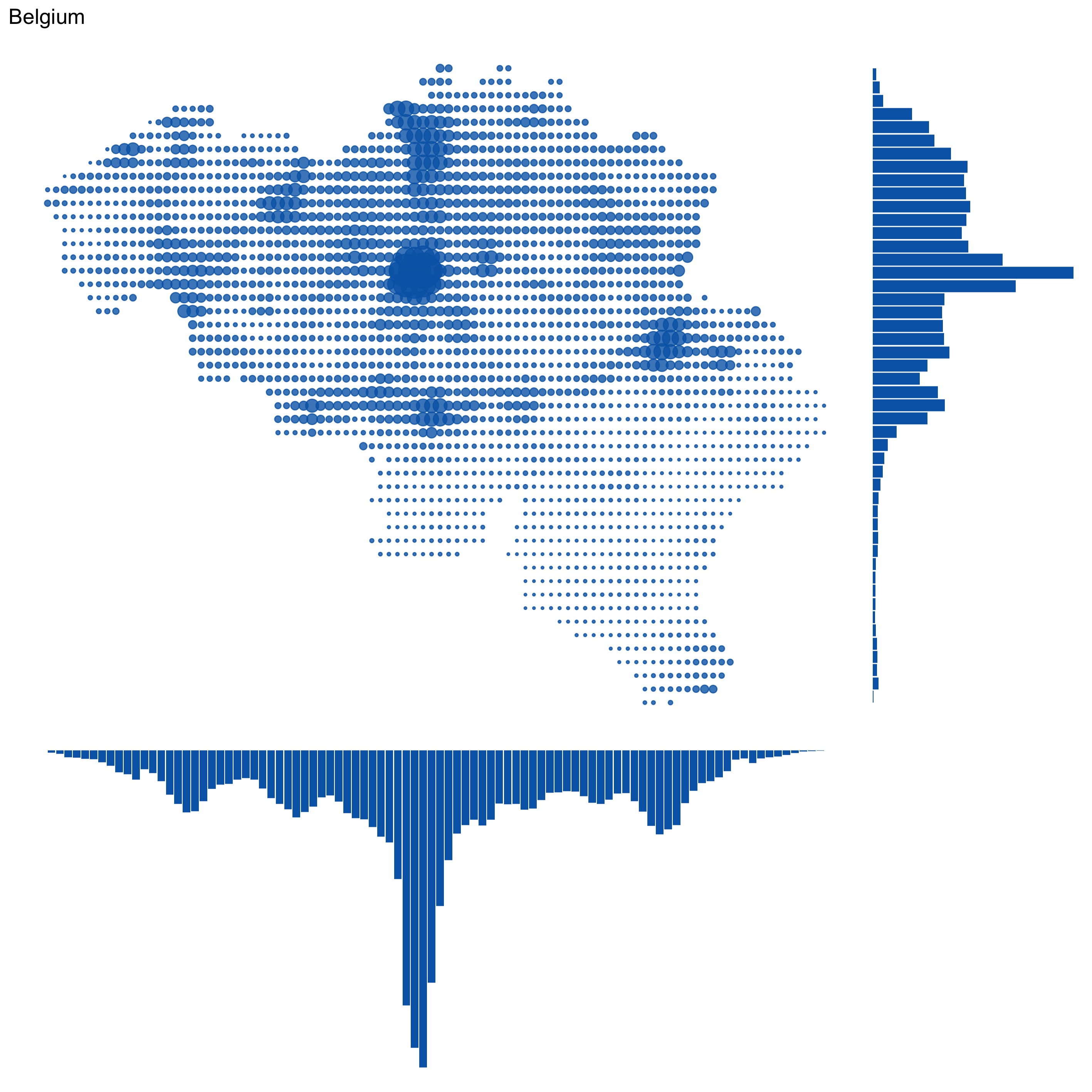
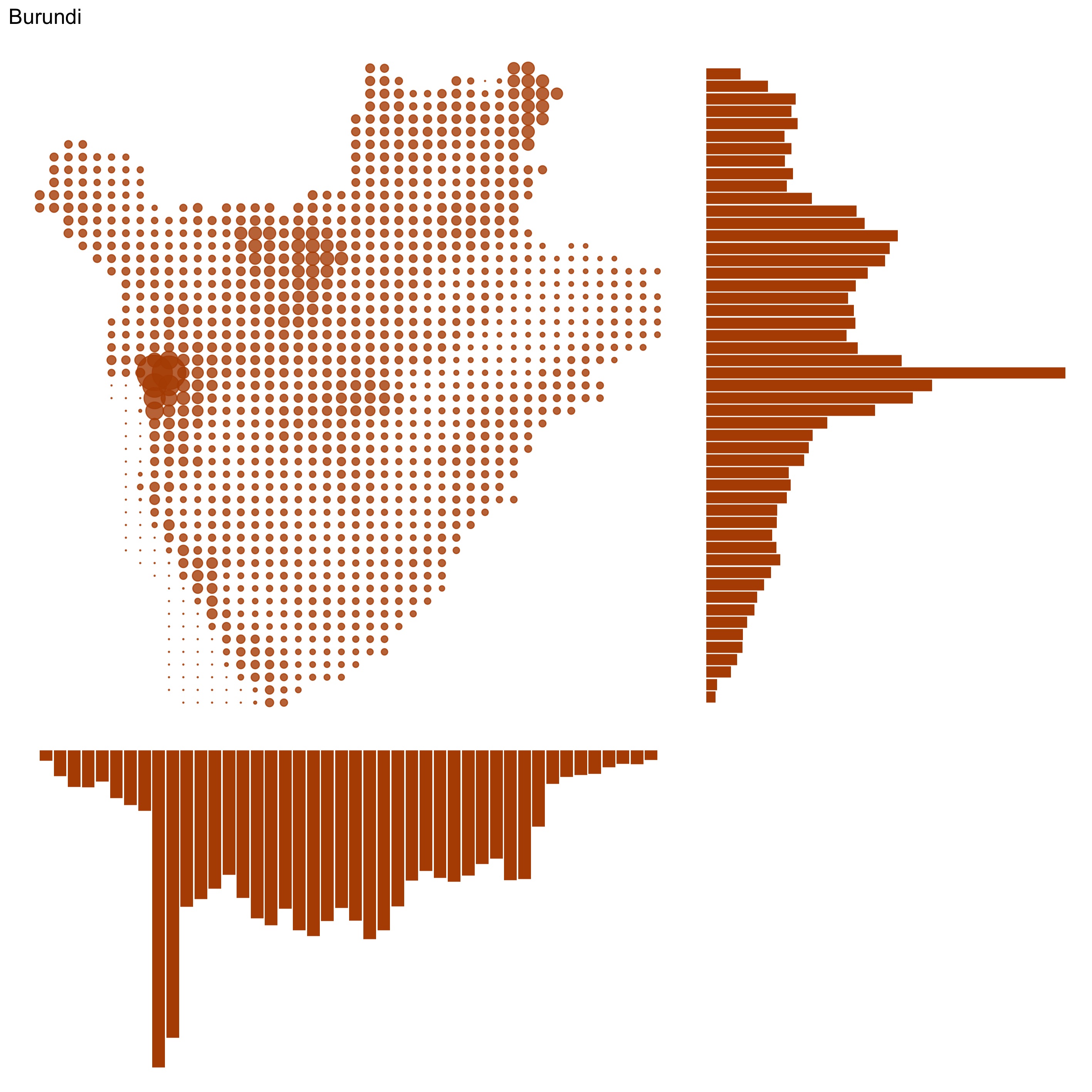
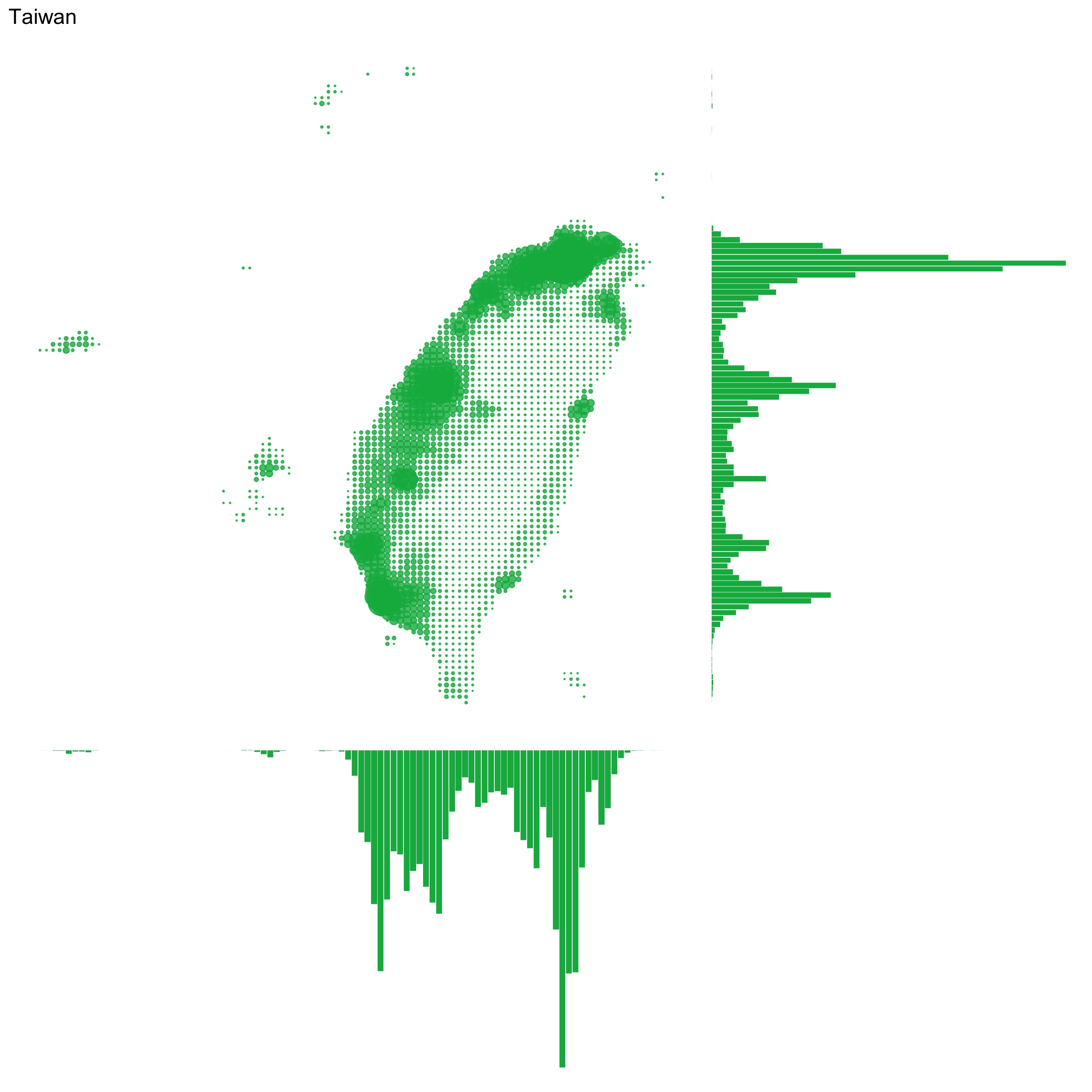
Challenge 24: statistics
Data: Gridded population of the world
Tools: R, with packages SDMTools, ggplot2 and patchwork
Goal: Make a classic “population by longitude and lattitude” map, but for individual countries instead of the whole world.
How I did it: I used the asc2dataframe() to convert the source files into something I could work with. The source files also contain data about to which country each cell in the population grid belongs, so I used that to filter the data by country. Then I calculated the total population for each row and column in the filtered data, made barcharts with these numbers in ggplot and finally glued the map and the 2 bar charts together with the patchwork package.
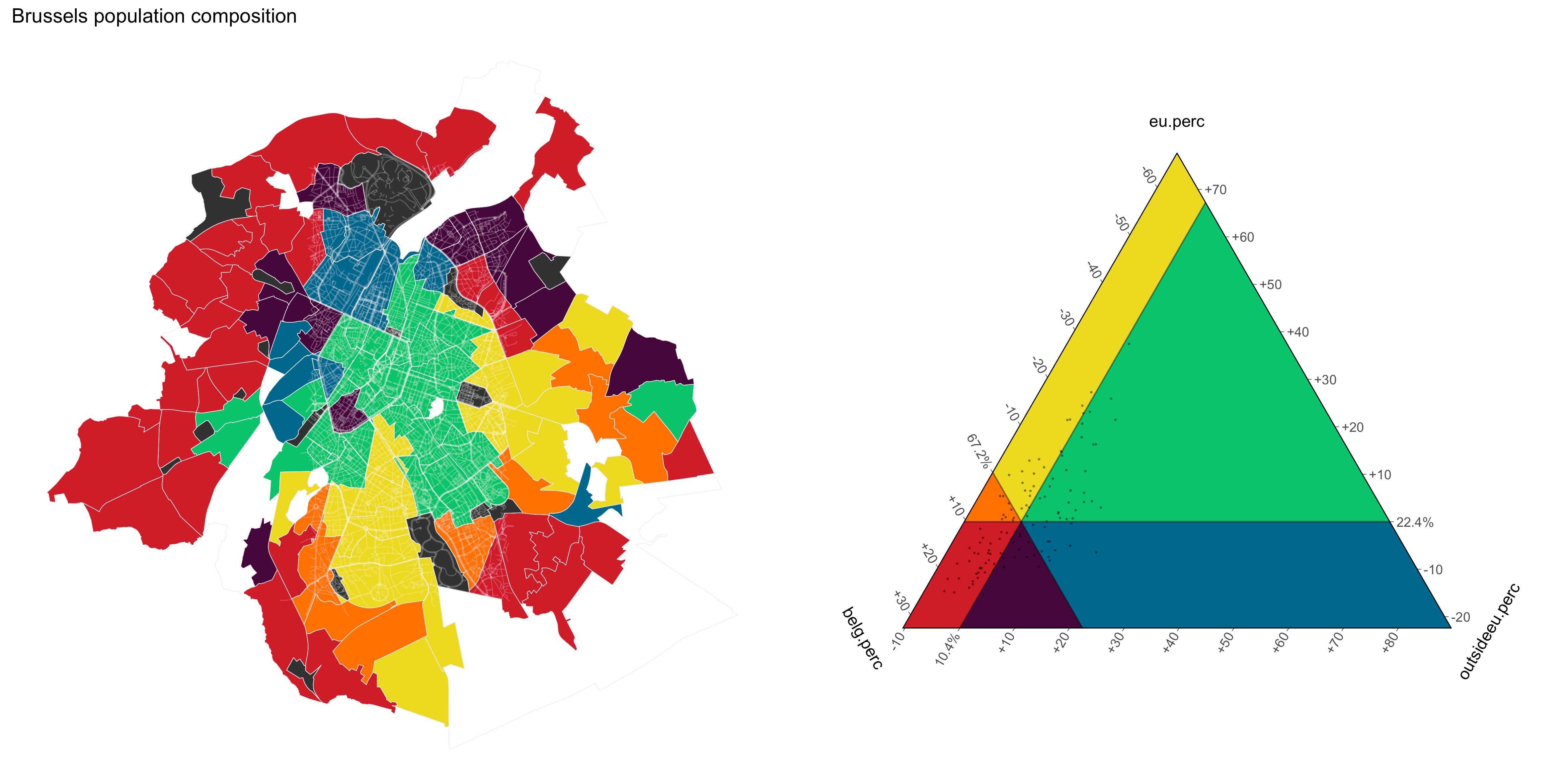
Challenge 23: population
Data: nationalities by neighbourhood from Wijkmonitoring.brussels
Tools: R, with packages sf, ggplot2 and tricolore
Goal: Make my first ternary map
How I did it: Apart from some data preparation, I basically followed this vignette, changing the Tricolore function to the TricoloreSextant function.
Challenge 22: built environment
Data: 3D GRB, a dataset containing the outline and height of every building in Flanders. I also reused the 5 meter DEM from challenge 11.
Tools: QGIS and the Qgis2threejs plugin
Goal: Make something cool in 3D ;)
How I did it: The base layer is the DEM with both hillshading and mapping elevation to color. The height of the buildings is the maximum heights of the buildings.
Static (the buildings heights are exaggerated here, but I love how you can see the Citadel towering above the city. And my new house is somewhere in here!):
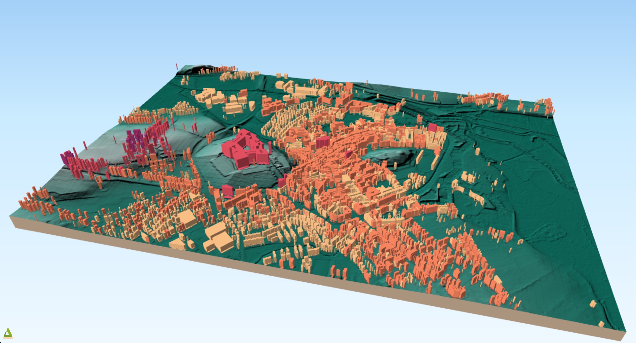
See the interactive version here (be warned: this is a heavy page :)
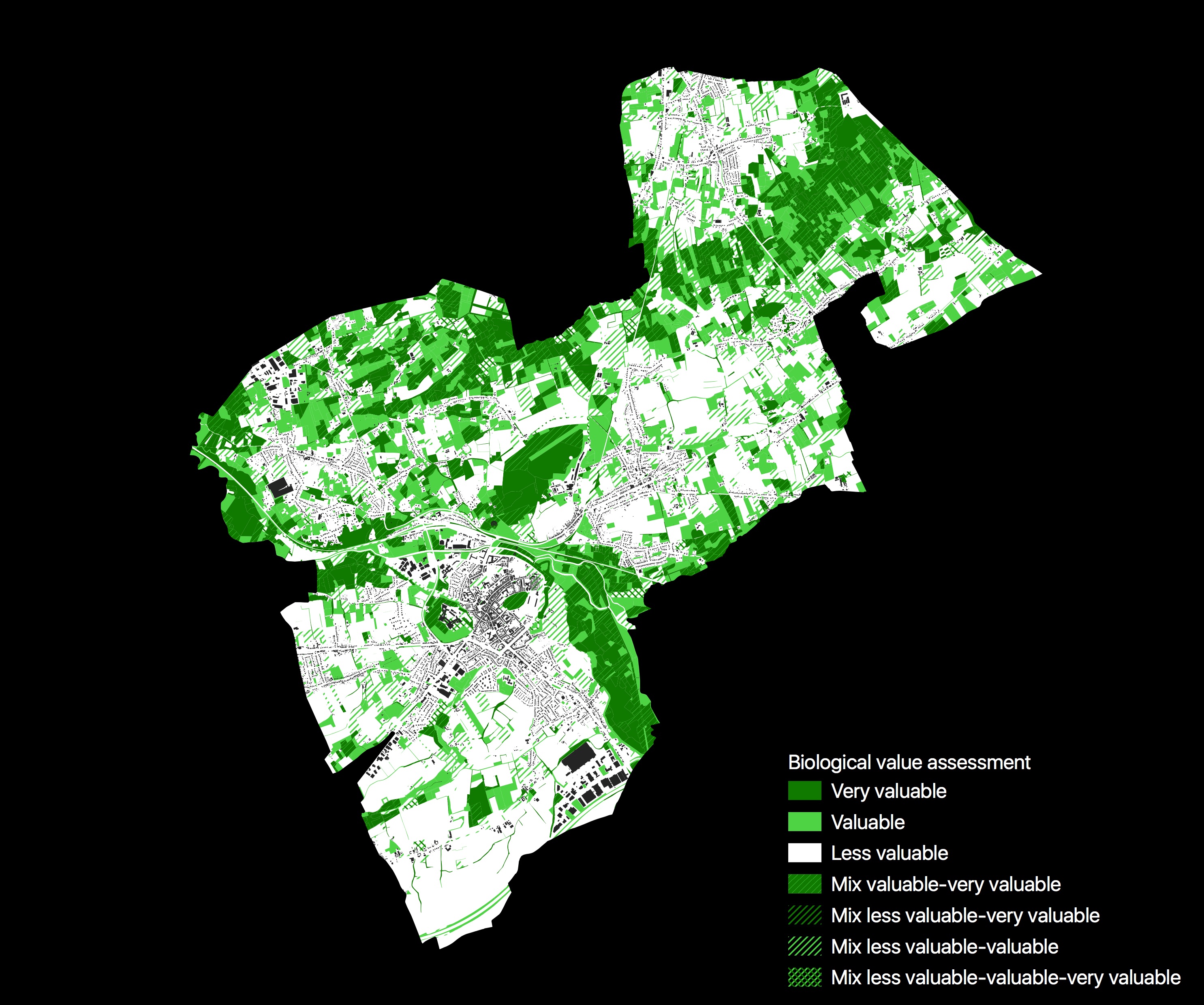
Challenge 21: environment
Data: Biologische waarderingskaart 2018, a dataset assigning an ecological value to all non-built up plot in Flanders. I’ve always wondered how they construct and update this data set
Tools: QGIS
Goal: I wanted to recreate the official color legend for this data. In the end, I changed it considerably, but I learned a lot about making hased textures in QGIS.
How I did it: Like in challenge 20, I used an inverted polygon to mask out everything outside of my municipality. After that, it was all about configuring the color and the hashing. I also added a building outline layer to give some context.
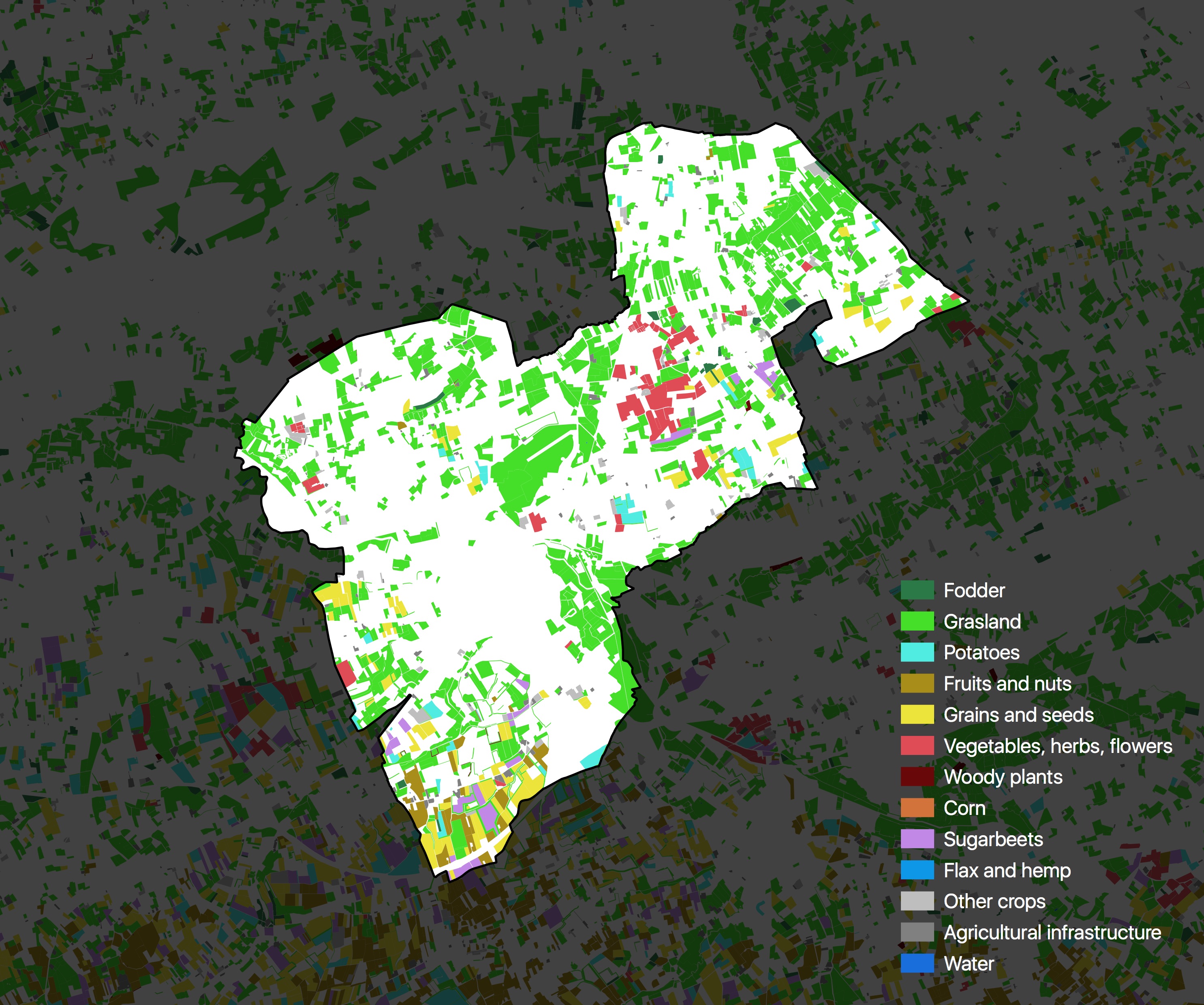
Challenge 20: rural
Data: Agricultural plots in Flanders, a dataset I worked a lot with in my early carreer as an agricultural economist. The most recent publicly available data set seems to date from 2013.
Tools: QGIS
Goal: Just a quick map of the different crops on the fields in my own municipality
How I did it: One of the tricks I learned during the #30DayMapChallenge is that you can invert polygons in QGIS. So I used that to mask the plots outside of my municipality.
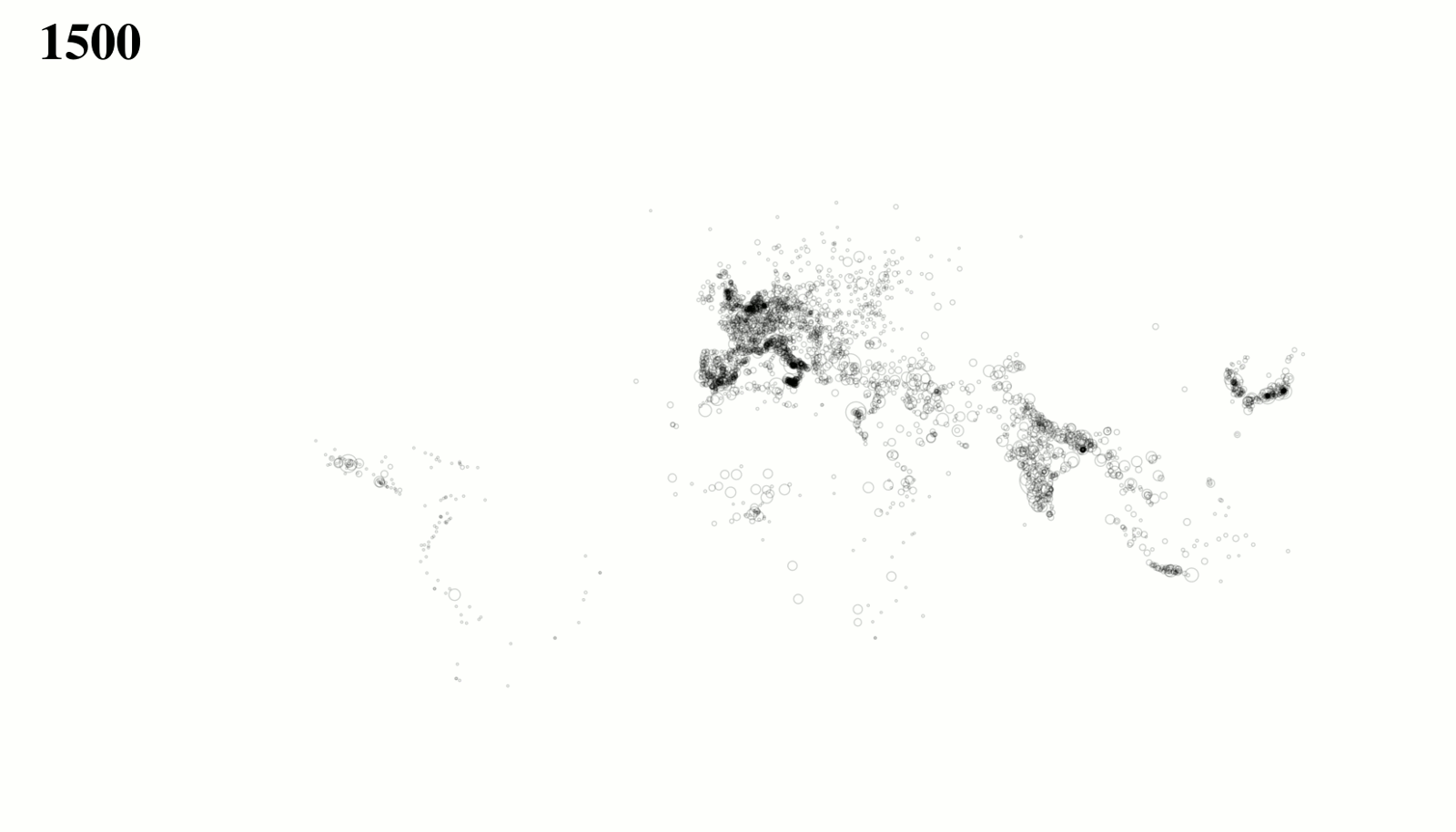
Challenge 19: urban
Data: I had no inspiration for this challenge, so I want strolling through the “data” folder on my computer and stumbled accross “data/cities”. It contained some Excel files I had forgotten about, containing the population and location of cities world wide between 1500 and 2000, in 50 year intervals. I need to look up the source of this data.
Tools: R to process the data, ggplot for making the maps, GIMP for making the gif
Goal: Show the growth of cities worldwide over time
How I did it: The map is a simple ggplot with a geom_point() layer and coord_map(). I generated 1 map for each year in the data, opened them as layers in GIMP and exported the layers as an animated gif, with 800 milliseconds between the frames.
Challenge 18: globe
Data: Detailed air passenger transport by reporting country and routes from Eurostat. The data with the locations of the airports was already on my hard drive, don’t remember where I got it from…
Tools: R to get and process the data, Flourish to visualise it
Goal: Show how European airports are connected
How I did it: I downloaded all the country data files with the eurostat R package and combined everything into one file. Then I uploaded the route data and the airport locations to the Flourish Connections Globe template and configured the map in there.
Flourish has another template that uses the same data structure: the Arc map. So I also made one of those with the data. I actually like that one better, but it is not a globe, so ¯_(ツ)_/¯
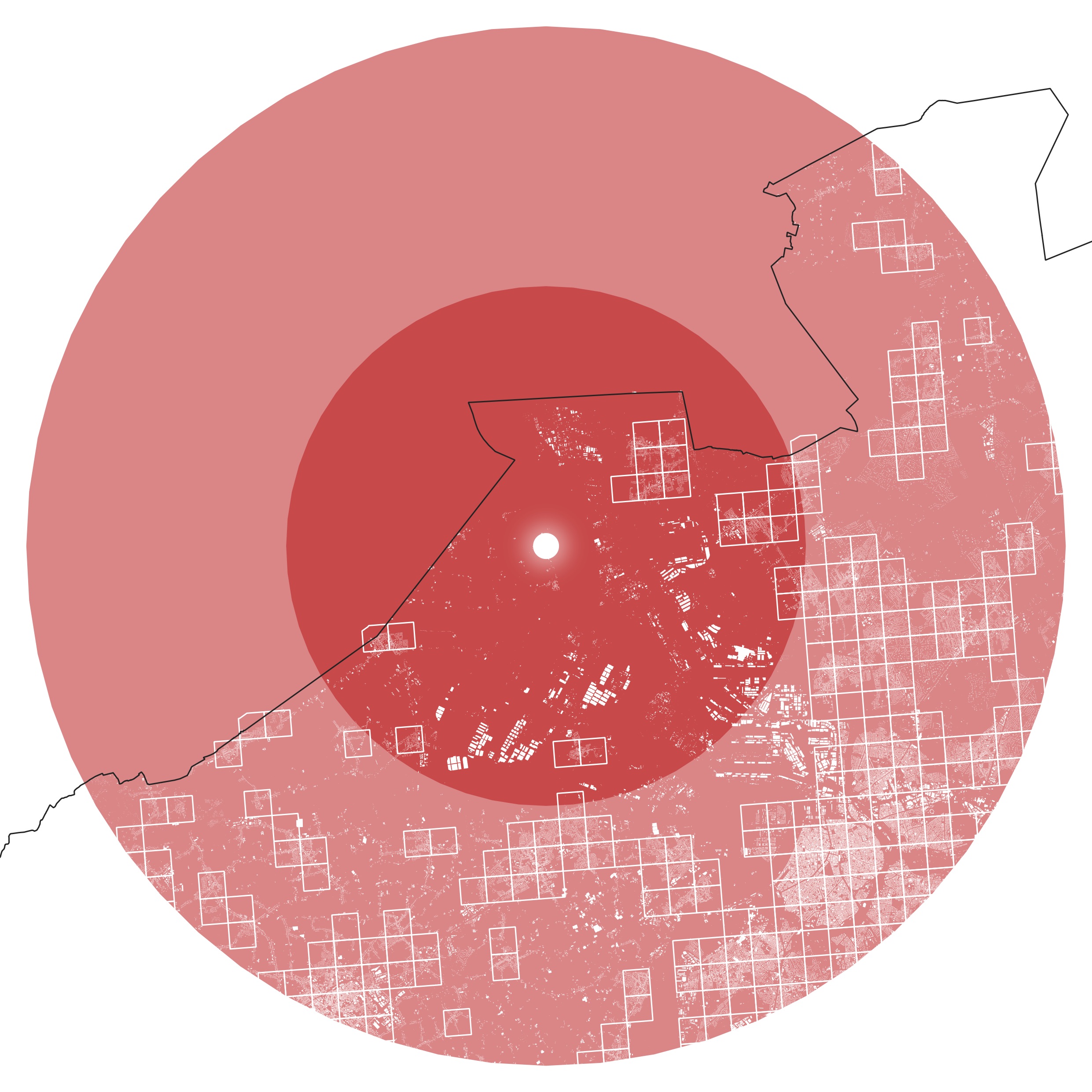
Challenge 17: zones
Data: 1 km population grid of the Belgian census 2011 and Flemish government building outline data
Tool: QGIS
Goal: Show the crowded area the Doel nuclear power plant is located
How I did it: I took the location of the power plant from Wikipedia and quickly made geojson file from it in geojson.io. Opened the file in QGIS and generated a 10 km and 20 km buffer around it. Then I added the population grid and styled the grid cells with a white outline and made sure that only the ones containing more than 500 people are visible. Lastly, I added the building outlines to show built up areas.
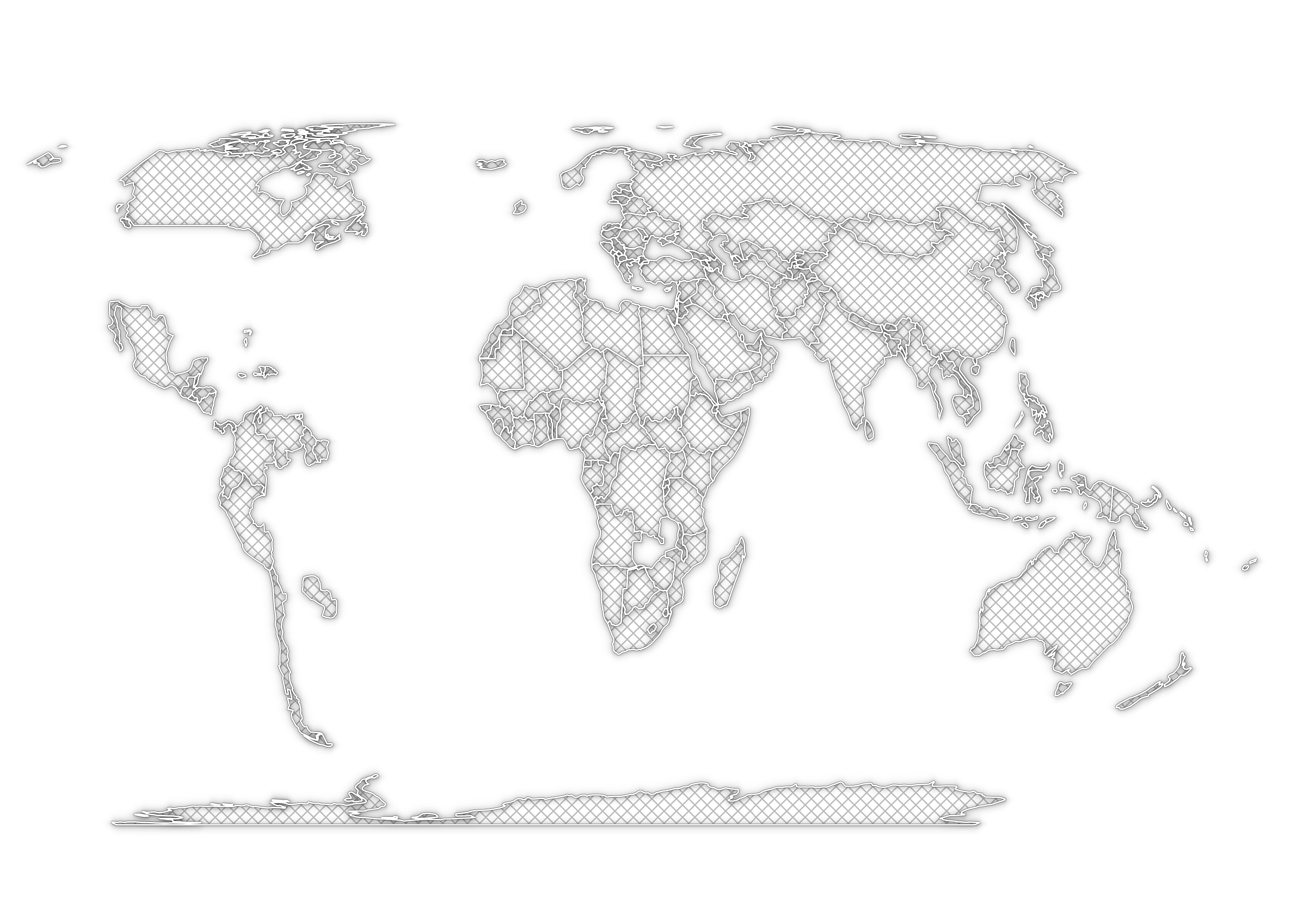
Challenge 16: places
Data: Natural Earth administrative boundaries
Tool: QGIS
Goal: Show all the countries I haven’t visited yet
How I did it: Just deleted all the countries I visited from the Natural Earth data set
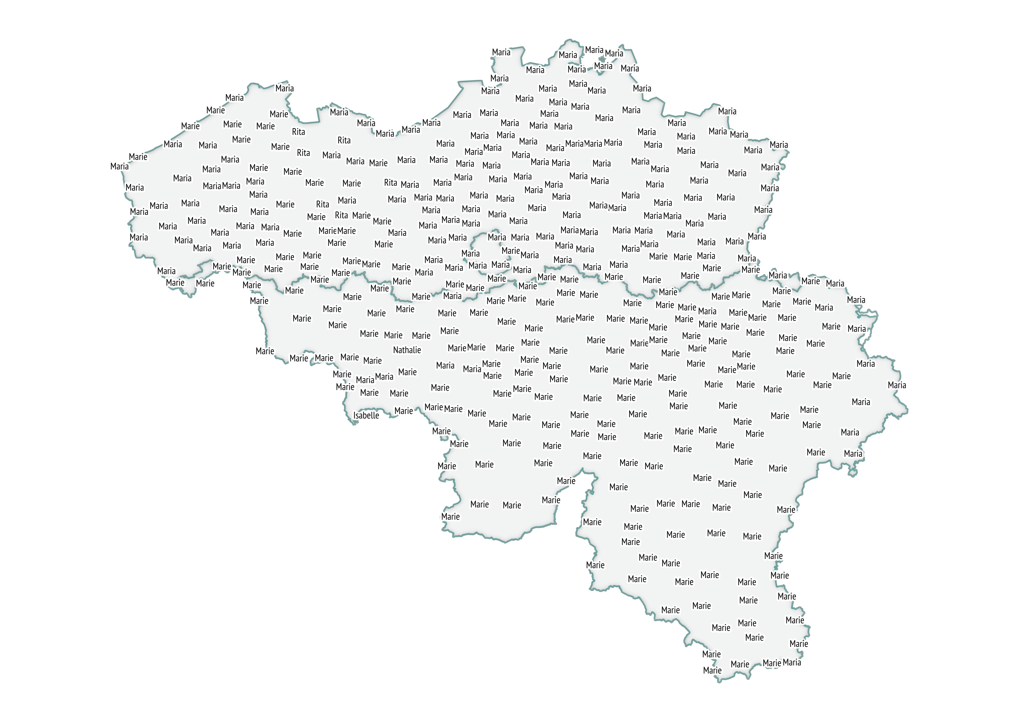
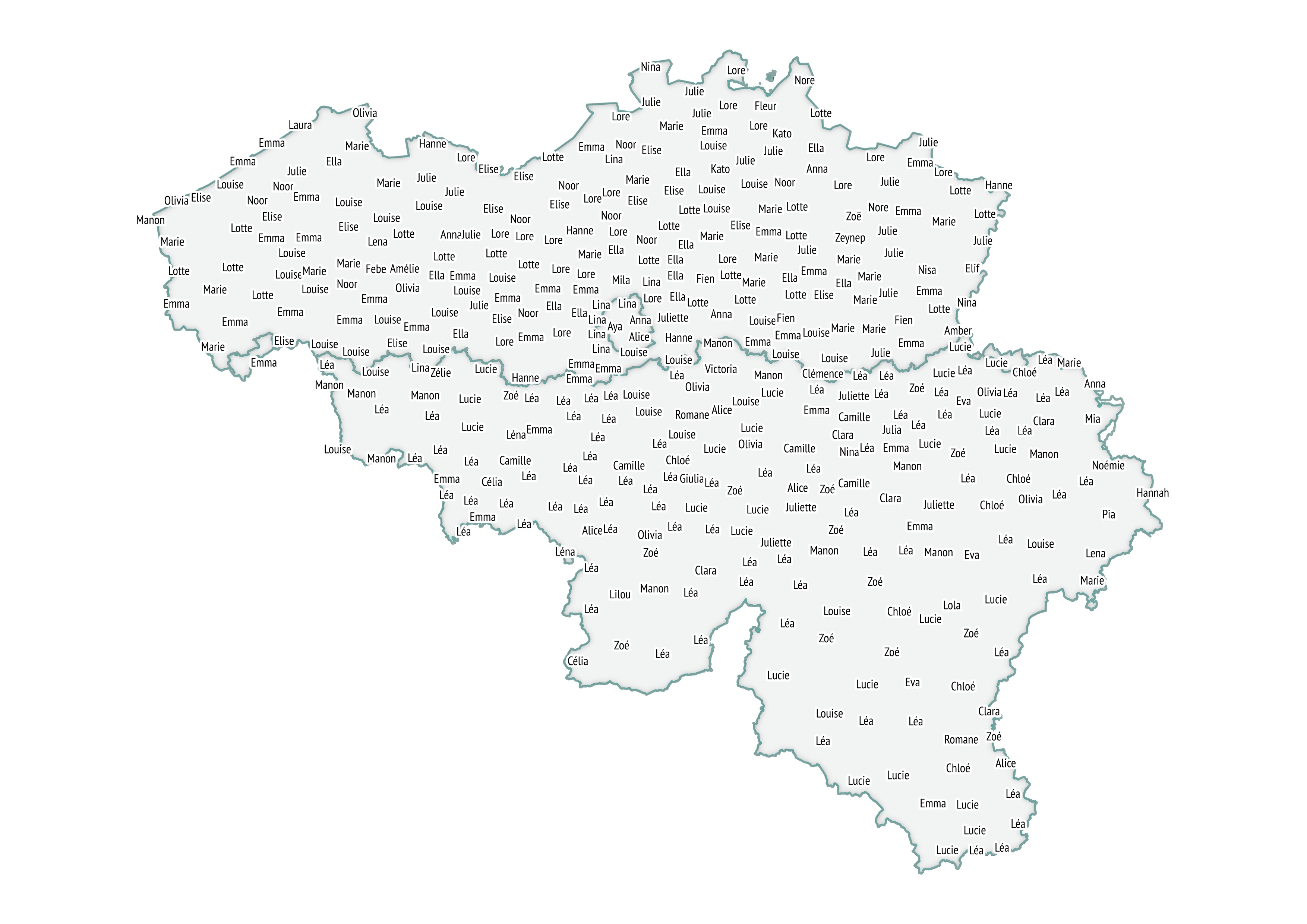
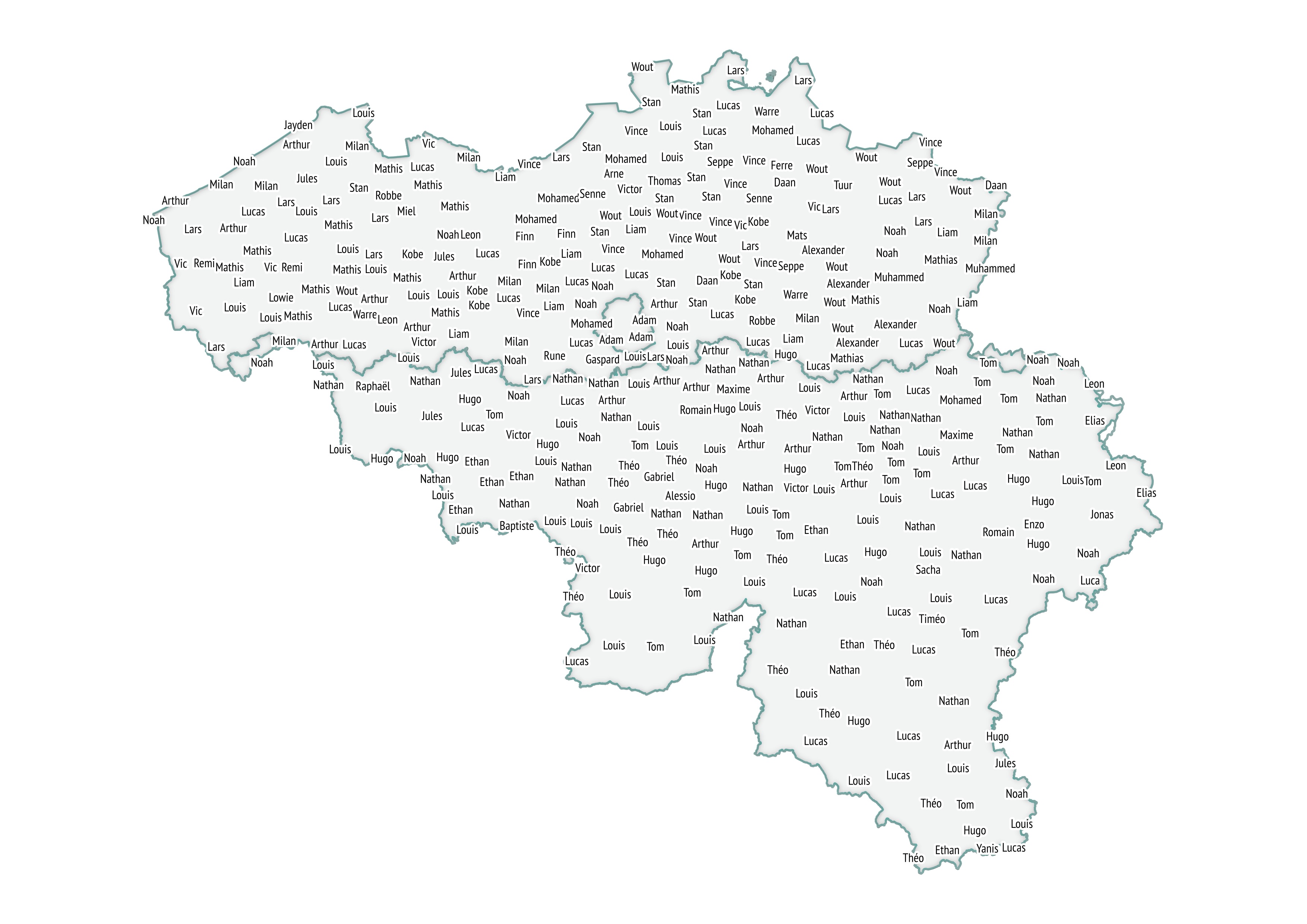
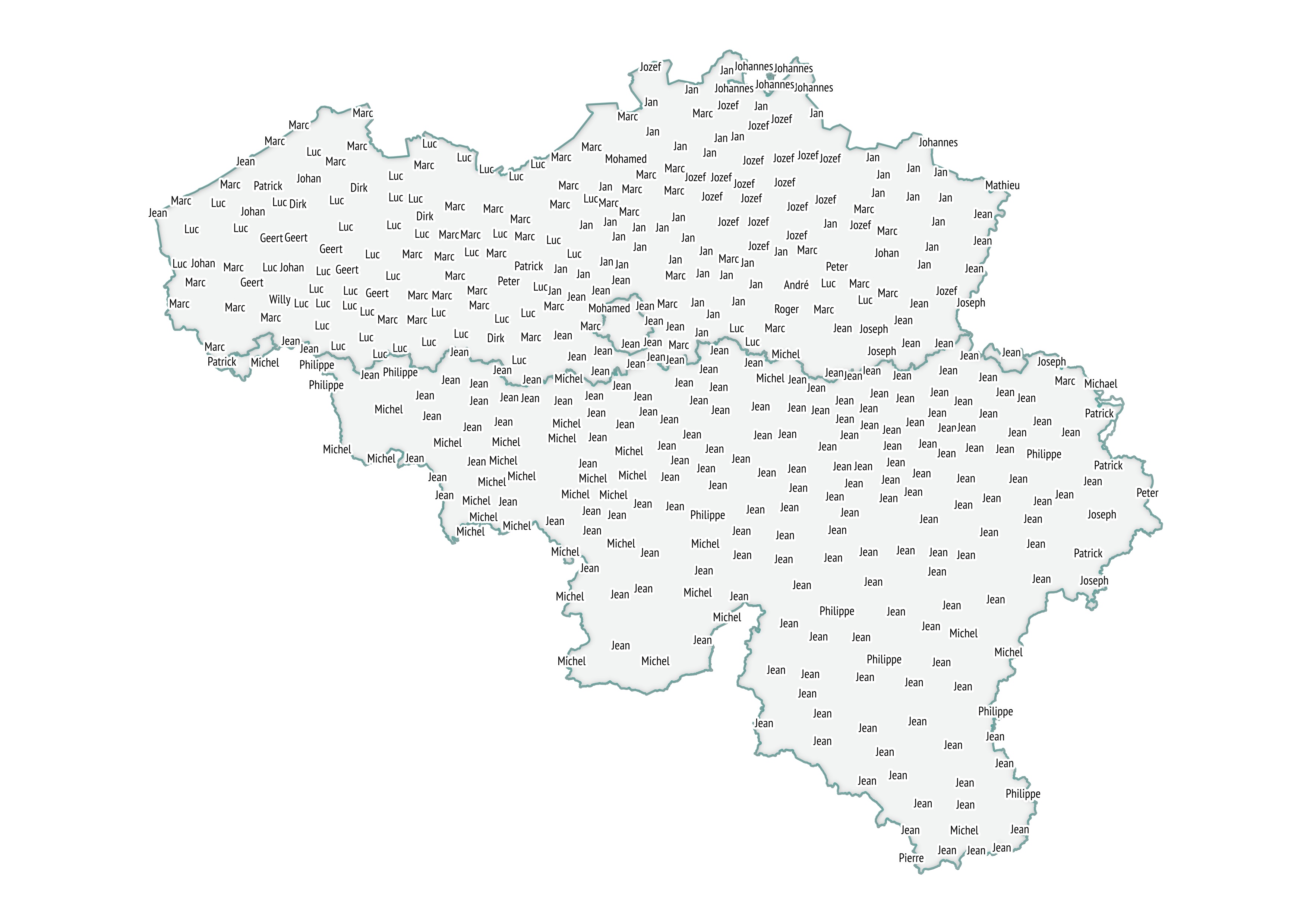
Challenge 15: names
Data:: Baby names by municipality and first names by municipality (I used the 2017 data for both)
Tool: Some R for data preparation, QGIS for the maps
Goal: Show geographical distributions of first names in Belgium, both for new borns as for total population
How I did it: I calculated the most common first names for each municipality in R, exported this data as csv, loaded it into QGIS and then joined it to the municipal boundaries. The first name labels on the map have a buffer (so they stand out), and some labels are not displayed to ensure no overlapping labels. I didn’t add titles, but I guess you can identify male versus female names and new born versus total :)
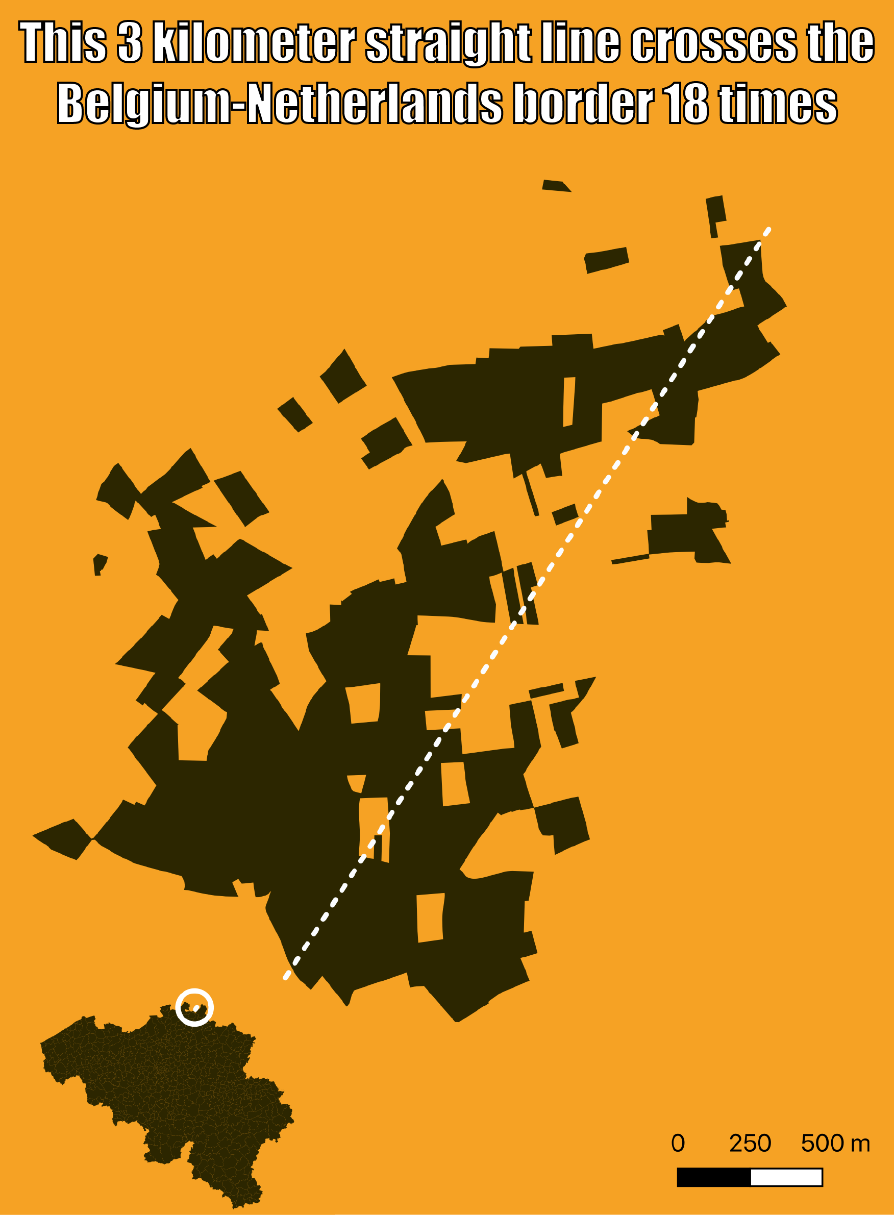
Challenge 14: boundaries
Data: Municipal boundaries of Belgium, and a self drawn line
Tool: QGIS
Goal: Showing the complexity of the boundaries of the municipality of Baarle-Hertog
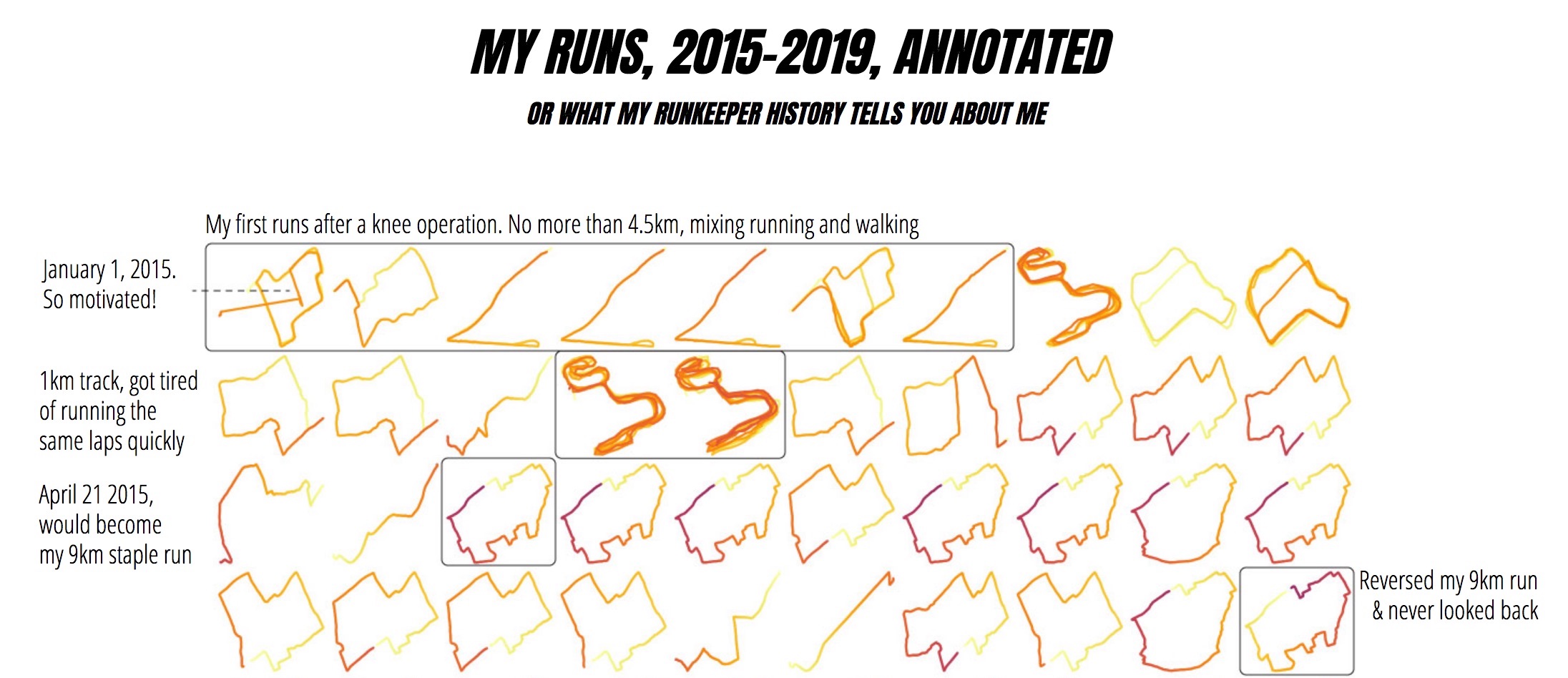
Challenge 13: tracks
Data: My own Runkeeper tracked runs
Tool: The Strava R package by Marcus Volz, ggplot2, Illustrater and AI2html
Goal: Show my running habits over the (almost) last 5 years
How I did it: I downloaded my data from Runkeeper and generated the small multiple tracks from it with the Strava package and ggplot, based on this script (I set the colors to represent the distance ran). I imported the generated png file in Adobe Illustrator and added all the annotions (browsing my running history was a lot of fun!). Then I used AI2html to generate the image with the annotations overlayed as html and css.
See the full piece here (zoom your browser if the font is too small, sorry for that)
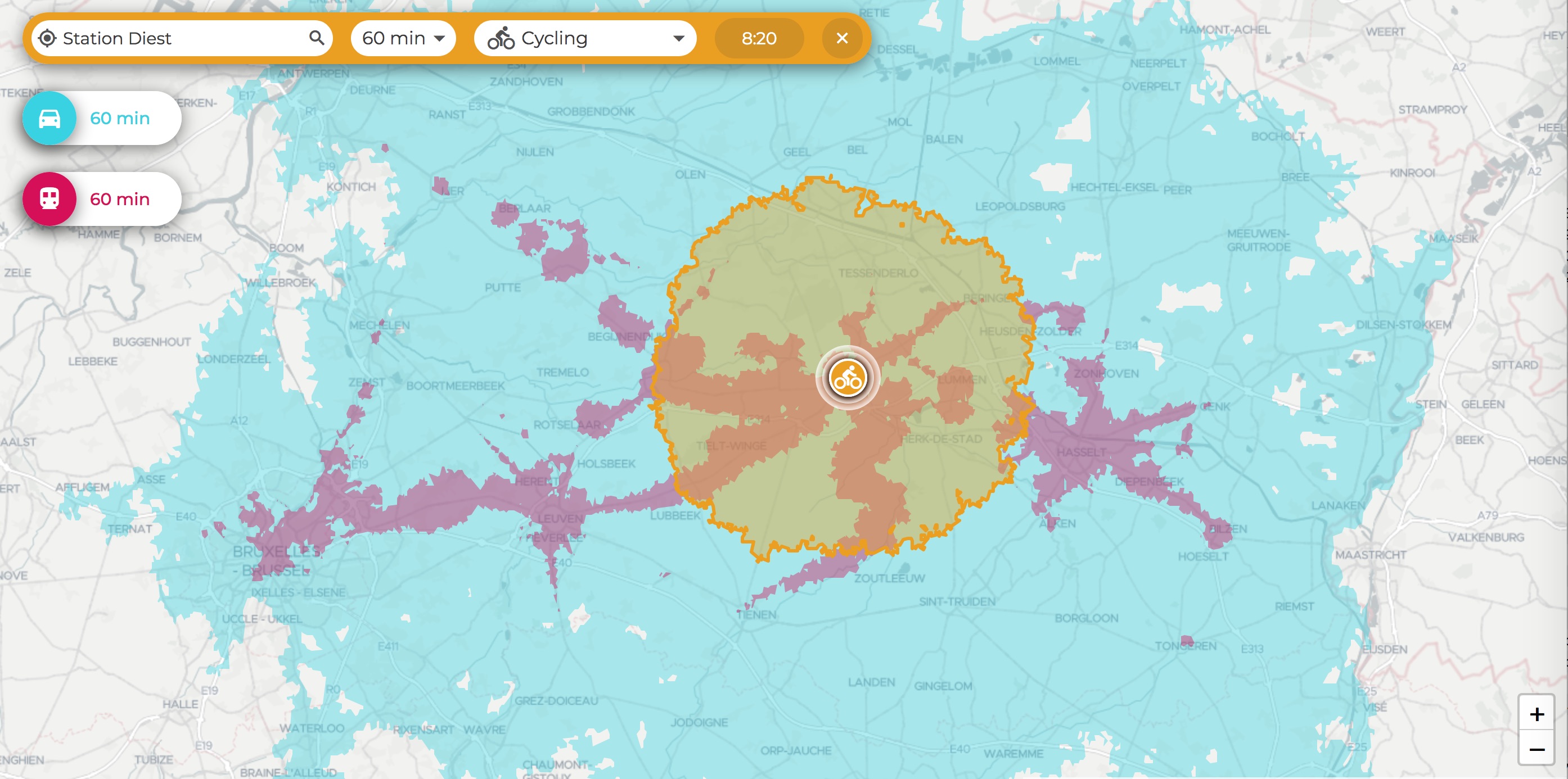
Challenge 12: movement
Data: TravelTime Platform
Tool: TravelTime Platform app
Goal: comparing how far I can travel in 1 hour by 3 modes of transport, starting from my local train station
How I did it: I just used the nice TravelTime Platform app (which has a very nice UI, I think)
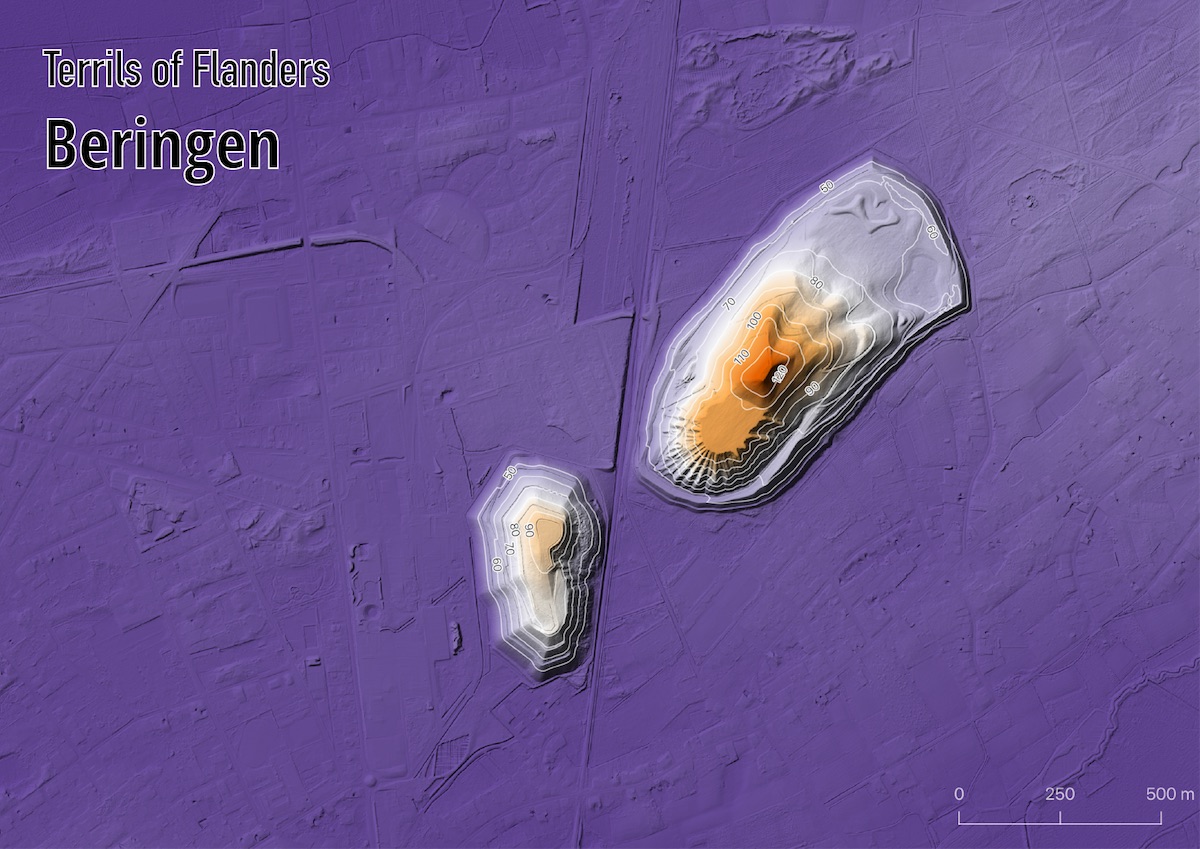
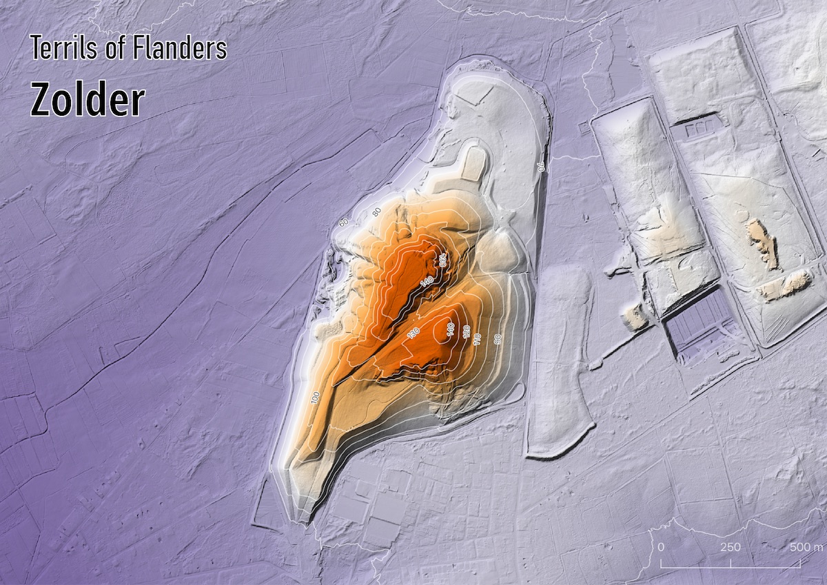
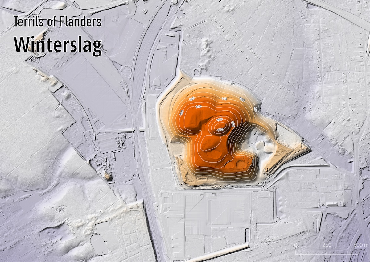
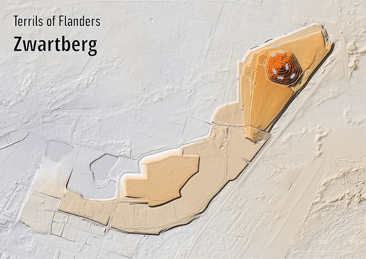
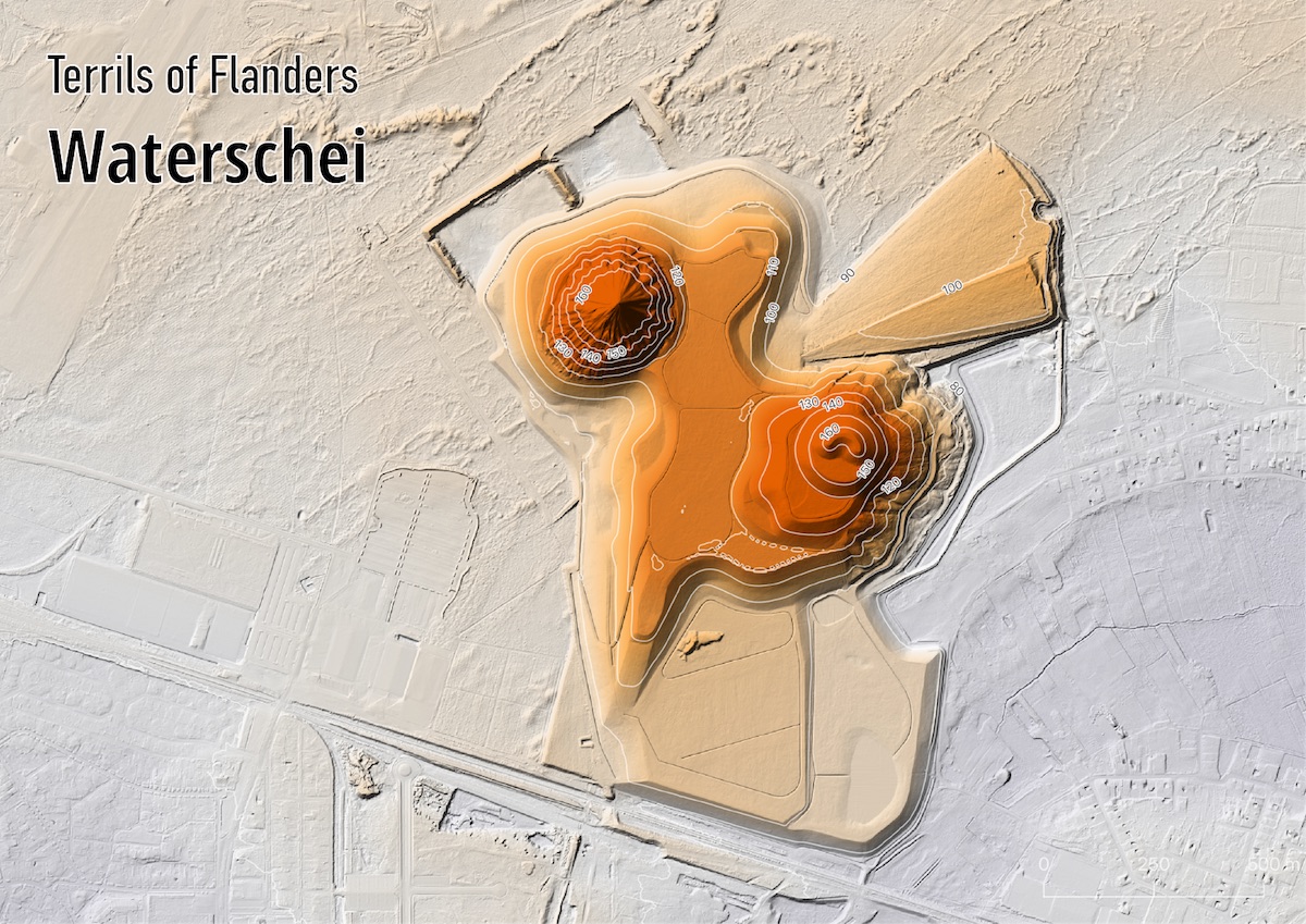
Challenge 11: elevation
Data: Digitaal Hoogtemodel Vlaanderen II, DTM, raster, 1 m
Tool: QGIS
Goal: Showing one of the most spectacular geographical features of my region: the Flemish spoil tips
How I did it: The terrain is a digital elevation model with a resolution of 1 meter, which I used to create the hillshade in QGIS. A duplicate of the layer is used for the colors, which maps the elevation to the PuOr diverging color scale. The contour lines are generated from a dem with a 5 meter resolution, with the Raster => Extraction => Contour tool in QGIS. I removed all contour lines not directly on the spoil tips, and labelled them with their elevation. The titles were added in Illustrator.
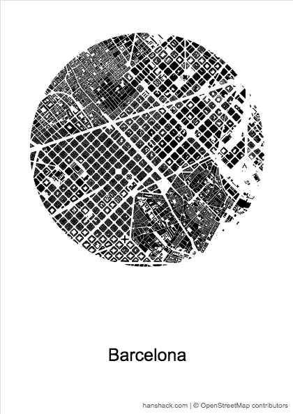
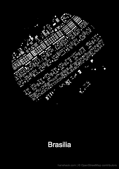
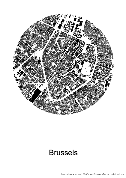
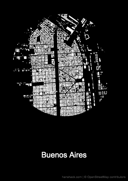
Challenge 10: black and white
Data: OpenStreetMap
Tool: Figuregrounder
Goal: Comparing streets layout and built up area in cities of which the names start with a ‘B’
How I did it: Just search the map, center it, and select a circle radius. I used 2km for all the maps.
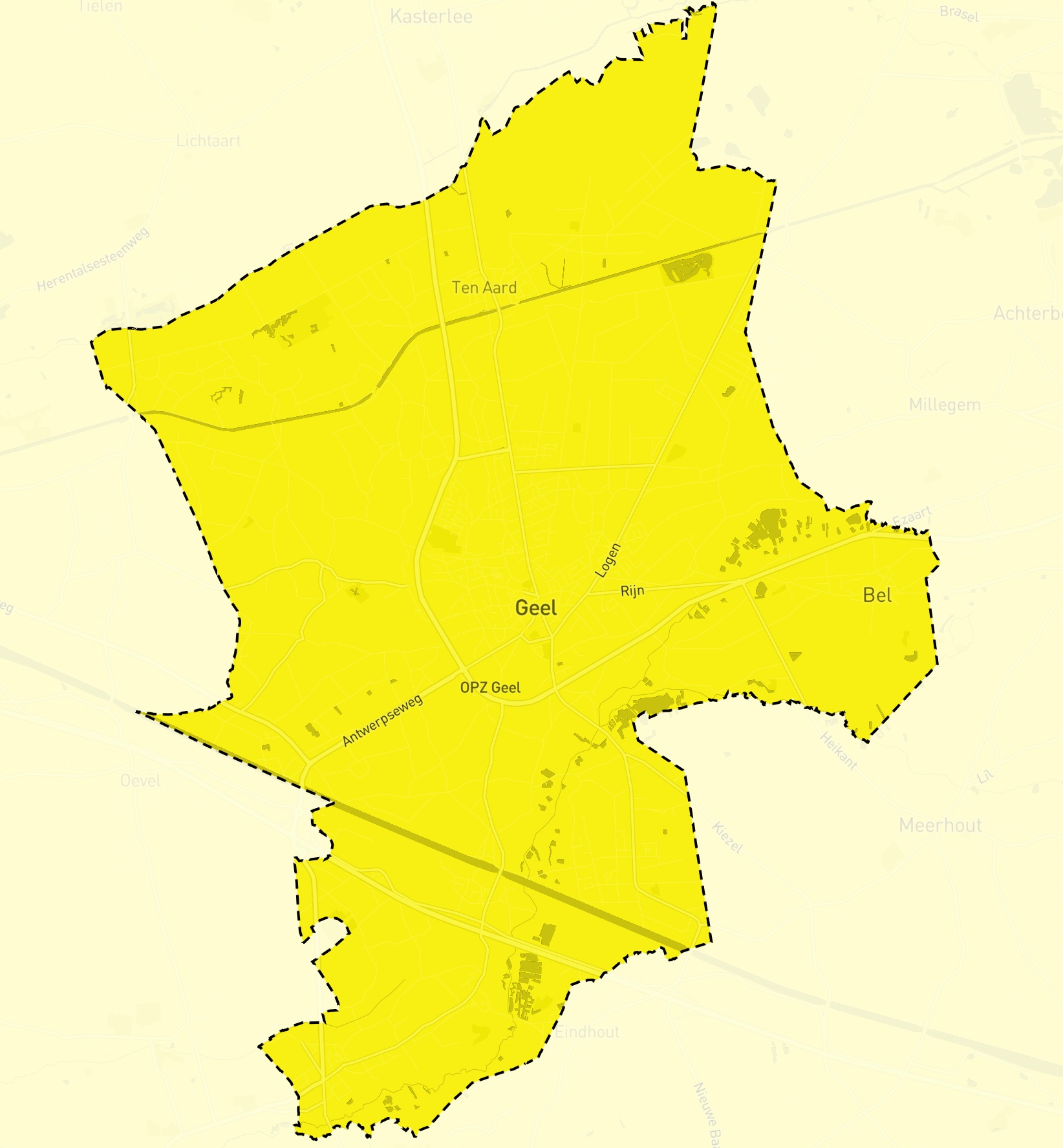
Challenge 9: yellow
Data: OpenStreetMap
Tool: Mapbox
Goal: Make a yellow map of the Belgian municipality of Geel, which name means “yellow” in Dutch
How I did it: With the Mapbox monochrome styling. See the interactive map here.
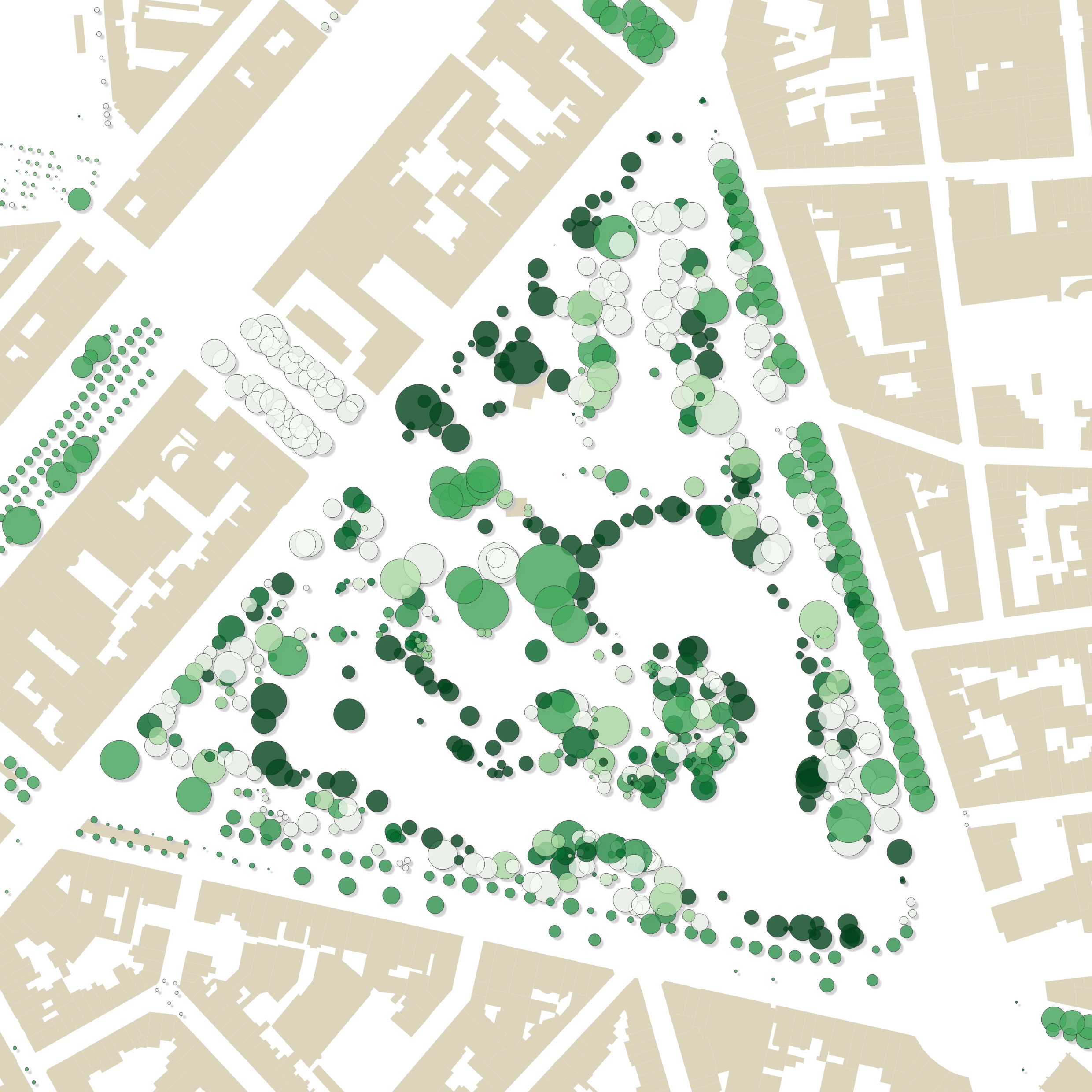
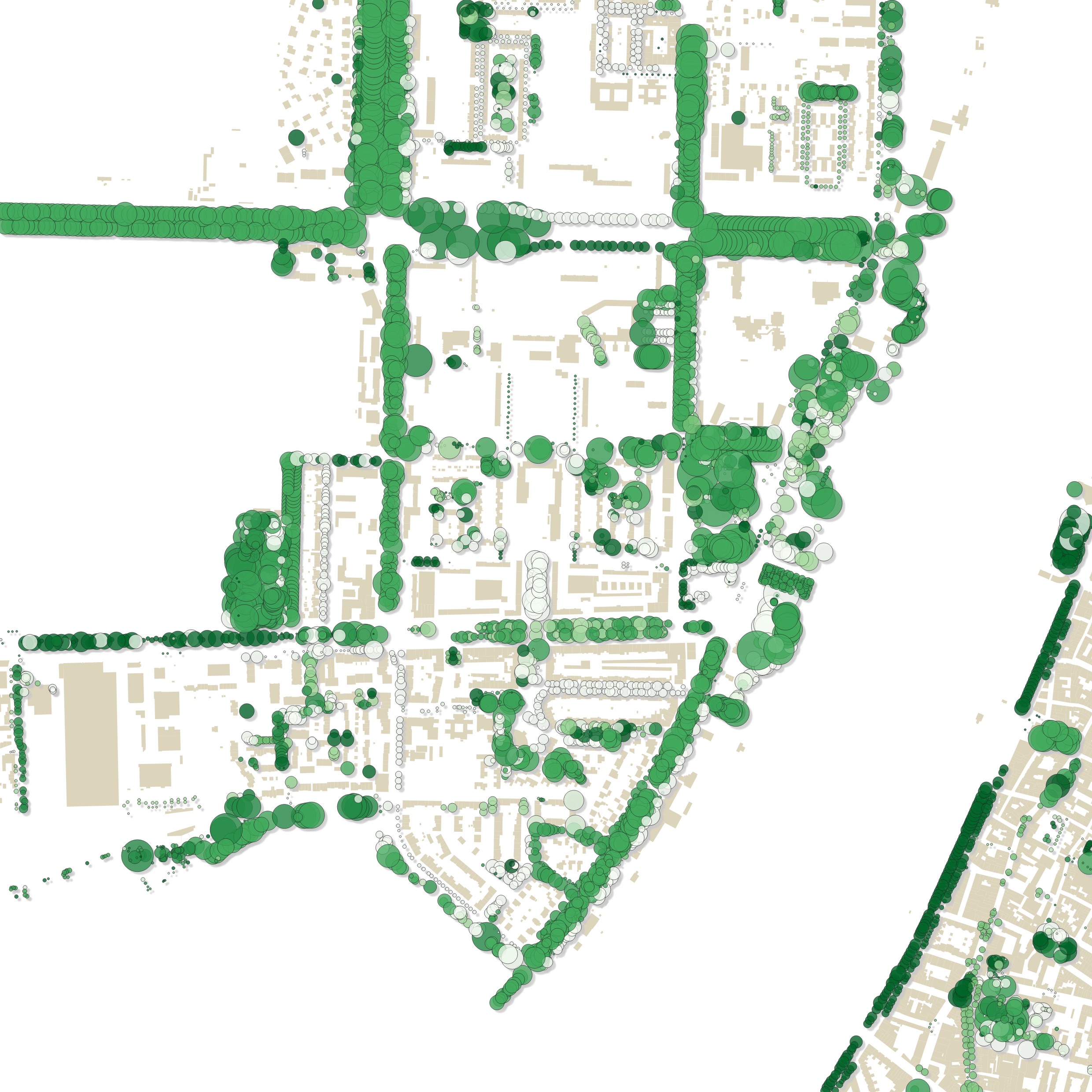
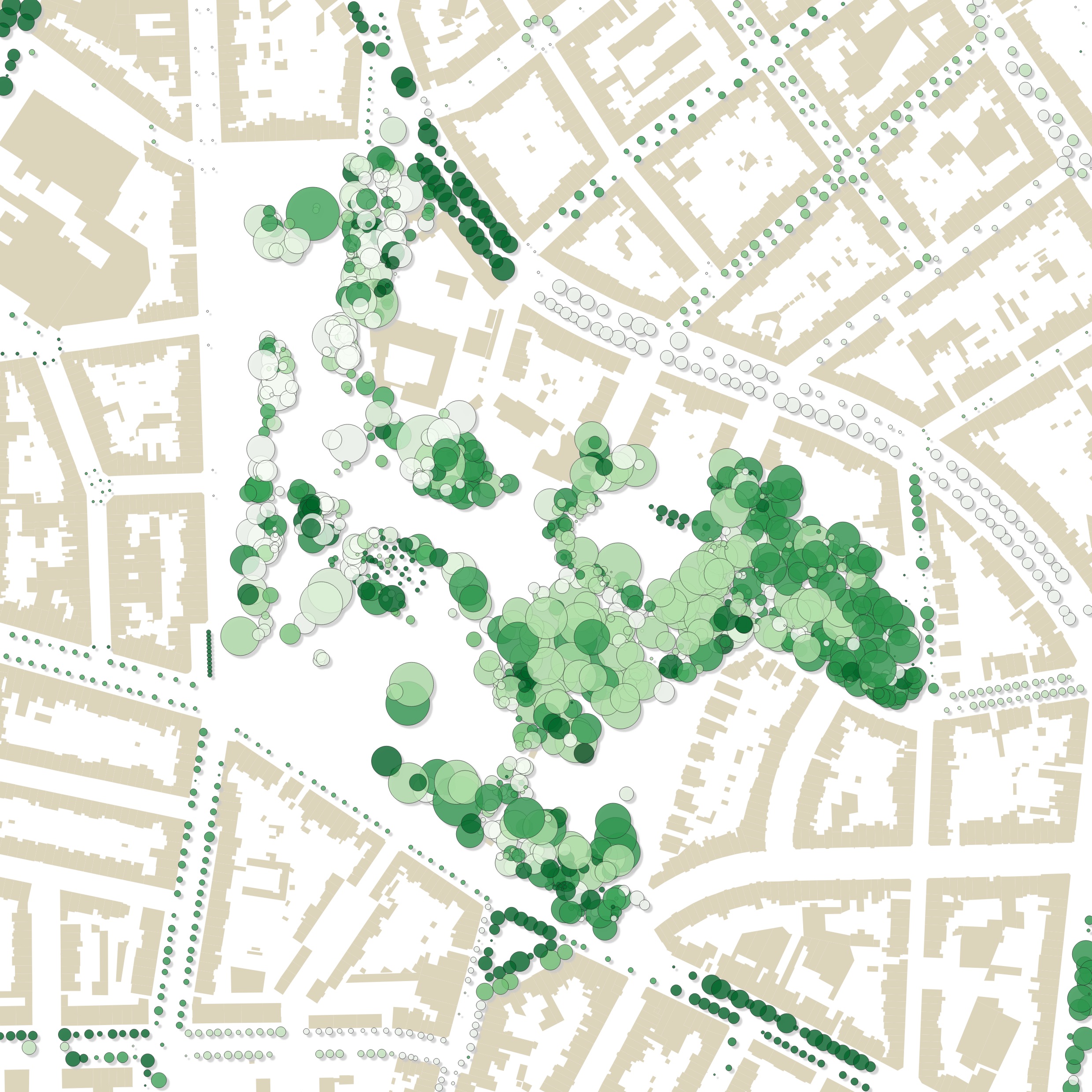
Challenge 8: green
Data: Trees in public space in Antwerp
Tool: QGIS
Goal: Finally making one of those c̶l̶i̶c̶h̶é̶ classic tree maps
How I did it: The geo portal serving the data had a little difficulty giving me the data, so I reached out to the people managing the Antwerp geoportal. They sent me this wonderfull data set over email. I’ll probably make a proper interactive ‘Trees of Antwerp’ map later. Here
- each shade of green is different genus of trees
- size of the tree crowns are proportional to stem diameters
- I added some shadow under the trees to make them stand out
Inspiration: I’ve always wanted to replicate one of my most fav maps ever: Trees of Türkenschanzpark by Markus Mayr
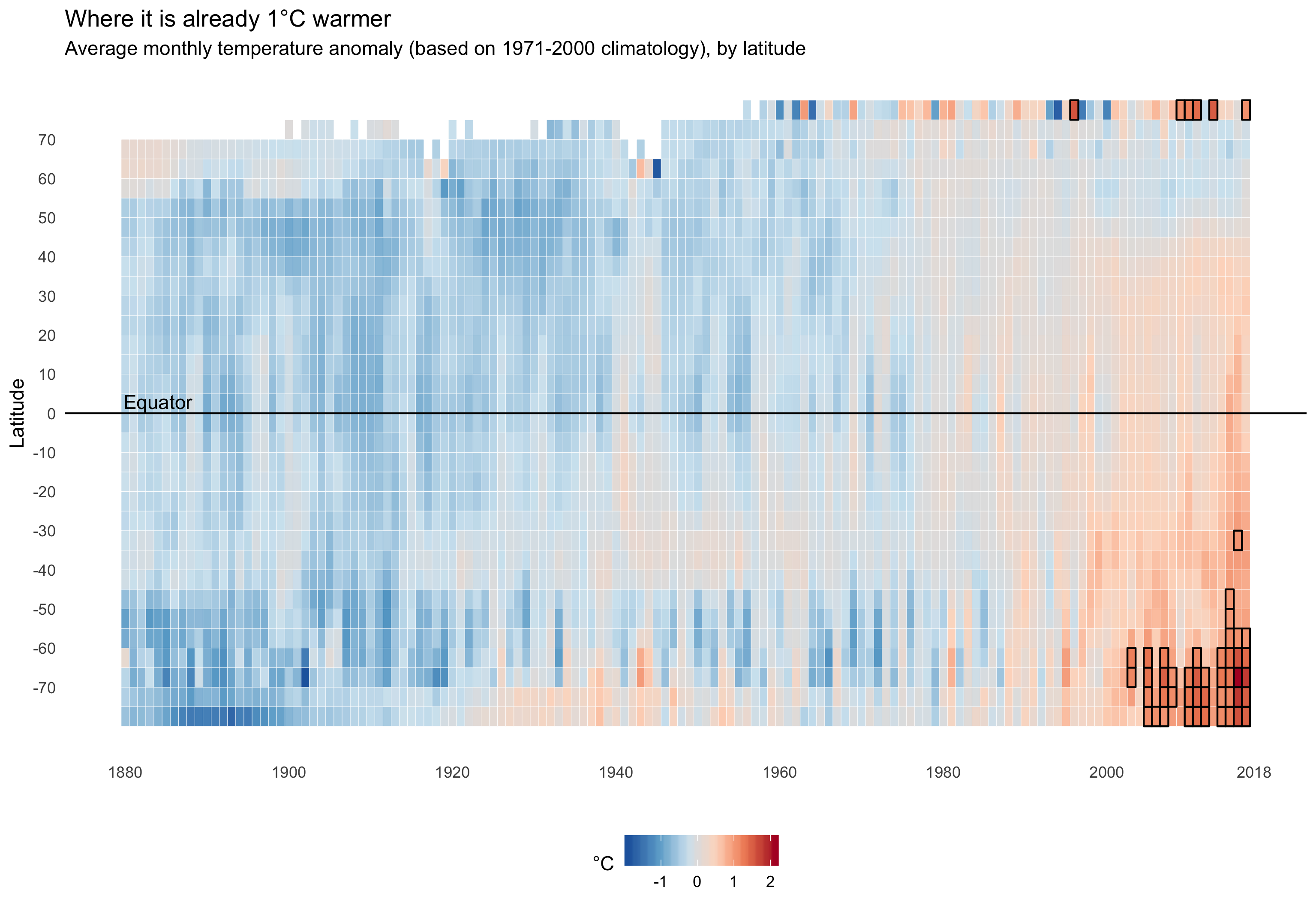
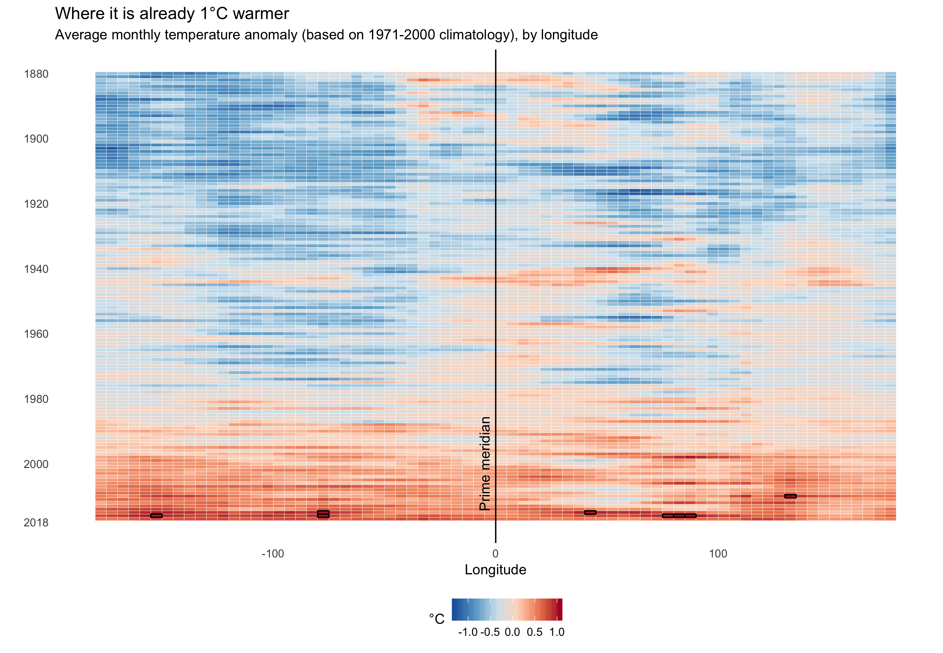
Challenge 7: red
Data: NOAA Gridded Global Temperature
Tool:: R/ggplot2
Goal: Make a Hovmöller diagram of average global temperature over time, by longitude and latitude
How I did it: The hardes part was converting the source data into something to work with. After that, I used ggplot’s geom_tile() to make the plots, and geom_vline() and geom_hline() to add the prime meridian and the equator
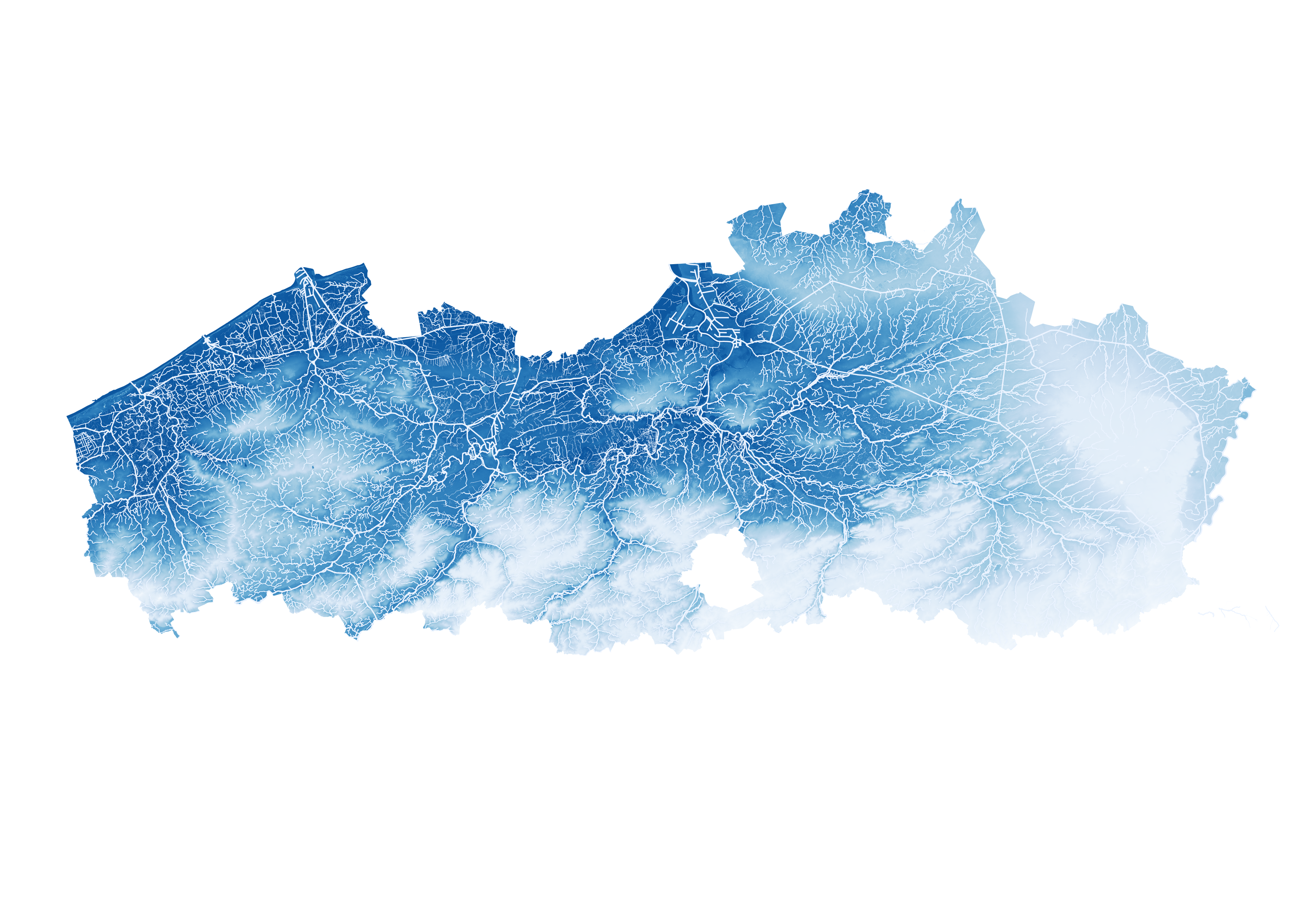
Challenge 6: blue
Data: DEM Flanders 25 meter and Vlaamse Hydrografische Atlas
Tool: QGIS
Goal: Showing the Flemish hydrography, in a blue fashion. (Yes, Flemish: notice the hole that is Brussels on the map. For many of the government data in my country, you need to consult 3 different government agencies (Flemish, Brussels and Walloon), and the data will most likely not be comparable, if it exist at all)
How I did it: A digital elevation model with a blue color gradient, with dark blue meaning lower elevation, underneath the waterways, of which the thickness is scaled to their importance.

You can find a higher resolution version of the map here.
Challenge 5: raster
I’m cheating a little bit with this challenge: this is something that was published over a week ago :)
Data: Luchtfoto Vlaanderen 1971, zomer - zwart-wit
Tool: Mapbox
Goal: Comparing aerial imagery from almost 50 years ago to today’s. The map was part of a series of articles by Flemish newspaper De Standaard on the poor spatial planning in Flanders.
How I did it: read all about it in the making of post
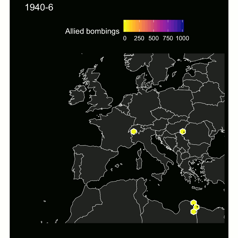
Challenge 4: hexagons
Data: World War II THOR Database
Tool: R/ggplot2, GIMP to make the animated gif
Goal: show the shifting front and the intensification of allied bombings during World War II
How I did it: Natural Earth data for the background map, geom_hexbin for the hexagons. I made one map for every month, loaded all the maps in GIMP and exported it as an animated gif.
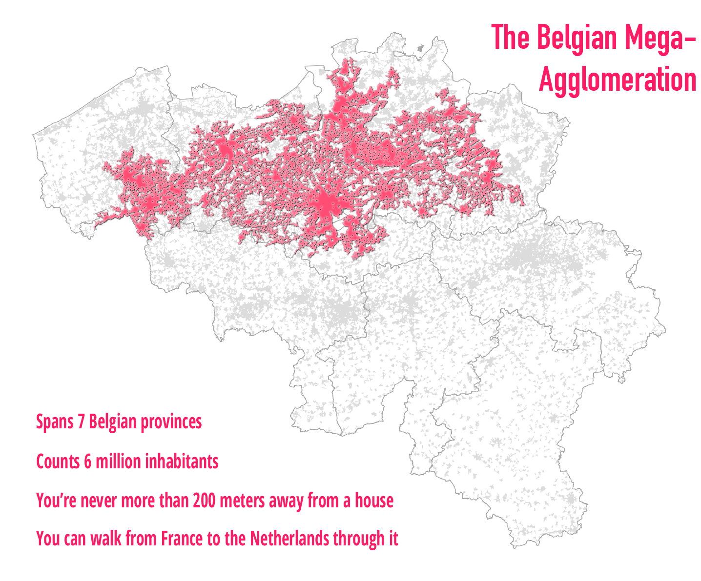
Challenge 3: polygons
Data: Agglomeraties 200m, Statbel
Tool: QGIS + Illustrator
Goal: show the big city that Flanders actually is
How I did it: Very basic styling of polygon shapefiles, with some inner glow and drop shadow.
Challenge 2: lines
Tool: R + ggplot2
Goal: see how Belgian airports are connected to foreign airports
How I did it: I used the eurostat R package to get data about the number of commercial flights between Belgian and foreign airports. The hardest part was then to geocode all the airports to their actual location. After that, I used the rnaturalearthdata package to get the baselayer data, and plotted everything on the map with ggplot (with geom_sf() for the countries, geom_segment() for the lines, and geom_point() for the airports).
These are the connections for all Belgian airports, units are total number of commercial flights between both cities, in 2018.
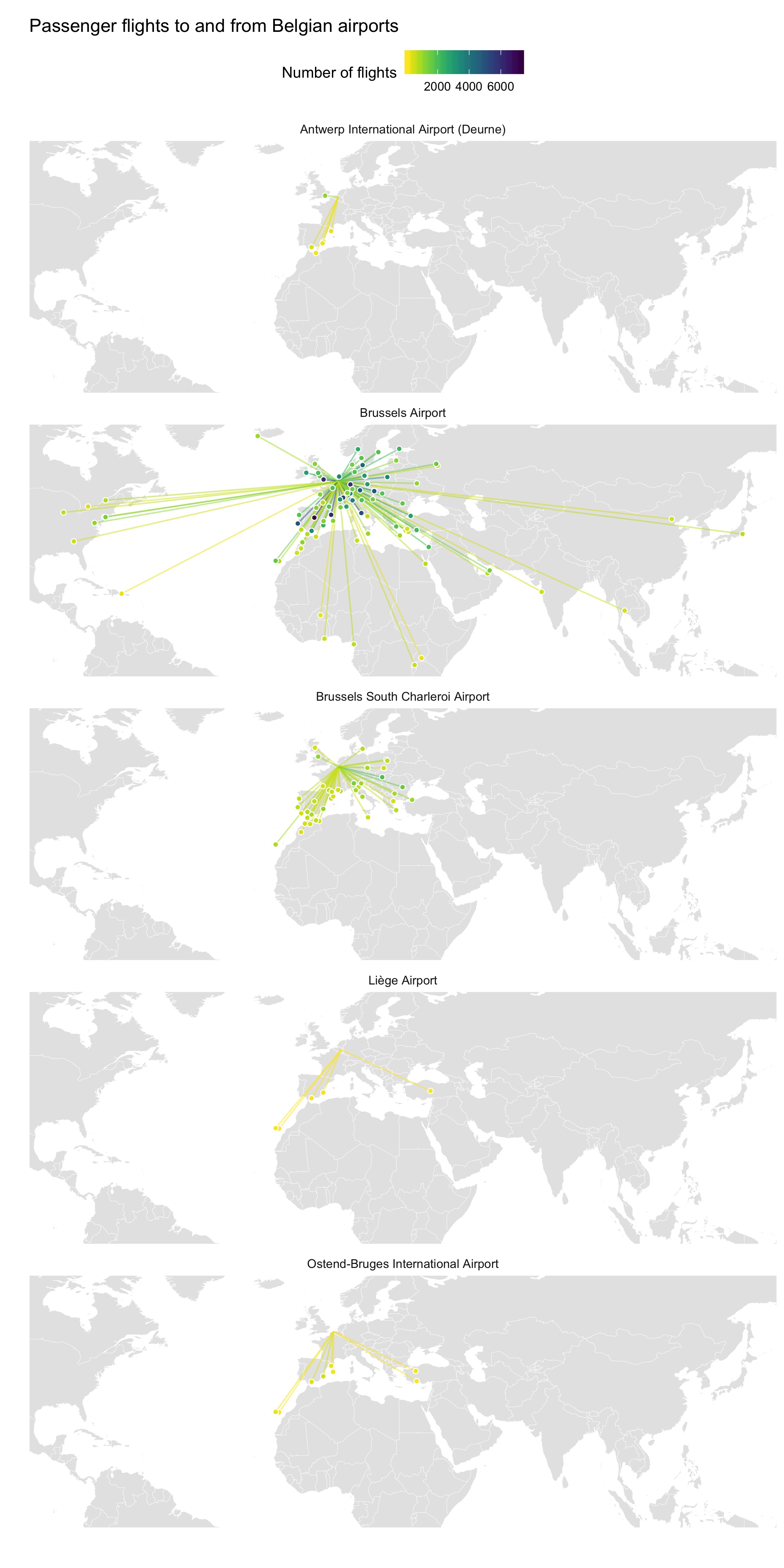
A zoomed in version, to better see the European connections:
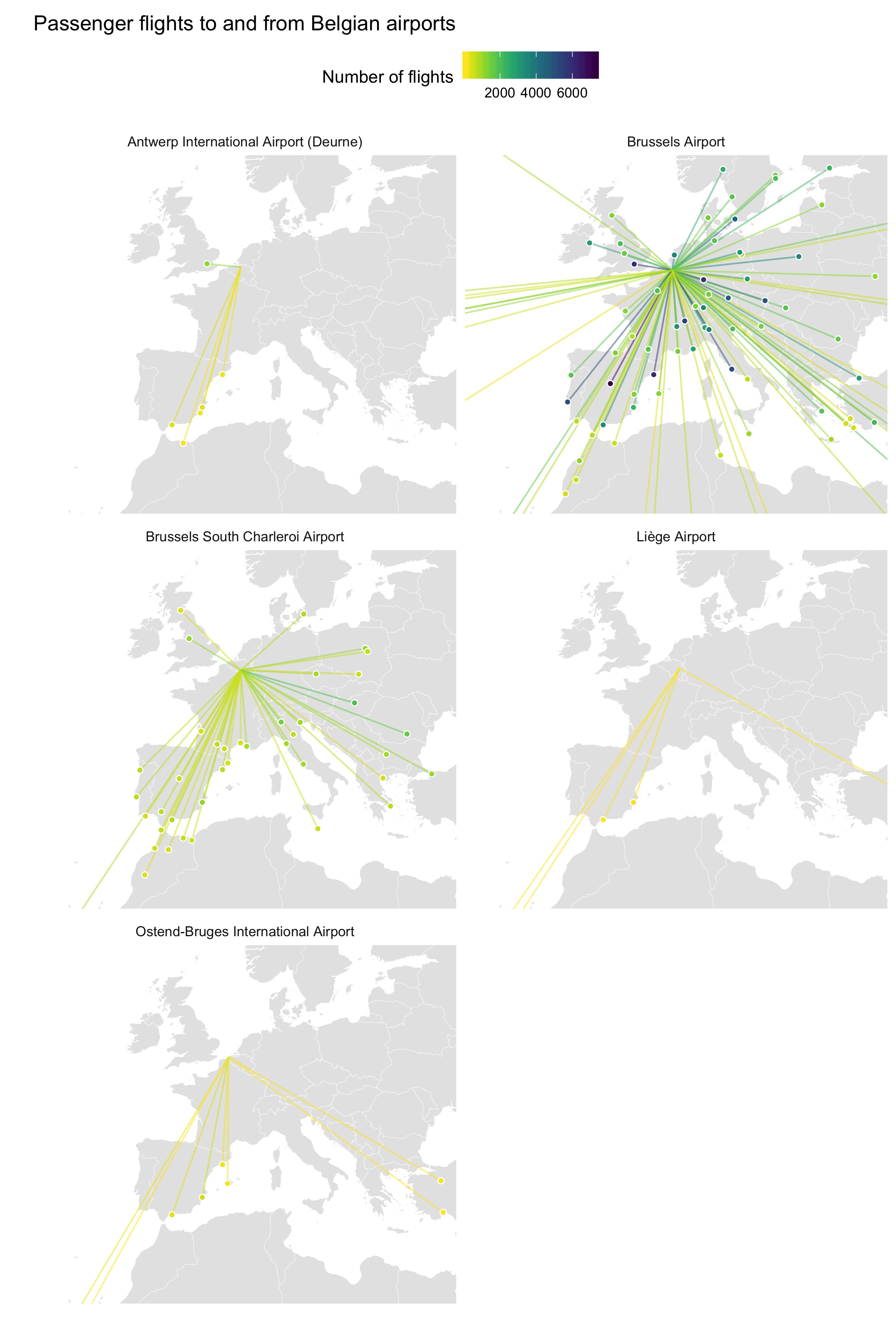
Because this is all in script, it is very easy to do for other countries:
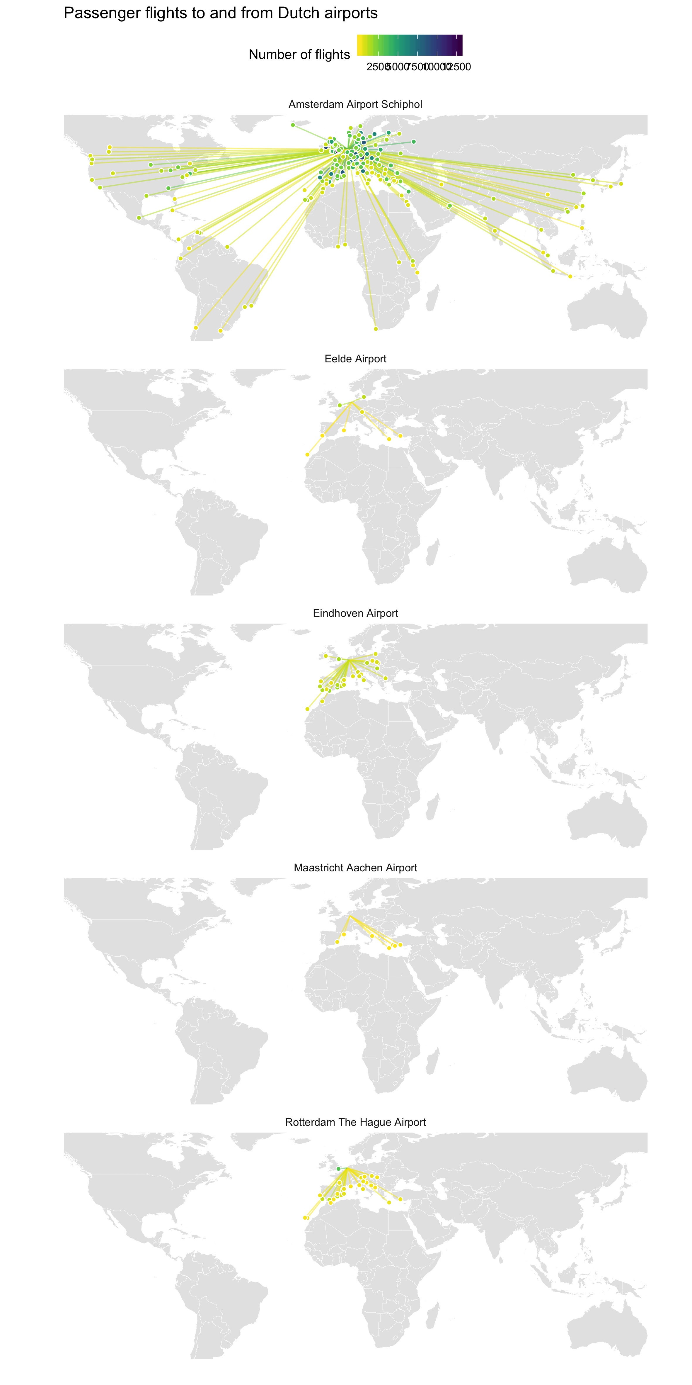
If you have a request for any European country, just let me know!
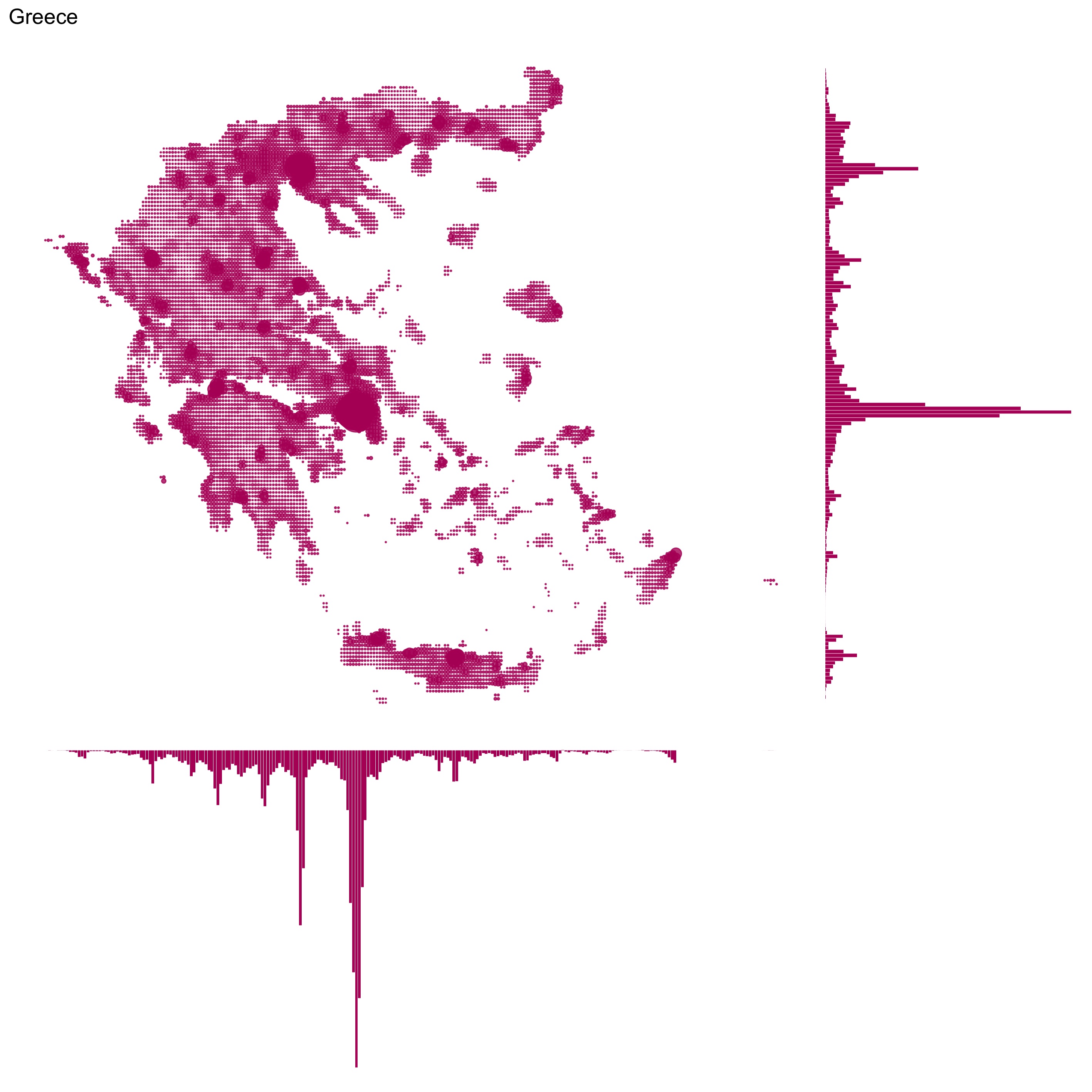
Challenge 1: points
Data: Global Power Plant Database
Tool: Flourish
Goal: map all power plants in Europe, by source of fuel
Inspiration: Mapping how the United States generates its electricity by The Washington Post
How I did it: I took the data from the Global Power Plant Database and with a little R script, I filtered out the plants in European countries. I uploaded the data to the Projection map - Europe (countries) template in Flourish. Then it was just a matter of styling the map a little bit.
Notice that Russia is not part of the country layer in this Flourish map template. But I’m going to leave it at that.
One powerful thing that you can do with Flourish is creating stories: slide decks that you can use to highlight different aspects of your data. In the map template, the color legend serves as filter, so creating the following little story was quite easy:
So challenge 1: done!