6 rules for good datascopes
April 07, 2014
One article on data visualization I really enjoyed reading lately was The Data-Visualization Revolution, by Cesar Hidalgo and Ali Almossawi. A very well written and inspirational piece.
Although I wouldn't compare the rise of digital data visualization to Galileo's discovery of the moons of Jupiter and the move away from geocentricity, as the authors do, I do think that with their article they hit a somewhat overlooked feature of data visualization: we are moving away from analog to digital visualization. Or, as they put it more beautifully in their article: from the rigidity of atoms to the fluid landscapes of bits.
Datascopes
The central paragraph of the article for me is this one:
As data visualizations leave the rigidity of traditional graphic design, and ink is replaced by pixels, we encounter the fluidity of working with designs that are not fully specified a priori. In its more modern incarnation data visualization has generated a new form of graphic design where visual attributes such as lines, shapes and colors become nothing more than the corporeal reality of graphic objects whose soul is made of data. The new graphic designer no longer creates visualizations by choosing a rigid collection of shapes, positions and colors but rather by choosing the rules needed for data to breathe form into geometric abstractions.
'Graphic objects whose soul is made of data': I love this. It also reminds me of how D3.js binds data to elements.
Further in the article the authors coin the term datascope, a tool 'that can be used to zoom in and out of large data sets in search of new understanding'. The field of datascopes is still young, but '[a]s Galileo did centuries ago, we now have primitive versions of tools that have the potential to become powerful ones'.
The articles proceeds by giving 2 examples of datascopes (Dataviva and Pantheon). But just last week I encountered two excellent examples of data visualization moving from rigid atoms to a fluid and interactive datascope. And I also published what I consider to be my first datascope. With these in mind, at the end of this article I try to list 6 rules that good and true datascopes should respect.
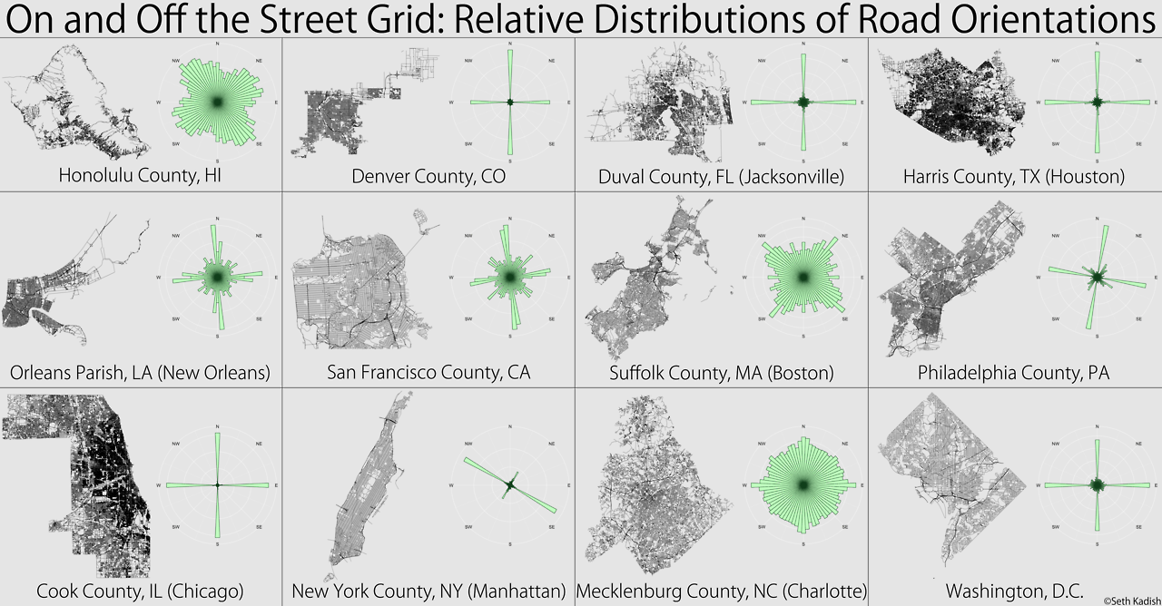
Road orientations
On and Off the Street Grid by Seth Kadish made the rounds in and outside the visualization community. It is a beautifull visualization of the orientation of streets in 12 American counties:
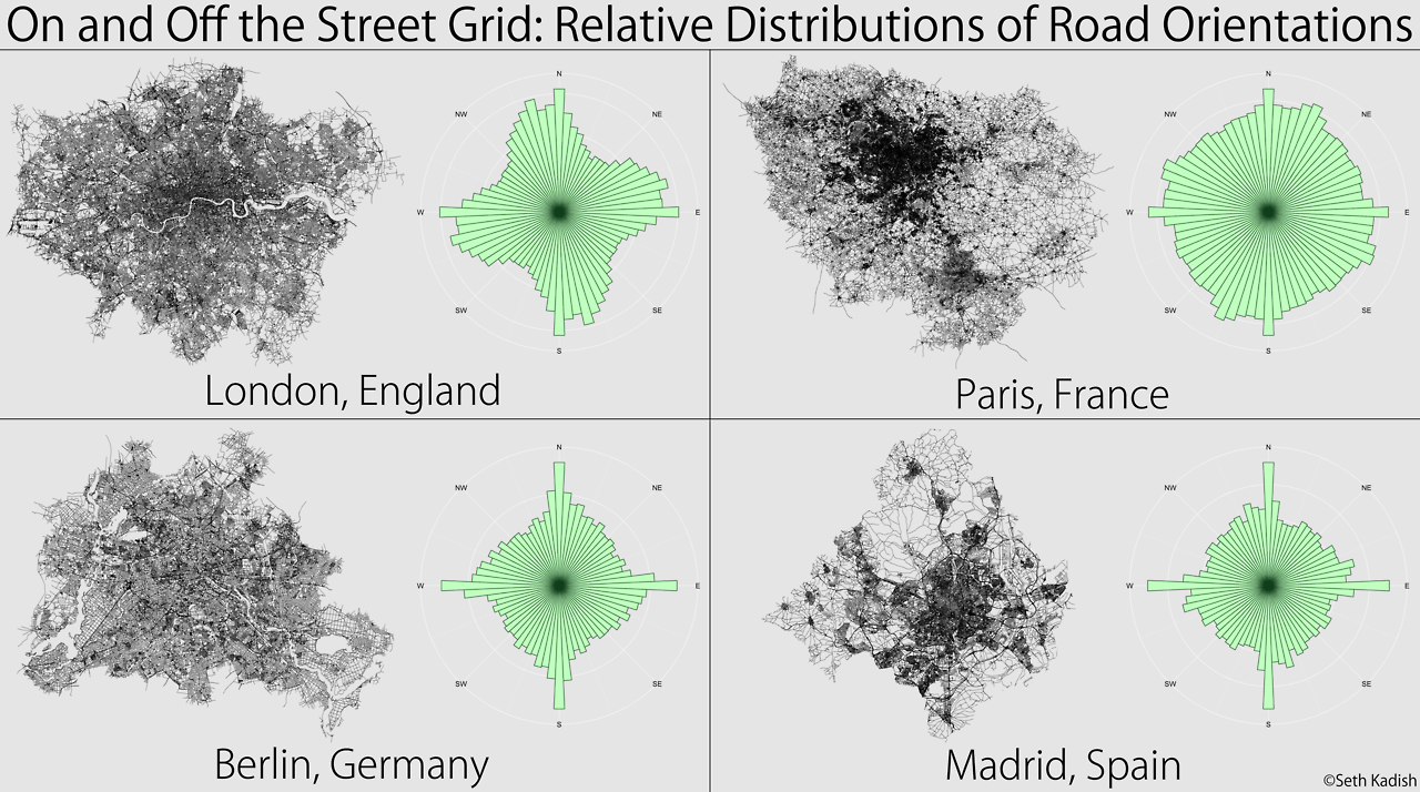
A follow up post by Kadish begins with
A lot of people were interested in comparing the US counties to European metropolitan areas.
So in order to please his readers, he created 4 more of these graphics, this time of the street orientations in London, Berlin, Madrid and Paris:
If you're like me and you want to know how the graphic would look like for your own town: too bad. You could only beg the author to make one for your town.
Enter Ben Lowe from VeloViewer. He was inspired by On and Off the Street Grid. On his blog he wrote:
So time to step up to the plate to see if I can find a more interactive and representative way of doing the same thing.
And so he went to create Road Orientation Distributions (ROD):
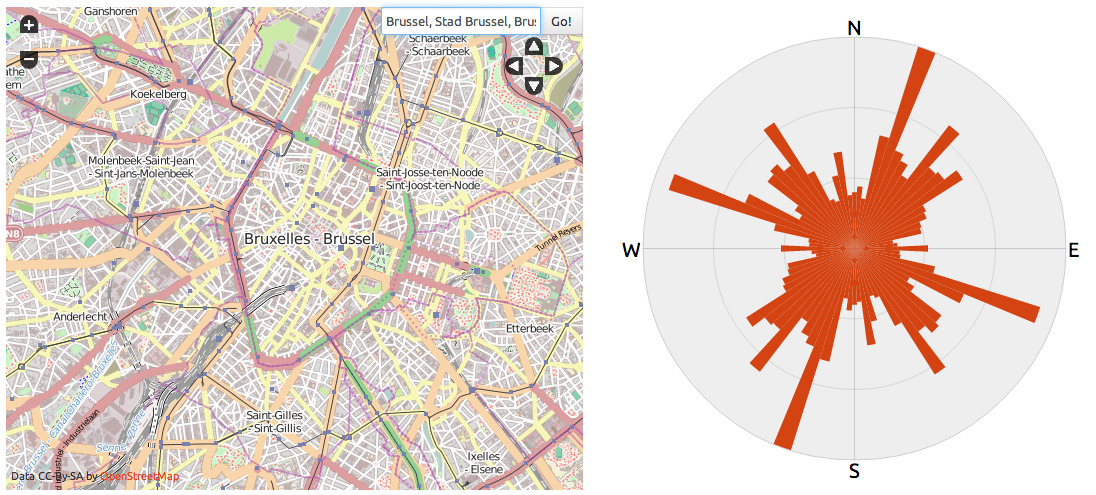
He improved the original by which he was inspired in several ways, like accounting for twisting streets and showing a much more legible map next to the compass rose. But, off course, the biggest change is the interactivity: you can now produce road orientation compass roses for any place in the world (provided it has OpenStreetmap data) and for any zoom level you want.
On popular request (by me and others), Ben added a location search box to the map. The search box, the zoom controls, the slippy map and the visual output make ROD a true datascope: a tool 'that can be used to zoom in and out of large data sets in search of new understanding'.
And there is more: through its clever use of url parameters, ROD views can be shared and bookmarked.
I really admire the simplicity, functionality, aesthetics and insightfulness of ROD.
Migration
Then there is the The Global Flow of People, which I first saw on Quartz in Where everyone in the world is migrating in one gorgeous chart. It is indeed a beautifull chart, but in its static form on Quartz rather illegible:
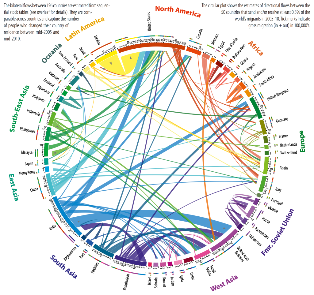
Luckily, the authors of the study that provided the data didn't only produce bueatifull images. They also made a datascope:
You can also see it in action on global-migration.info.
This type of graph was used before to visualize migration flows. But the interactivity of this one really stands out: you can switch between time periods, you can zoom in on a region to show country data and hover effects provide access to the raw numbers.
The fluid bits are really put to work here and go way beyond what the static atoms can offer.
My first datascope
A week ago, I myself launched What Google thinks of your municipality, an interactive map that shows the top 10 Google Autocomplete suggestions for the 308 Flemish municipalities. And allthough this app isn't near as complex and insightful as Roads Orientations Distribution or The Global Flow of People, I consider it to be my first datascope. (Yes, it is in Dutch, but I guess you'll understand the functionality).
It allows the user to switch between 2 views (municipality and suggested keyword) and provides a visual clue in the form of a map. The interface is made up of 2 search boxes (with autocomplete functionality, off course), a clickable map (with tooltips) and clickable tags under the map.
I could have just made an offline analysis of the 3080 keywords suggested by Google and just produced some maps in a desktop GIS program. The results would have been similar to the ones of On and Off the Street Grid: interesting static maps, which leave a lot of users/viewers/readers wondering what Google is suggesting for the municipality they themselves are living in.
Datascopes
I built my datascope in order to be able to perform my own analysis and to generate some maps. But I made it to work in the browser, and so I could put it online, to be used by anyone.
This is also a property of a true datascope: it is a tool to be used by many persons, be it a niche group of people or the general public. Any of the datascope users should be able to explore the data (visually) and to look for the facets of the data that interests them the most.
Therefore datascopes, especially the ones designed for the general public, should have well designed controls for facetting, filtering and sorting. In the case of ROD, these are a simple search box and the all familiar zoom controls and slippy map. The Global Flow of People has buttons and clickable visual elements. In the case of my own datascope, these consist of 2 search boxes with autocompletion, a clickable map and clickable tags.
For datascopes, controls should be simple and functionality should be clear. In my view, this is where Dataviva and Pantheon, the two examples mentioned in the article by Hidalgo and Almossawi, are lacking as datascopes: both have a lot of controls that can produce a lot of different facets and as user you don't always know exactly what you are looking at. It might be, however, that for experts these are good datascopes, as the example use of Pantheon in the article shows.
Naturally, the visual output of a datascope should respect the basic rules of good visualization design, like a choice of graphic form that respects data types (line charts for time series, for example), avoidance of chart junk and well thought use of colors. These rules apply equally to data visualizations with atoms (paper and ink, or a static image file) as to fluid pixels (interactive visualizations). But the latter can take extra steps and enrich the visual elements of the datascope by providing tooltips, hovereffects and clickable visual elements.
6 rules for good datascopes
So to sum up, my 6 rules for a good datascope:
A good datascope
- unlocks a big amount of data
- for everyone
- with intuitive controls
- of which changes are immediately represented by changes in the visual output
- that respects the basic rules of good data visualization design
- and goes beyond what can be done with static images.
Maybe I should add a 7th rule: a facet or view of the datascope should be saveable and shareable. The migration datascope and my own both fail on this rule.
Another very fine datascope is GED VIZ, which visualizes trade, migration and bank claims between countries and regions.
Do you have any examples of good datascopes? Or examples of datascopes that fail on one or more of the 6 rules for a good datascope? Or do you have a suggestion for a modification of the rules or for an extra rule for good datascopes? Let me know!