The rise of explorable explanations
March 04, 2015
Something I strongly believe in seems to be taking off lately: explorable explanations.
It may be that I'm just late to the party, but the last couple of months some very interesting mixes of text and small, interactive graphics explaining quite complex mathematical, statistical and other concepts came into my view. Here I list some of these new and powerful explorable explanations.
The inspirator
The term 'explorable explanation' was coined 4 years ago by Bret Victor, in his essay with the same title. Victor argues that readers will be more engaged and will learn and remember better when they are 'active readers'.
Active reading requires 'reactive documents': text and visuals enriched with small interactive handles for the user to play and interact with. In Victor's words, this is the definition of a reactive document:
A reactive document allows the reader to play with the author's assumptions and analyses, and see the consquences.
Victor also introduces the 'explorable example':
An explorable example makes the abstract concrete, and allows the reader to develop an intuition for how a system works.
By adjusting the parameters in the graphs at the bottom, the values in the diagram and the formulas change. In this way, active readers immediately see the effect of changes in the parameters. See the live example.[/caption]
In a following essay, Up and Down the Ladder of Abstraction, Victor applies his concept of the explorable example multiple times, every time adding some more interactivity and complexity:
One of the many small interactive playables in Up and Down the Ladder of Abstraction.
Explained visually
Victor's essays and examples inspired the recent wave of explorable explanations. Explicitely citing Bret Victor's work as a source of inspiration, Victor Powell and Lewis Lehe created Explained Visually. Every episode of Explained Visually demonstrates a mathematical or statistical concept, ranging from conditional probability over π (pi) to image kernels.
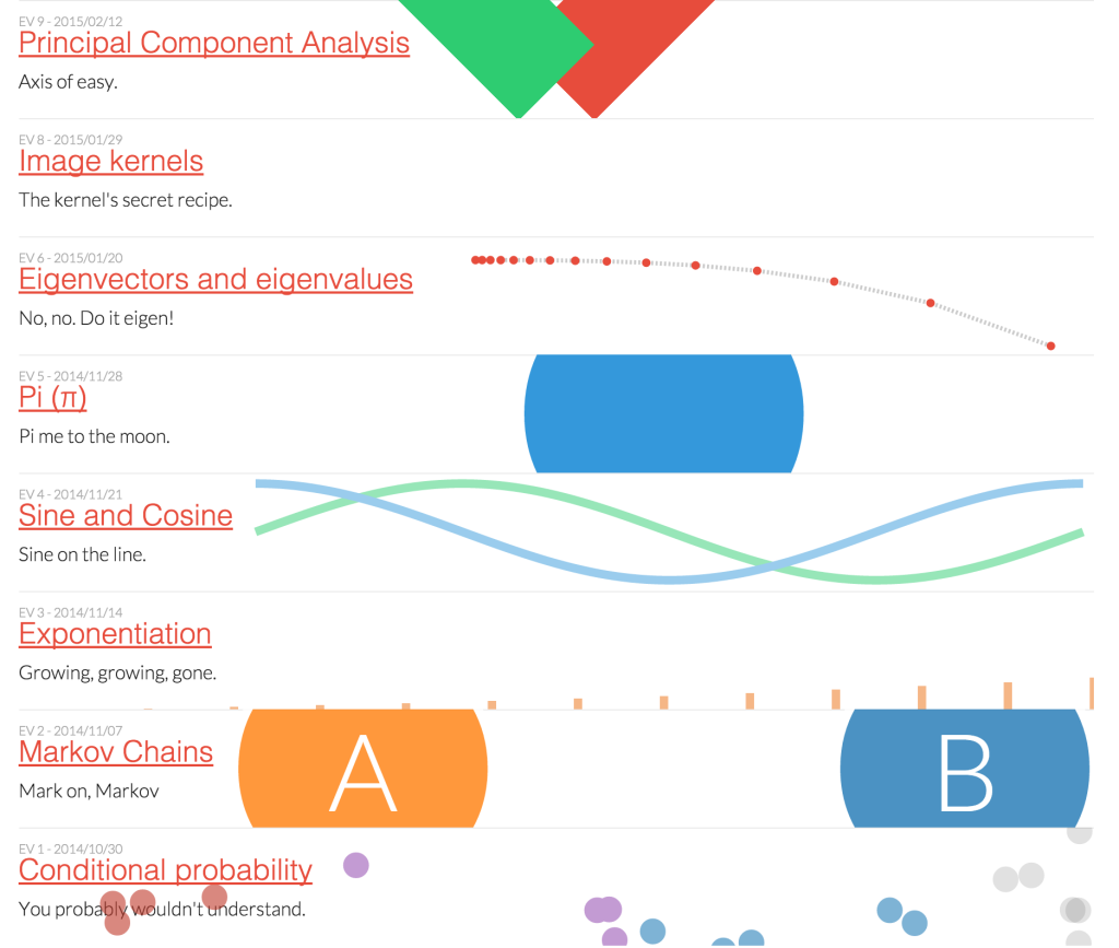 The episodes of Explained Visually published so far.
Explained Visually provides small graphics, animations and controls that the reader can manipulate in order to better understand the concepts layed out in the text. Visuals serve as direct controls themselves and/or give direct feedback when controls are manipulated.
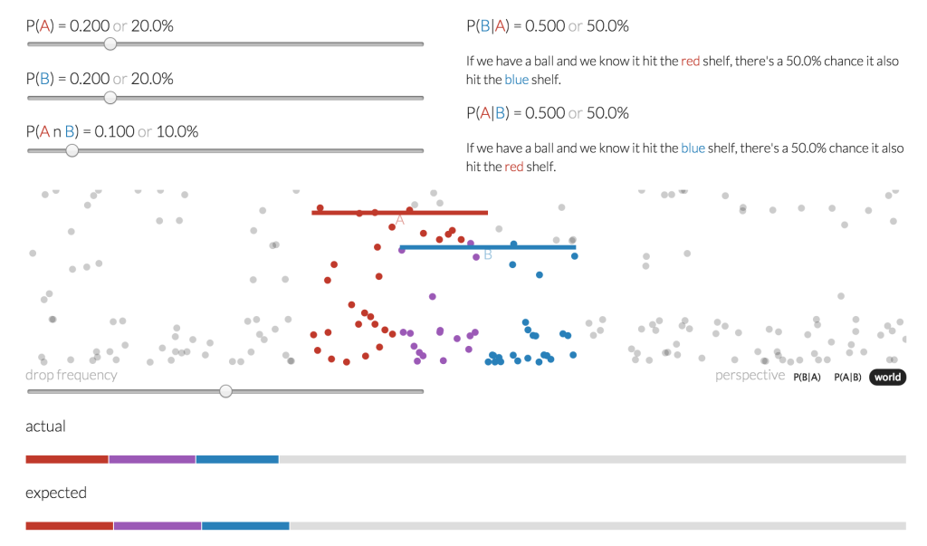 Screenshot of an interactive animation from Conditional Probability Explained Visually. Changes in the sliders adjust probabilities, which are reflected graphically in the animation and the bars at the bottom.
Seeing circles, sines and signals
Just as I was preparing this article, Jack Schaedler published Seeing circles, sines and signals, 'an eccentric piece of not-so-rigorous literature with a preoccupation for explaining things using interactive visualizations, animations and sound'. With this impressive piece Schaedler explains waves, sines and cosines, imaginary numbers and Fourrier transformations.
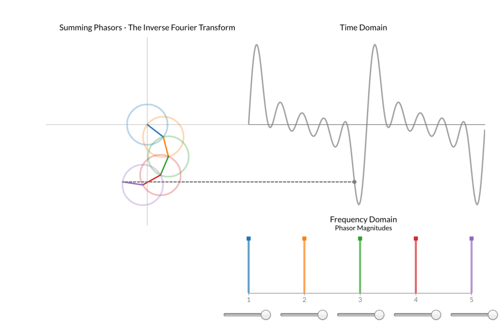 One of the many small interactives from Seeing circles, Sines and Signals.[/caption]
I never managed to get my head around Fourrier transformations completely. But only halfway the text and the little interactives, I think I understand it better than ever before. Schaedler also mentions the work of Bret Victor as a source of inspiration.
Earth Primer
Explorable explanations are not confined to mathematics and statistics and can also work on tablets. That is what Earth Primer, an iPad app by Chaim Gingold, proves. It was released only a couple of weeks ago.
Readers are guided through geological, ecological and meteorological concepts with text and images, but most important are the zoomable and rotatable game-like interactive transects of earth. At the end, the active reader can play around with all the controls in a Sandbox.
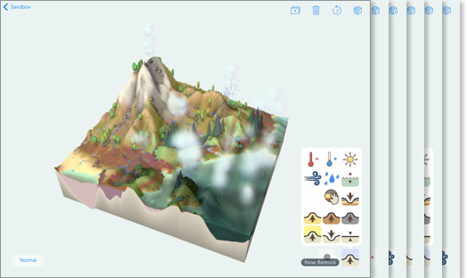 The controls in Earth Primer enables you to see the effects of rain, changes in sea level, wind direction, temperature and relief on vegetation and geography.
Visualizing algorithms
In June last year Mike Bostock, inventor of the fantastic D3.js library, published Visualizing Algorithms, the written cristallization of a talk he gave at the Eyeo 2014 festival. The intro says it all:
"Algorithms are a fascinating use case for visualization. To visualize an algorithm, we don’t merely fit data to a chart; there is no primary dataset. Instead there are logical rules that describe behavior. This may be why algorithm visualizations are so unusual, as designers experiment with novel forms to better communicate. This is reason enough to study them.
But algorithms are also a reminder that visualization is more than a tool for finding patterns in data. Visualization leverages the human visual system to augment human intellect: we can use it to better understand these important abstract processes, and perhaps other things, too."
He proceeds by illustrating various sampling, shuffling and sorting algorithms with images, animations and playables.
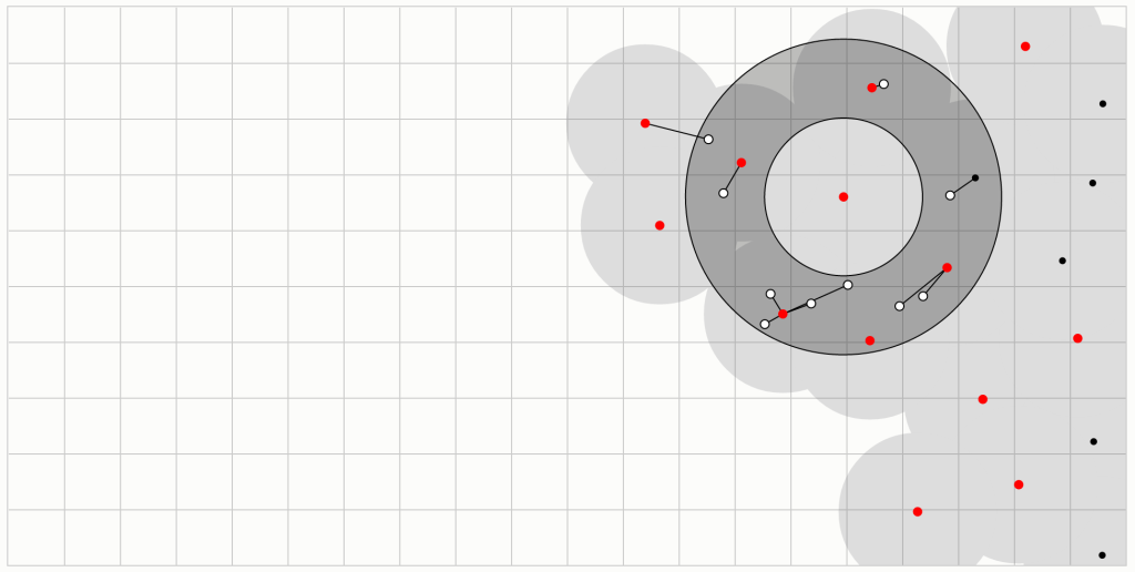 A sampling algorithm illustrated with an animation.
Parable of the Polygons
Parable of the Polygons, by Vi Hart and Nicky Case is an interactive story that explains how segregation in society works. It is a very playful work, with 'shapist' triangles and squares. It also ends with a sandbox to play in. Parable of the Polygons proves that explorable explanations can also be used in social sciences.
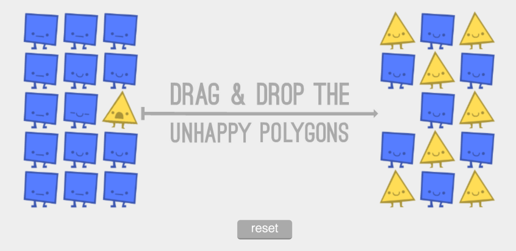 Animations and interactives illustrate how a society of blue squares and yellow triangles gets segregated.
Design patterns and considerations
With the subtitle Explorable Explanations. Interactive non-fiction. Active essays. Glogs. Nicky Case (the same one from Parable of the Polygons) shared the insights she and others gathered at 'a 20-person workshop on figuring out how to use interactivity to help teach concepts.'
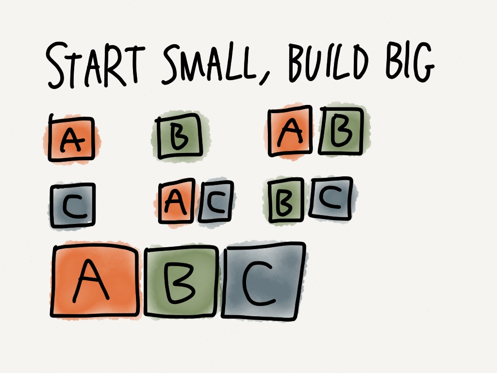 One of the principles for making explorable explanations is to first explain small parts, than combinations and in the end letting them all play together.[/caption]
If you're interested in making explorable explanations, the article gives some very good advice on how to lay out your story, how to integrate interactivity and other do's and don'ts.
The future of education
I strongly believe in the power of explorable explanations. Allowing the reader to actively test his own hypotheses, guided and nudged by the maker of the explanation, leads to much more knowledge then simple text with only some formulas and static images thrown in. Concepts I never really understood (like eigenvectors, for example) suddenly seem to be well in my mental reach when I can explore them visually and interactively.
That is why I think the textbook of the future will explain things explorably. Bret Victor sowed the seeds some years ago and today a lot of people from a lot of different fields are experimenting. Lessons learned from these experiments are already starting to take shape.
I hope (and think) that explorable explanations will be popping up more and more. Maybe I'll make one myself?