To the point: 7 reasons you should use dot graphs
May 03, 2015
Points go beyond where lines and bars stop. Sounds weird, especially for those who remember from their math classes that a line is an infinite collection of points. But in visualization, points can do so much more then lines. Here are seven reasons why you should use more dot graphs, with some examples.
1. Dots are efficient
As Cleveland and McGill proved way back in 1984, points arranged on a common scale are one of the most efficient ways to represent quantities and proportions.
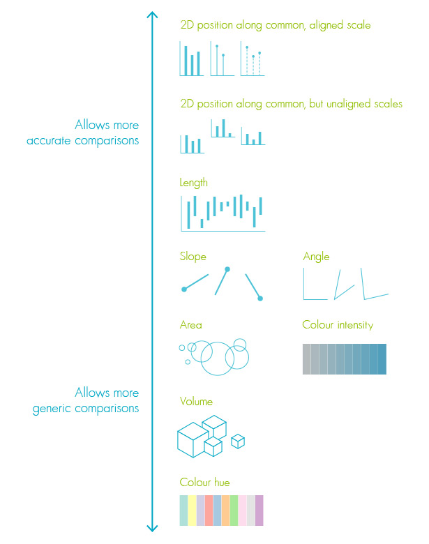
Visual forms that allow for more accurate comparisons (on top) and forms that are less efficient (below) © Alberto Cairo, based on Cleveland en McGill
Considering the efficiency of dot graphs, it is surprising they are so rare.
2. Dots give more details
Beyond Bar and Line Graphs, Time for a New Data Presentation Paradigm, a recent and very interesting article in PLOS Biology, argues for the replacement of bars that represent mean values and mean errors by '1-dimensional scatter plots' in scientific articles. Main reason for this is that scatterplots also show distribution, outliers and density in data points.
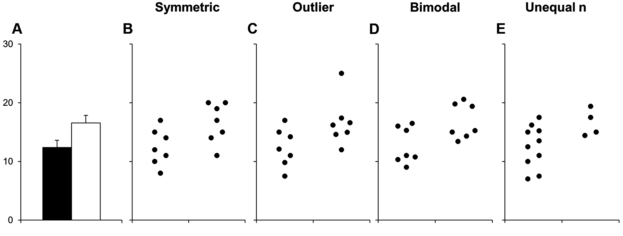
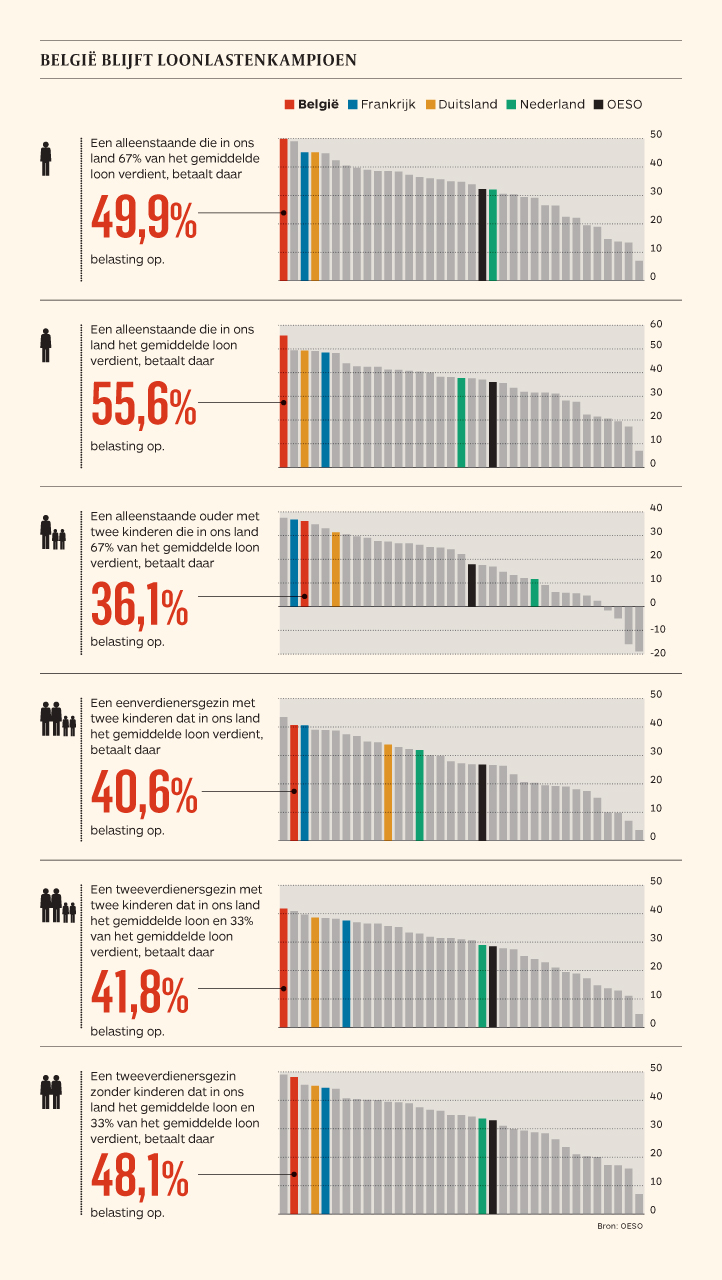
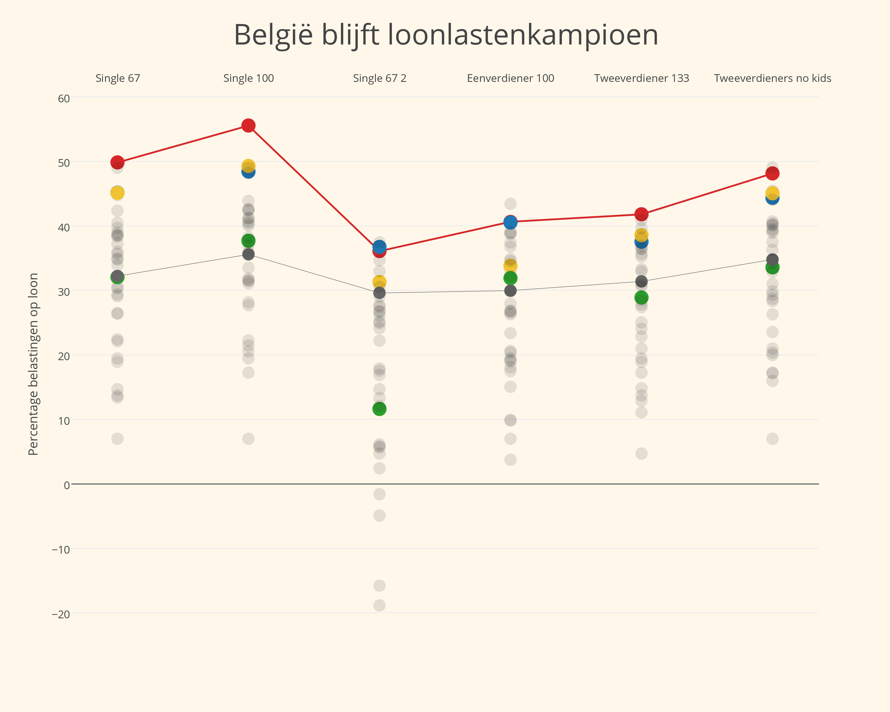
This is a very valid point. Compare for instance the following graphics on unemployment in Europe, both published by Eurostat.

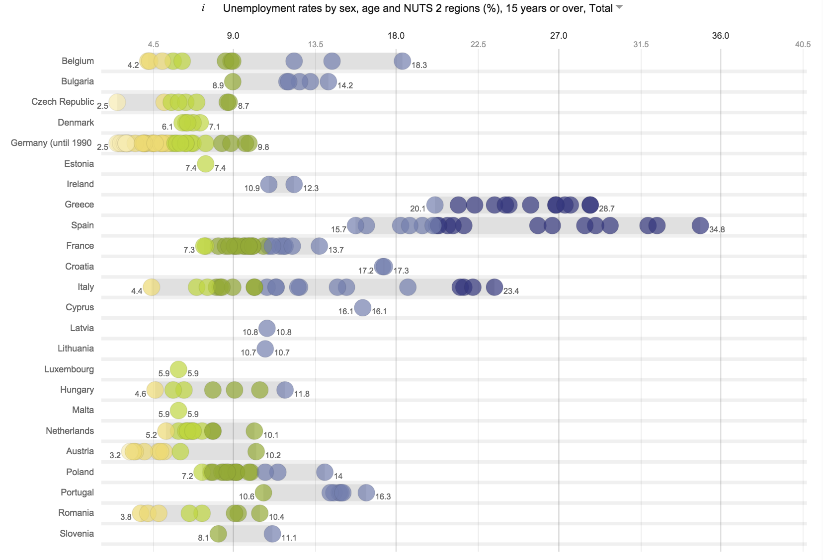
The second graphic also shows the distribution of unemployment within each country, and therefor gives a much completer picture.
3. Connected dots give... slopes
The article in PLOS Biologiy also shows how you can detect groups and trends in your data by connecting two 1-dimensional scatterplots by lines.
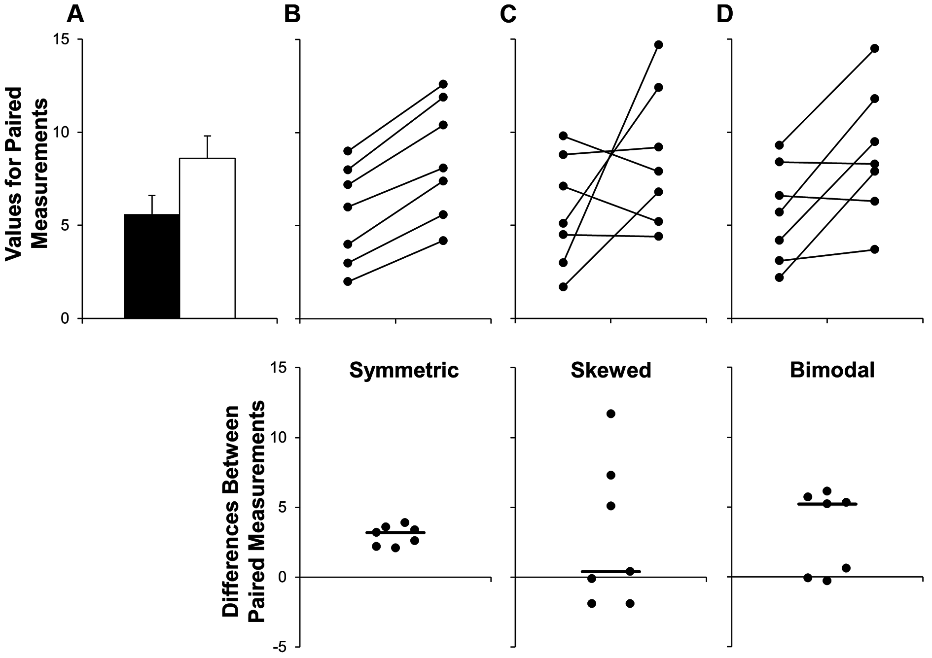
The results are slopegraphs, one of my favorite visualizations. Of course, two 1-dimensional scatterplots can also be represented by a standard 2-dimensional scatterplot.
4. Dots are pixel savers
On paper dots take up a lot less ink and on screen they can save you a lot of pixels compared to other visual forms. With dots, you can produce visualizations with a very high datadensity of data-ink ratio. Have a look.
Original (sorry, in Dutch):
And my remake (quickly sketched with plot.ly):
5. Dots give room to more dimensions
It is pretty easy to add more datadensity to your dot plot by using color and size. Points can be colored according to a quantitative or qualitative value and dot size also can be visually encoded. If you add the time dimension by using animation, you get the famous Rosling-graphs (aka bubble charts).
Naturally, you have tho make sure your graphic is still readable. Not straightforward, with 5 dimensions (x, y, color, size, time) in 1 graphic.
6. Dots tell your story
With a well chosen use of color, you can highlight the most important points in a dot cloud or other type of dot plot to tell a story.
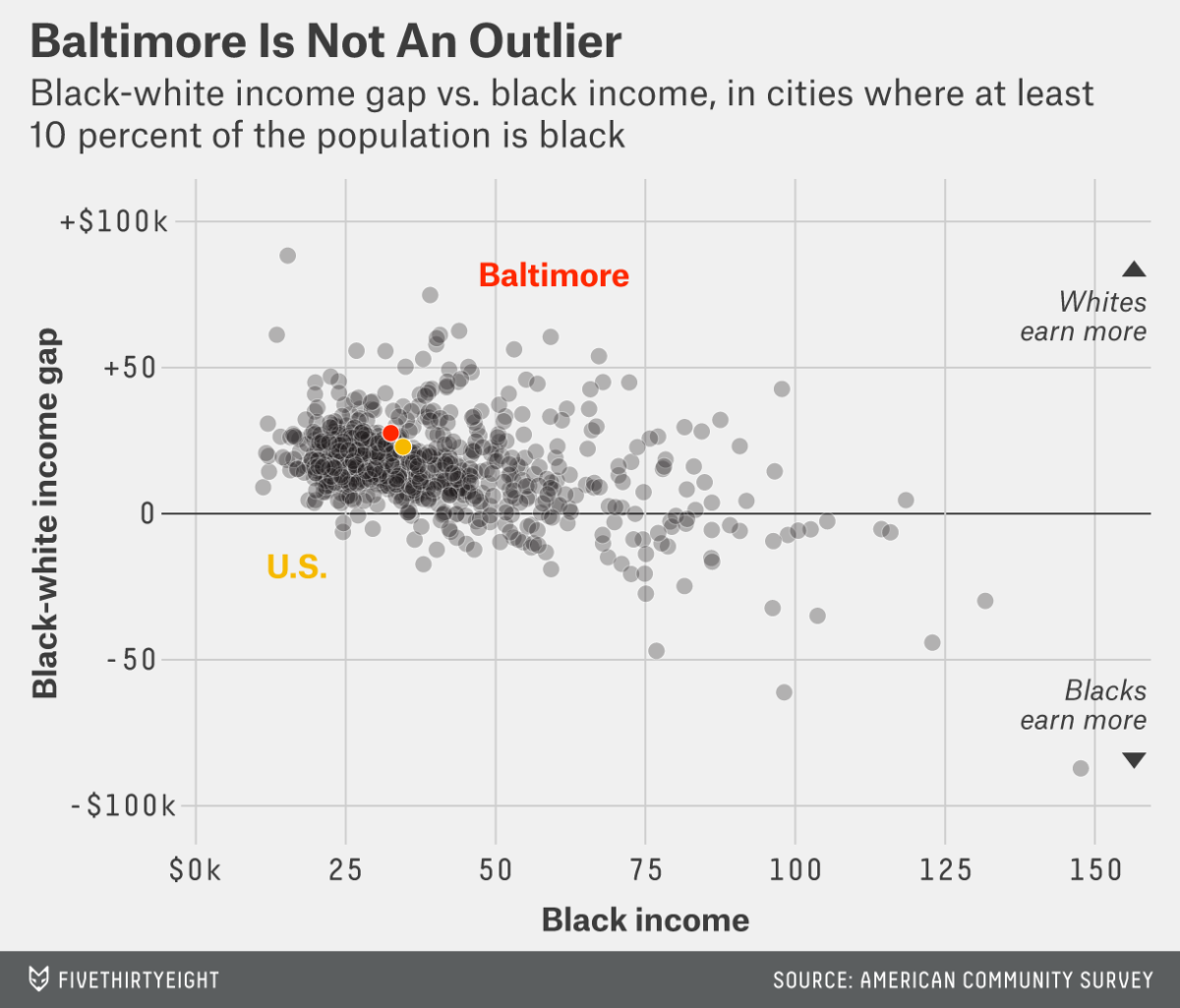 Source: How Baltimore's Young Black Men Are Boxed In, fivethirthyeight.com
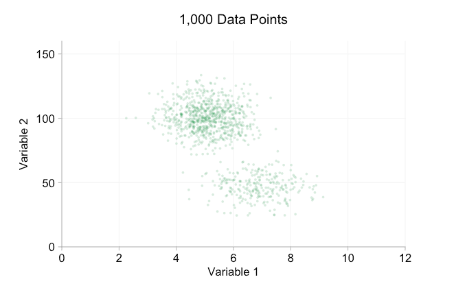
7. Dots can handle thousands
With the smart use of transparency, dots can by used to literally represent thousands of data points. There are limits, of course, but as Tim Brock explains there are some tricks you can use to find the optimal transparency level.
 Source: Too big data: coping with overplotting, infragistics.com
Automatic detection of optimal transparency is being studied. I guess we will hear more about this in the future.
The dot graphics family
Because of the reasons mentioned above, I would like to see dot graphics to be used more for visualization of numbers then is the case today.
But in what case should you choose what type of dot plot?
- For comparisons of a single dimension across many categories: 1-dimensional scatterplot.
- For detecting of skewed or bimodal distributions in 2 variables: connecte 1-dimensional scatterplots (slopegraphs)
- For showing relationships between 2 variables: 2-dimensional scatterplots.
- For representing 4-dimensional data (3 numeric, 1 categorical or 4 numerical): bubble charts. Can also be used for 3 numerical dimensions or 2 numeric and 1 categorical value.
- For representing 4-dimensional data + time: animated bubble chart (aka Rosling-graph)