The 2015 list of visualization lists
December 23, 2015
Yes, you are already bombarded with lists of everything of 2015. But this list actually helps you to select what lists to read: it is the meta list of visualization lists of 2015.
So, in no particular order:
1. @visualisingdata: 10 Significant visualisation developments: July to December 2015

If you want significant developments for the whole of 2015, also read 10 Significant visualisation developments: January to June 2015
2. @flowingdata: 10 Best Data Visualization Projects of 2015

3. @nature: 365 days: The best science images of 2015

4. @fivethirtyeight: The 2015 Data Awards
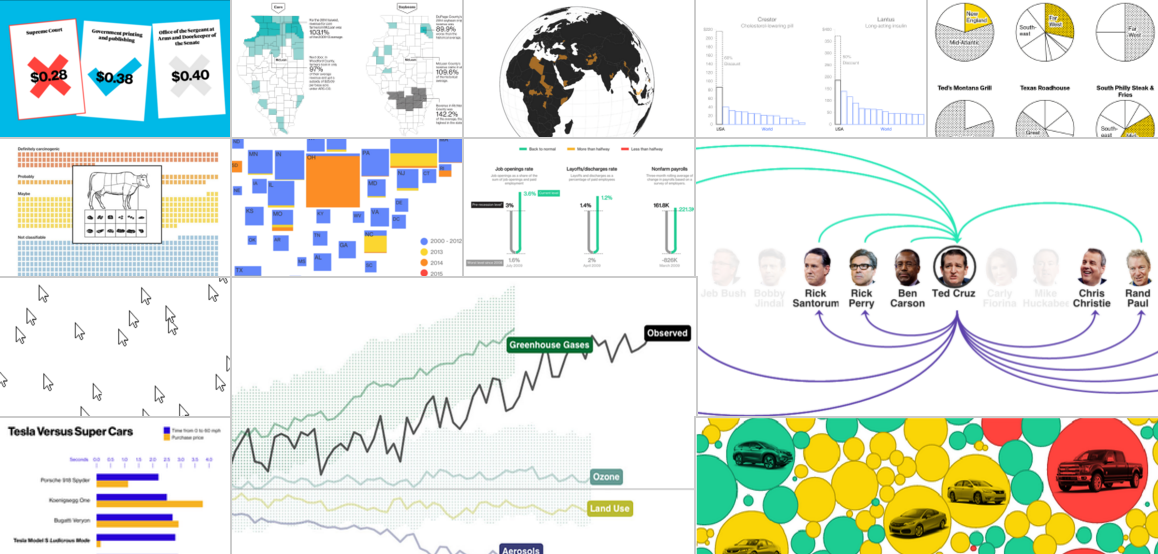
 5. @BBGVisualData: 2015 in Graphics

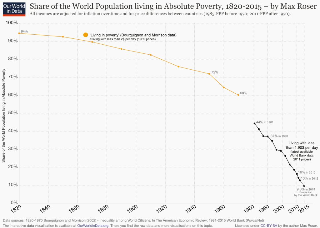
 6. @qz: Quartz’s Chart of the Year™ for 2015

 7. @PostGraphics: A Year in Graphics

 8. @NYTGraphics: 2015: The Year in Visual Stories and Graphics


9. @WSJGraphics: The Year in Interactive Graphics
 10. @kennethfield: Favourite maps from 2015


11. @PopSci: The best science and tech images of 2015

12. @ECONdailycharts: The 2015 Daily chart Advent calendar

13. @BBCNewsGraphics: A year in Graphics and Interactives

14. @qz: The most misleading charts of 2015, fixed

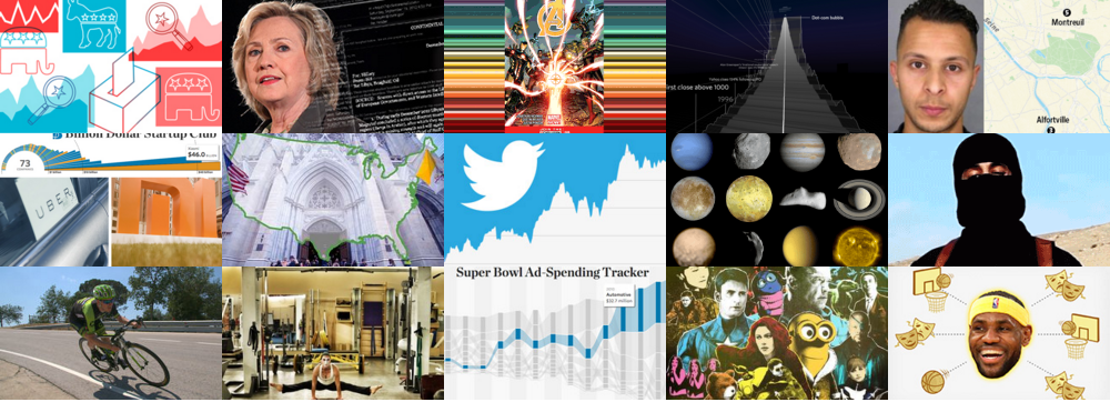
15. @FiveThirtyEight: Our 47 weirdest charts from 2015

16. @ProPublica: The 2015 ProPublica Year in Visual Storytelling
