Papers, screens and goggles
March 31, 2017
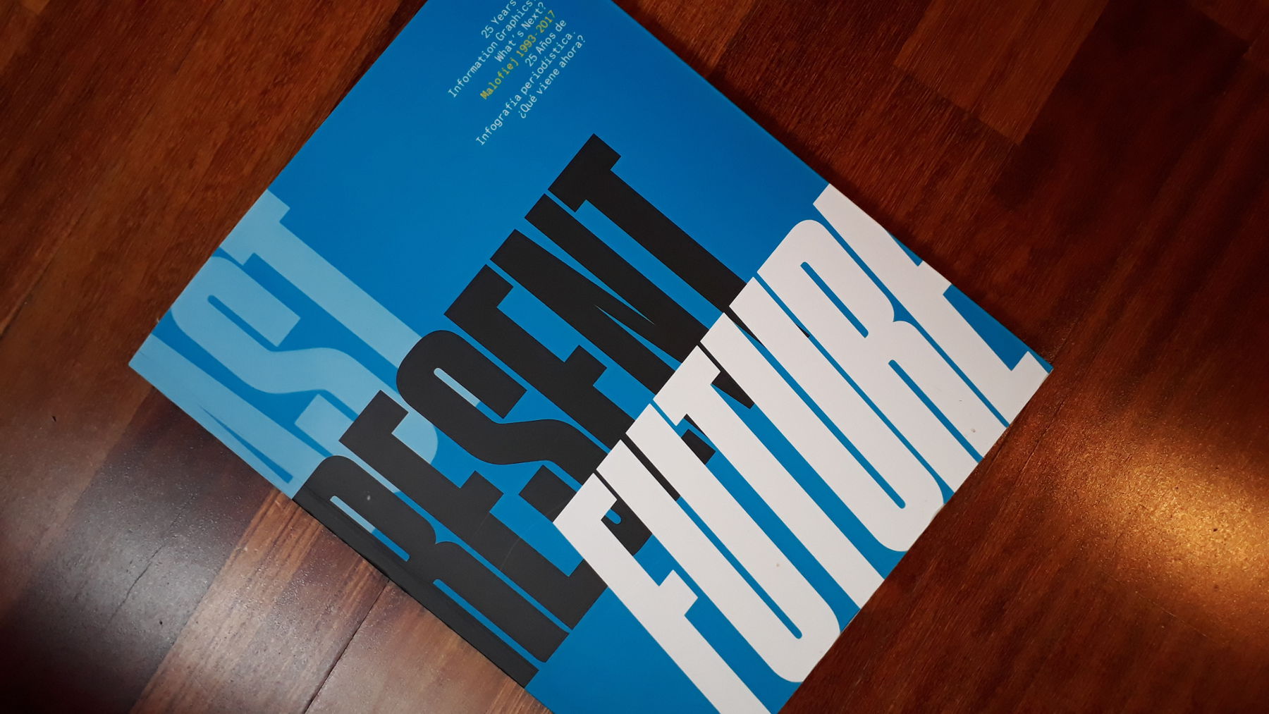
I am currently at the Malofiej Infographics World Summit in Pamplona. It is my second attendance to this wonderful conference and this edition is special: the conference celebrates its 25th anniversary. And for the anniversary, the conference organisers published a dedicated book: Past. Present. Future. I was delighted to be invited to write a little essay for this book and be featured on an impressive list of contributors. So this is my contribution.
Papers, screens and goggles
In hindsight, 2010 was a pivotal year for modern data visualization. The first big data journalism stories were published and the first iPad was launched, without support for Adobe Flash. This was the start of pictorial graphics giving way to more abstract and data driven graphics. Data visualization really took off, especially interactive data visualization. But now mobile is king and virtual reality is around the corner, the static-interactive and pictorial-abstract graphics balances are swinging again.
War Logs and Fusion Tables
Just as I was preparing for my new job and my first steps in journalism, in October 2010, Wikileaks published the Iraq War Logs. Almost 400.000 United States Army reports were leaked, documenting the deaths of 109.000 soldiers and civilians during the war in Iraq. The Guardian, a frontrunner in data journalism at the time, produced some excellent reporting on the Logs, including many maps and other visualizations. Some months later, during the summer of 2011, the Guardian repeated its supreme data reporting, covering the London riots.
Journalists were already using data and computers before, but 2010 was a starting point of something new. It was the tipping point of large datasets becoming available and tools to analyze and visualize them becoming democratic enough for journalists to use.
One year earlier, in June 2009, Google had launched Google Fusion Tables, ‘an experimental system for data management in the cloud, merging multiple data sources, discussion of the data, querying, visualization, and Web publishing.’ The now ageing Fusion Tables had a big wow-factor: non-programmers suddenly had a lot of analytical power for data in their hands. And for the first time, media disposed of a tool to publish data ‘the web way’: interactive, queryable and visual.
However, just as the use of data and computers were already present in journalism, interactivity wasn’t new in media: interactive applications, graphics and maps were already very present on the web. But then, also in 2010, on April 3, Apple launched its first iPad. And it didn’t support Adobe Flash, the technology behind the bulk of interactive visual content on the web. And as news consumption on iPad and other devices lacking Flash support grew, media had to adapt and step away from this technology.
Enter D3
It was time for something to fill the void that Flash was leaving behind. For datavisualization, this came in the form of a javascript library: in February 2011 researchers from Stanford University released version 1.0 of D3.js. Javascript was and still is the most used language to create interactivity online and D3 provided the framework to generate interactive visualizations from data (D3 stands for Data Driven Documents).
It is hard to overstate the impact D3 has had on online data visualization and even visualization in general. Today it is built into numerous visualization platforms and software packages, a vibrant community of enthusiastic visualizers and programmers has emerged around it and a lot of people, including myself, are earning a substantial part of their income building things with D3.
One of the creators of D3, Mike Bostock, was later hired by The New York Times. Bostock and the other members of the New York Times graphics department are a good example of how the incorporation of data, D3 and engineers and statisticians is changing visual journalism. From being mostly pictorial, it is now split between pictorial and abstract graphics, based on data. Graphics and art are not purely the result of manual manipulation anymore: code is generating visuals too, with data at its base. Choropleth maps have become ubiquitous, bar charts are already considered boring and new, more exotic chart forms (effective or not) keep popping up. A new graphic field is conquering media and even everyday life.
Trench of disillusionment
With new tools like D3, online journalism was suddenly full of visual experiments and people were stretching what could be done with interactivity. But at the 24th edition of Malofiej, in 2016, deputy graphics editor of the New York Times Archie Tse put some things into words that many working in newsrooms were struggling with: readers interact little with interactive content and producing interactives that work well on all platforms is hard. It seemed that after the hype, we had fallen into the trench of disillusionment of interactive data visualization.
Archie’s points are valid and are, amongst others, consequences of the rise of mobile and touch devices: designing for mobile and desktop at the same time is difficult. But going for the lowest common denominator (mobile first) can lead to underwhelming experiences on desktop. This is a missed opportunity. The full interactive experience of desktop, with a big screen, mouse interactions and readers sitting down and taking their time, can be very powerful.
That is why I’m happy to see some kind of a ‘counter movement’. Some visual and data driven sites, like datasketch.es and polygraph.cool, simply state upfront that you should view their content on desktop for the full experience. Agreed: these sites cannot be considered news sites (however I would argue they are journalism). But they illustrate that for some data stories, the best medium can be desktop. So why shouldn’t this be the case in media too?
Sometimes you need pixels
Paper, mobile screens, big desktop monitors and, in the future, VR goggles all have their own strengths and logic. Paper gives you perfect control of layout and can present a big overview with small details at the same time. Touch screens give the reader mobility, location awareness and the breaking news is never missed. And the pixels and mouse of desktop have a lot more visual and interactive power.
I hope that we will not always be aiming for the lowest common denominator of small touch screens. Good and powerful visualizations sometimes just need pixels. We shouldn’t be afraid to say so and direct readers to bigger screens.
We do the same now with virtual reality, by the way: ‘For the best experience, put on your goggles’. VR still has to prove its value in a media context, but adding a third dimension and interactivity to pictorial graphics can result in very immersive experiences. So VR could very well be the next technology swinging the balance between pictorial and abstract graphics back again.