A look back, and a look forwards
July 25, 2019
I’ve already started working again, after a week of holidays, with the main activities doing nothing, napping, playing with the kids and reading some books. This was very needed, as the past 6 months were whithout a doubt my busiest ever. So with this post, I want to share a bit of what I have been up to in the past couple of months, and what my plans are for the coming period.
Data visualisation training programme at the European Commission
One of my goals for 2019 was to do less trainings and spend more time making visualisations instead of explaining about them. I failed miserably: I have never given more trainings than in the past months (I just counted: I gave 13 full day trainings in the past 3 months). The main reason for this failure was that I accepted to develop a training programme around data visualisation for the Publications Office of the European Commission.
So I developed 5 trainings and 3 workshops (those are more hands on than the trainings), and gave them both in Luxembourg and Brussels.
You can find the slides I used at the following links:
- Guidelines for effective data visualisation (an intro to data visualisation)
- Garbage in, garbage out: how to assure data quality for visualisation (on common data quality issues)
- Boosting your data analysis skills with data visualisation and ggplot2 (an introduction to R and the ggplot2 package, with exercises hosted on the great rstudio.cloud. You need to be logged in to access these)
- Telling your story through data visualisation
- Making great online visualisations without coding
This fall I’ll give the remaining training (called “Going beyond bars and lines”, on non-standard visualisations) and workshops (on D3.js and on remaking visualisations Makeover Monday style) of the programme. The Publications Office is also organising the EUDataViz conference on the 12th of November in Luxembourg.
On top of these courses for the Publications Office, I gave trainings about data visualisation and journalistic techniques at Eurostat and for the European Statistical Training Programme.
Datylon
My biggest client since I became a freelancer is Datylon, a data visualisation startup from Antwerp. Their main focus now, and also mine when I work for them, is Datylon Graph, an Adobe Illustrator plugin for making visualisations. The plugin is in private Beta at the moment, but already has some nice features.
I mainly help Datylon with developing the visualisation library that is driving the plugin. You should definitely keep an eye on future releases if you do data visualisation and if you are an Adobe Illustrator user.
My Pudding debut
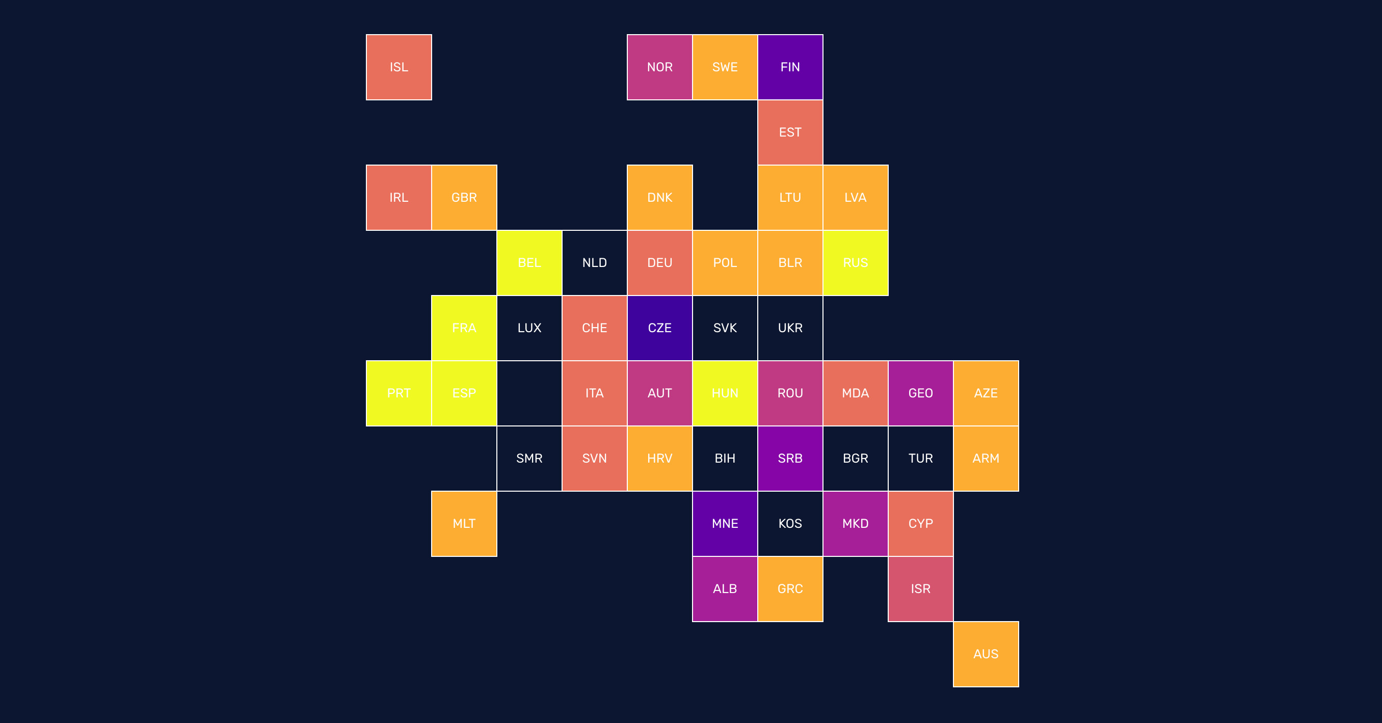
I didn’t completely fail my goal to make and publish more visualisations, though. In April I made my debut on The Pudding, with Why Budapest, Warsaw, and Lithuania split themselves in two. The piece is a visual and animated explainer about funding of European Union regions. That might sound like a boring topic, but I did my best to turn it into an engaging story.
I got some nice comments about the piece and the last stats I heard were that people were spending on average 18 minutes with it. That is a huge!
In June, I was invited by Live Magazine to bring my story on stage. I got to tell my story to some 1.000 people in one of the nicest theatres of the country (with a giant screen!).
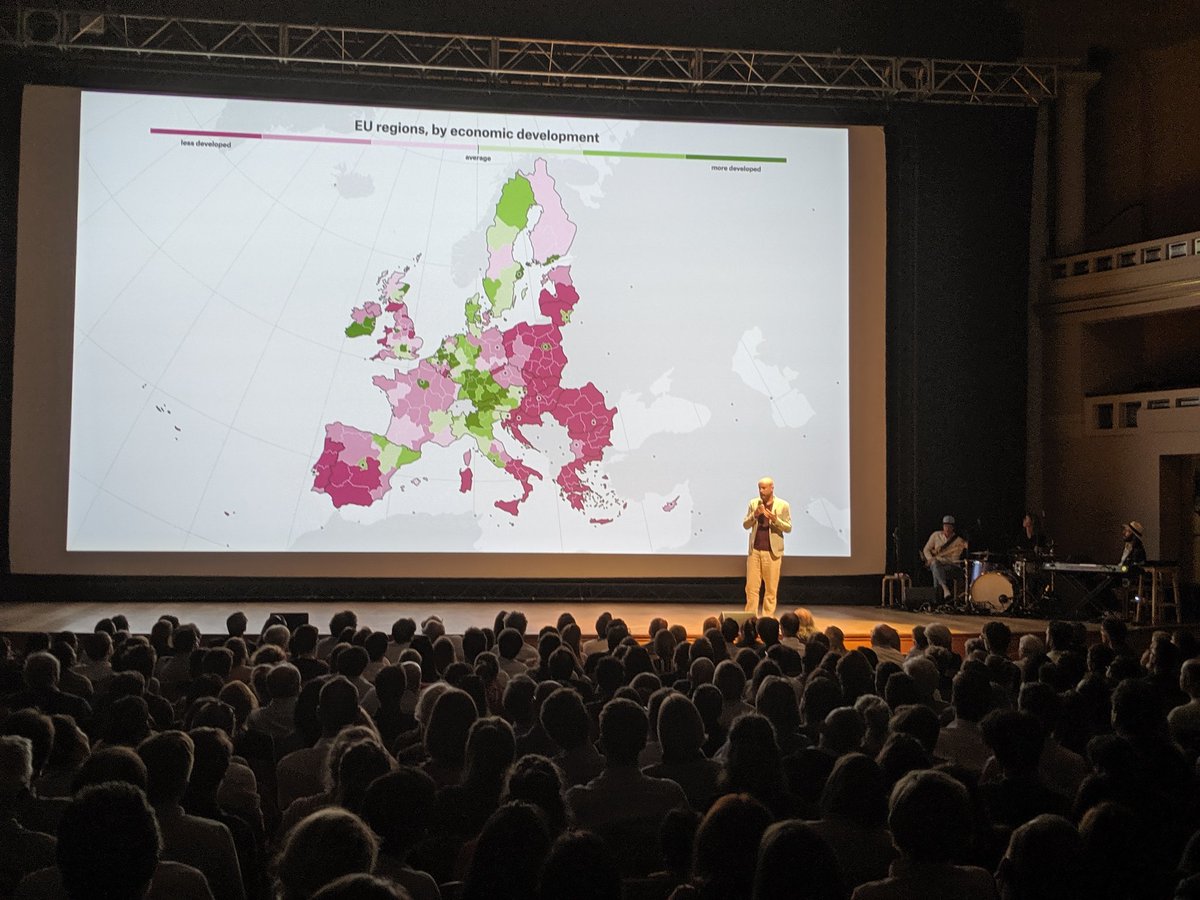
Picture by Karim Douïeb
Eurosearch Song Contest 2019
Just as in the previous two years I worked with the Google News Lab to simulate voting in the Eurovision Song Contest based on search activity. This year we added historical data and went all the way back to the start of the Eurovision televoting system in 2004.
I was able to reuse some of the visuals and code from the 2017 and 2018 editions, but I improved and rewrote many aspects of the visuals and also added new ones. Just as for my piece for the Pudding, I hope to be able to write a making of of this piece soon.
The visualisation system at a national office for statistics
Another interesting assignment was (or better: is, as this is still in progress) that I got invited to make an audit of current tools and practices of the visualisation output and processes of a middle sized European national office of statistics. Main goal of the assignment is to formulate optimisations for the workflows that produce visualisations and to write requirements for new tools to be used and developed.
The most interesting part so far was probably that I got to interview 15 different people within the organisation about their views, desires and practices around data visualisation. I really liked that.
More work
Some smaller, but definitely not less interesting assignments from the past months:
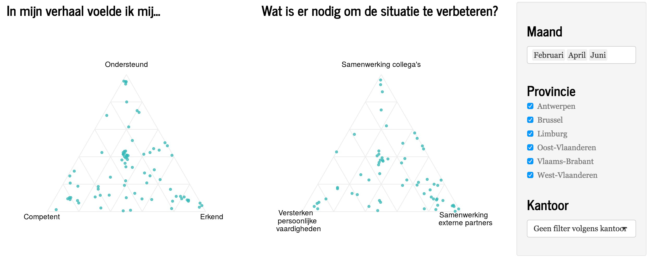
Developing a Shiny dashboard involving ternary plots
Interesting bit: the data comes from a data collecting platform that mixes the collection of stories (from users, clients, employees, …) with quantitative data.
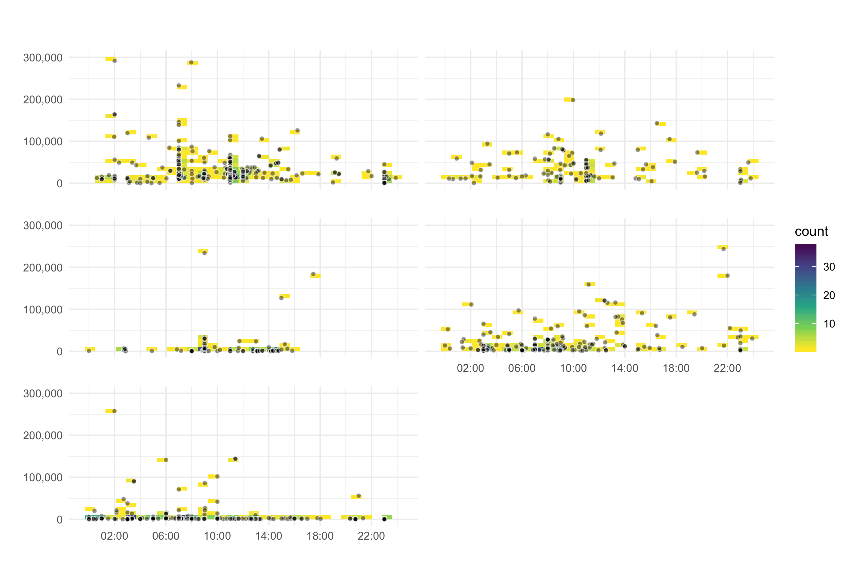
Developing visualisations of YouTube Analytics of a major brand
Interesting bit: the data was fit for some non standard visualisation techniques. And the client liked them ;)
An animated treemap and interactive menu calculator
Together with Karin Schwandt, I developed an animated treemap and an interactive calculator to visualise the impact on land use and greenhouse gass emmissions of different diets for the Dutch Planbureau Leefmilieu. Interesting bit: as a bio-engineeer, this topic was quite familiar for me.
An assessment of the visualisations, structure and language of a EU publication
For the European Commission Joint Research Center, I did a review of a 2 yearly report. I was asked to review the report both from the standpoint of a (data)journalist and as an expert in data visualisation. Interesting bit: this was a very interesting report, and as with many of my assignments, I learned a lot doing my work.
The future
As a freelancer, it is always better to have too much work than to have too little. That is the reason I overloaded my agenda a bit and had some crazy months, with many projects for many different clients. In a way this is fun: I love the diversity in clients, data and deliverables.
But having many projects means a lot of overhead (meetings, invoicing, reporting and other administration) and also means overlapping deadlines. My new goal is to have a little bit less of that :) So in the coming months I plan to work on just a couple of projects, which are a bit bigger in scope. Let’s hope I don’t fail this goal too :)