Visualizing a genome collection with CactusTrees
July 02, 2021
How do you visualize a genome collection of more than 44.000 soil microbes? I never asked myself that question, before agro-biotech company AgBiome asked me. AgBiome owns a large collection of gene sequences of different kinds of soil organisms, and tries to find species and specimens that are biologically active against crop pests. And they needed a way to show the size and structure of the collection, and how they are using their collection in a smart way.
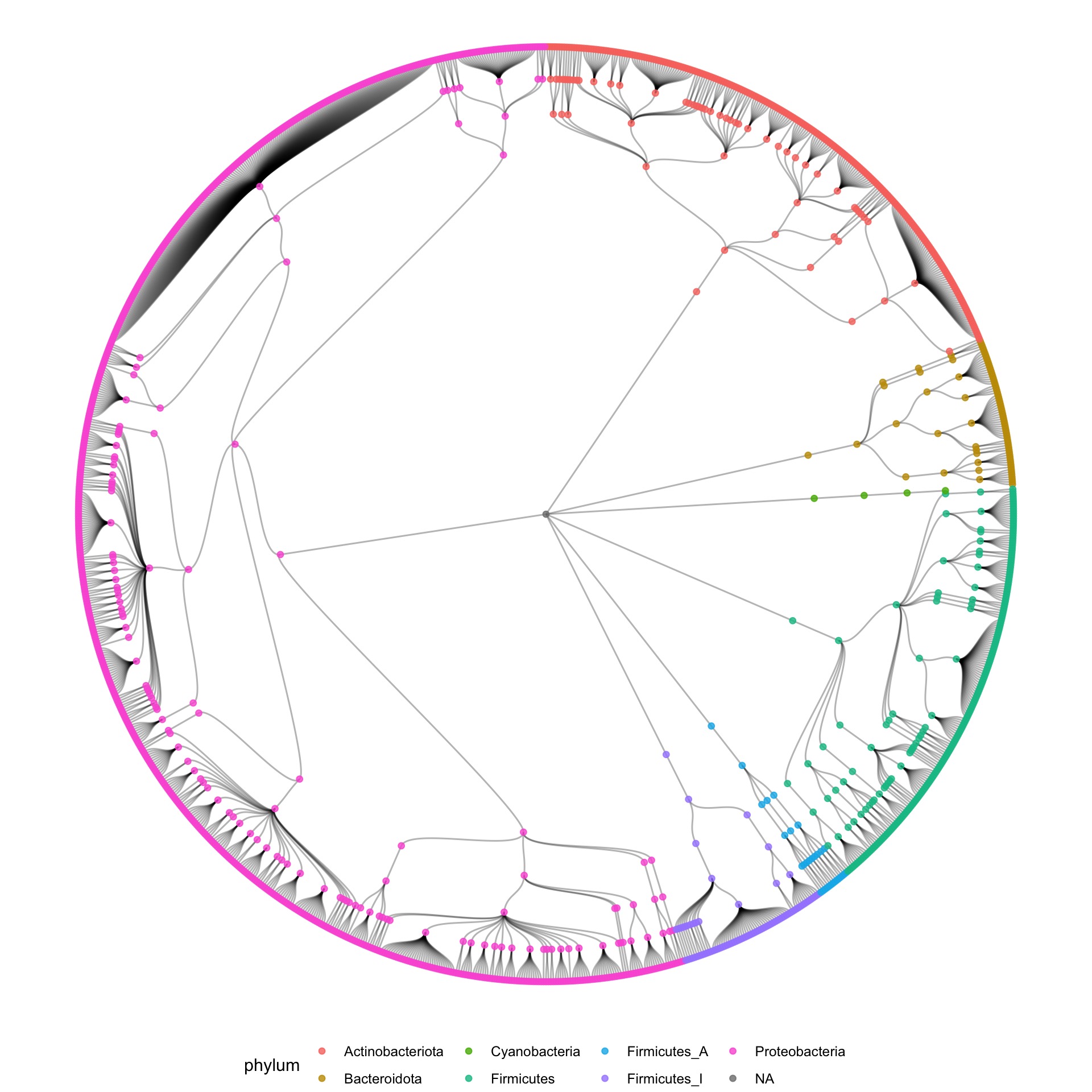
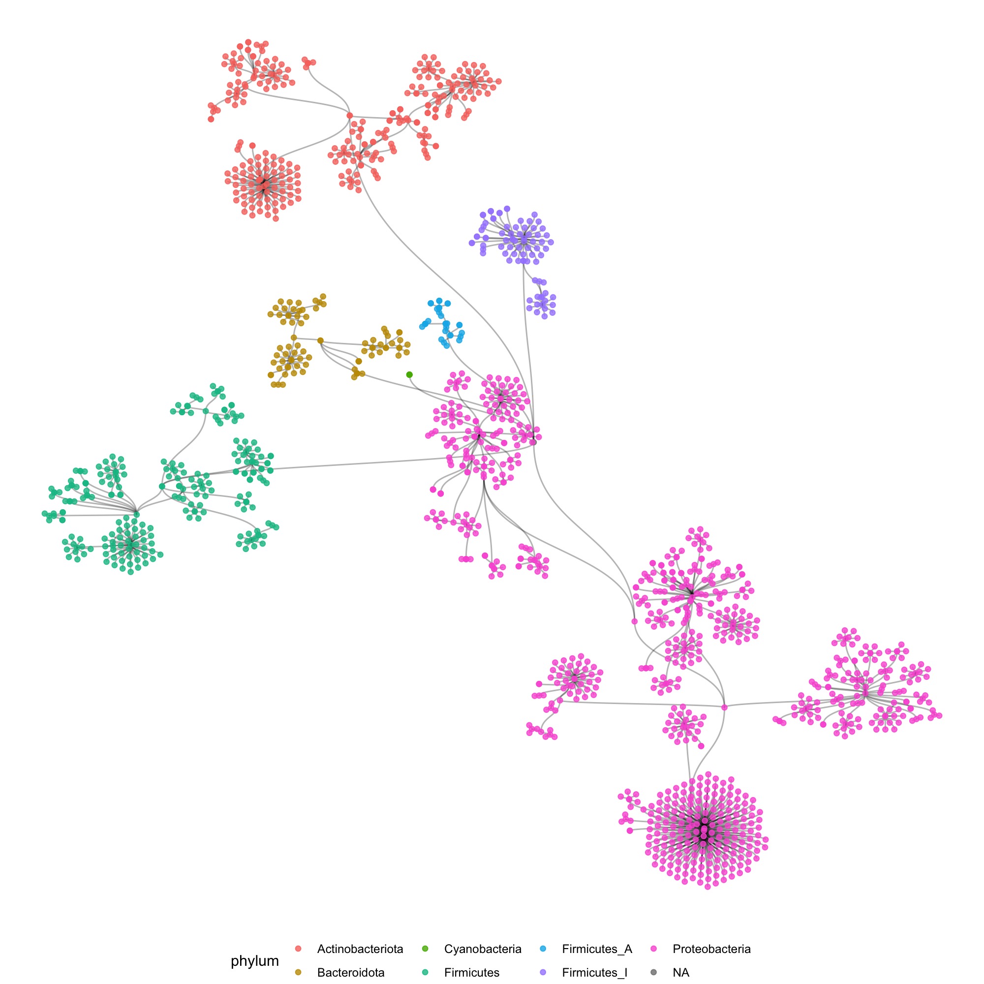
I have a background in bio-engineering, so I was a little familiar with all the Bacillus, Staphylococcus and Pseudomonas in the collection. I was also familiar with phylogenetics, so I knew the collection’s structure was a hierarchical tree of phyla, classes, orders, families, genera, and ultimately species and individual specimens of each species.
So my first reflex was to move in the direction of a tree of life, and make some dendrograms, showing the structure. I used R to construct the graph data from the tabular data that I received, and used the ggraph package to make some sketches.
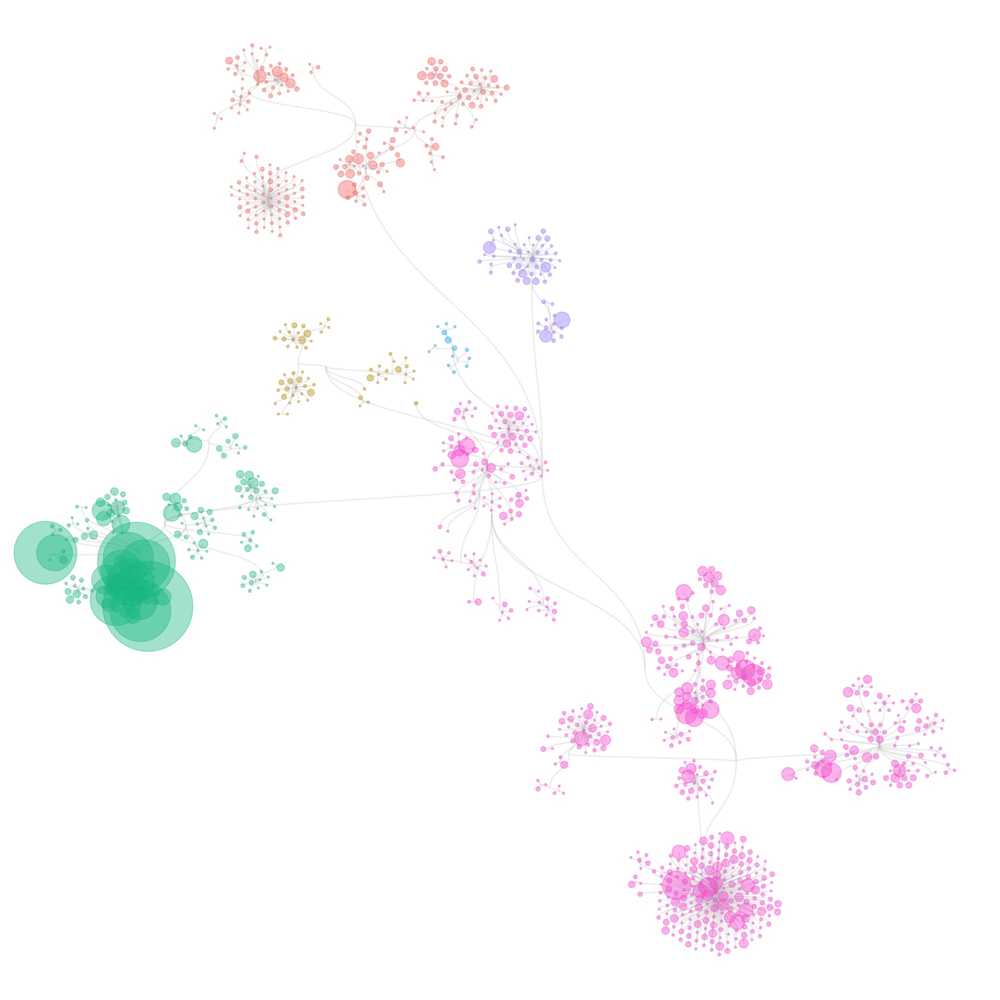
I also tried some other graph layouts with ggraph. These feel more organic, and make more efficient use of the space then the circular dendrograms.
These initial sketches were all really interesting and fun to make, but at that point I had to still tackle 2 issues:
- I wasn’t showing individual specimens in the collection yet: all visualizations were only showing species (some also show the number specimens of each species, by scaling the size of the species circles). When I tried to make the visualizations at the specimen level, it took forever to generate the graphics.
- AgBiome tries to find bioactive specimens in its collection, and from there it tries to find closely related specimens with a high potential of being even more bioactive. The visualization needed to show these relations between specimens.
These issues were tough nuts to crack. But from the research I did for building xeno.graphics, there was one visualisation technique for hierarchical data that I remembered very well, both for its name and the cool layouts it produces: CactusTrees:
The CactusTrees paper contains some pseudocode describing the algorithm to produce the layout, and after a first little test, I decided to write my own implementation. And because of the high amount of nodes to plot, I decided this was a great opportunity to work for the first time with the canvas API.
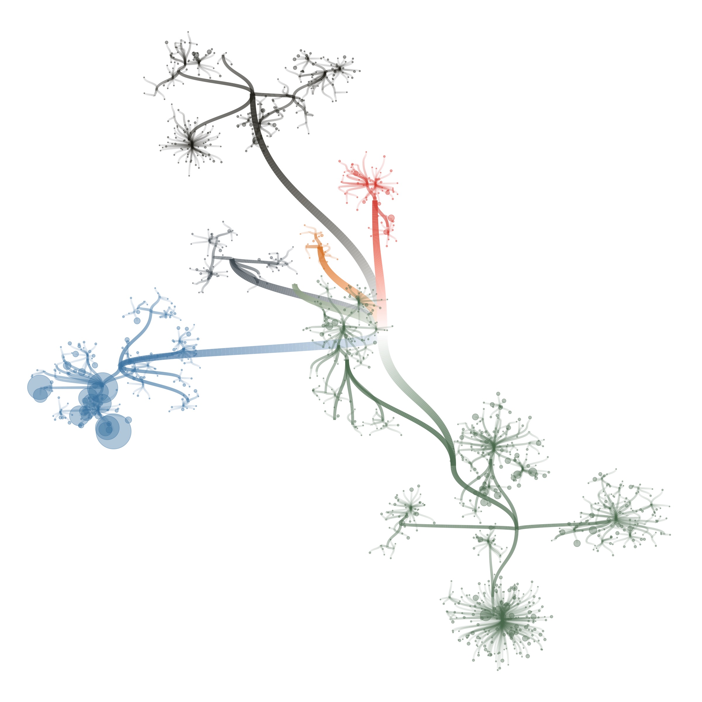
The layout calculation relies heavily on d3-hierarchy, and I learned a ton from the Visiting a d3.hierarchy Observable and some of @recifs othe Observables. It also involves hierarchical edge bundling and pyramid sorting (where the biggest value is in the middle and values decrease away from the middle).
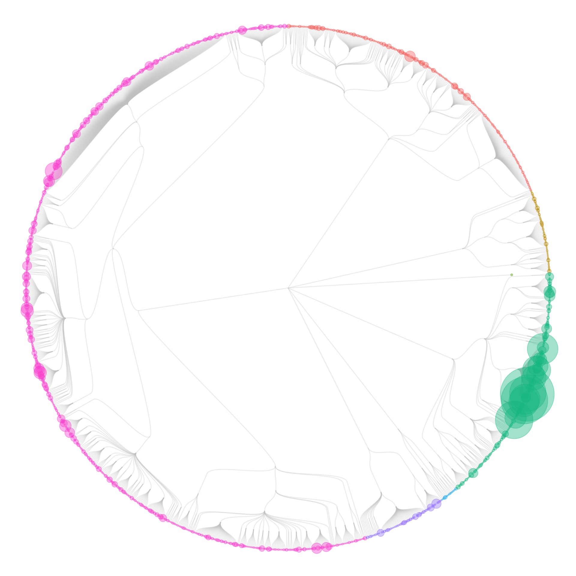
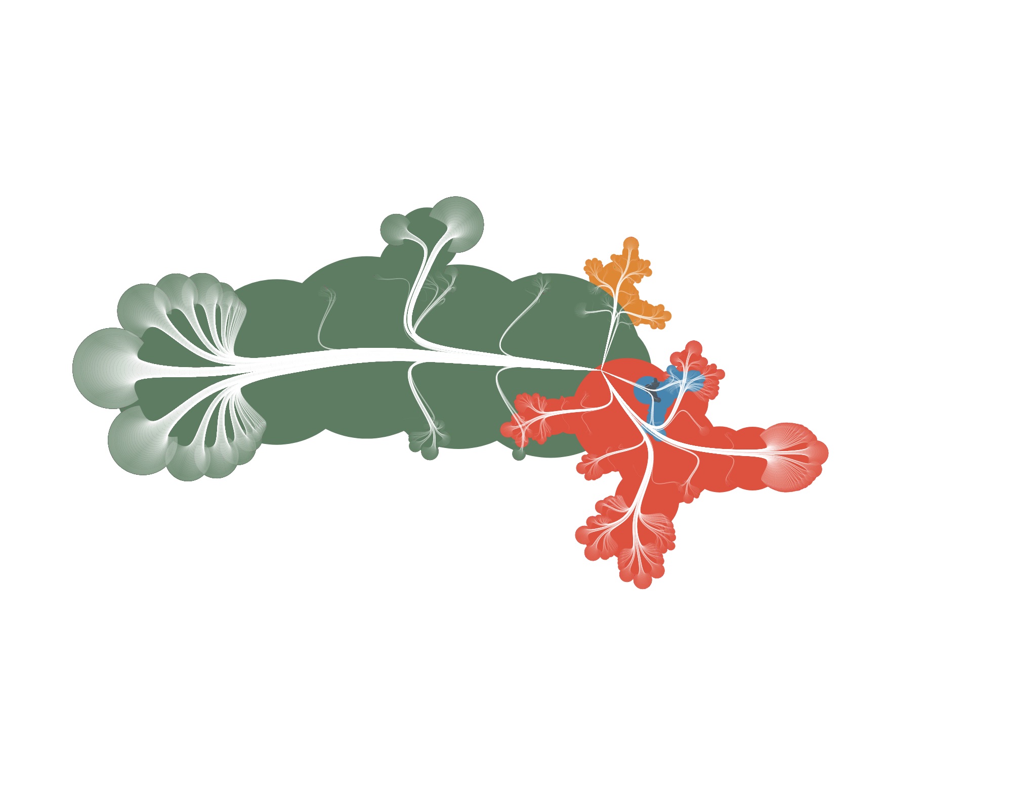
The first results looked something like this:
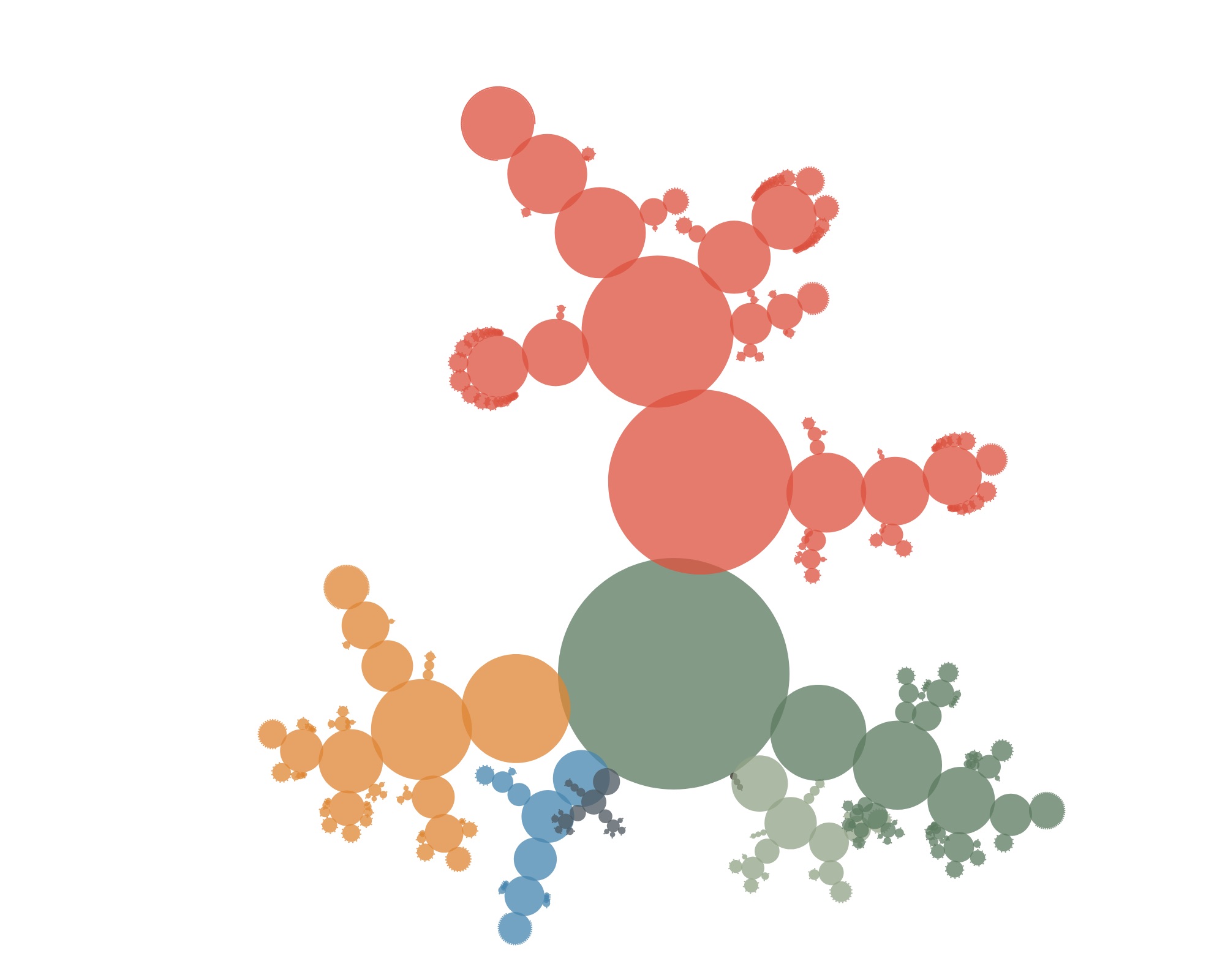
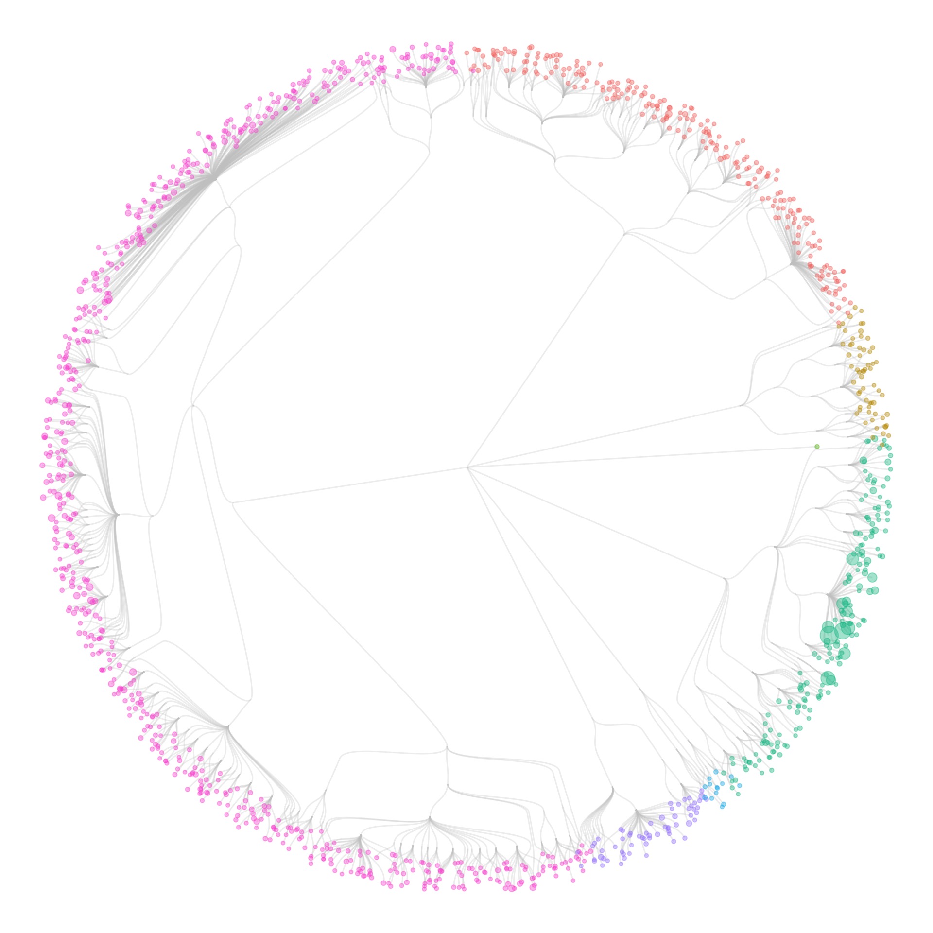
Not very convincing yet (and actually still not showing individual specimens). But if you let the circles overlap a little more…

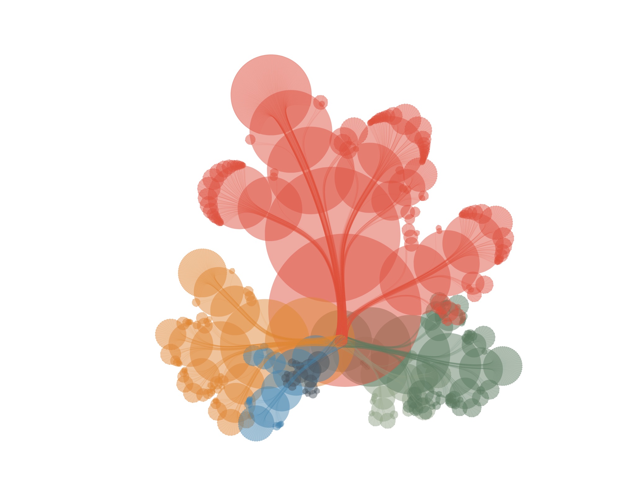
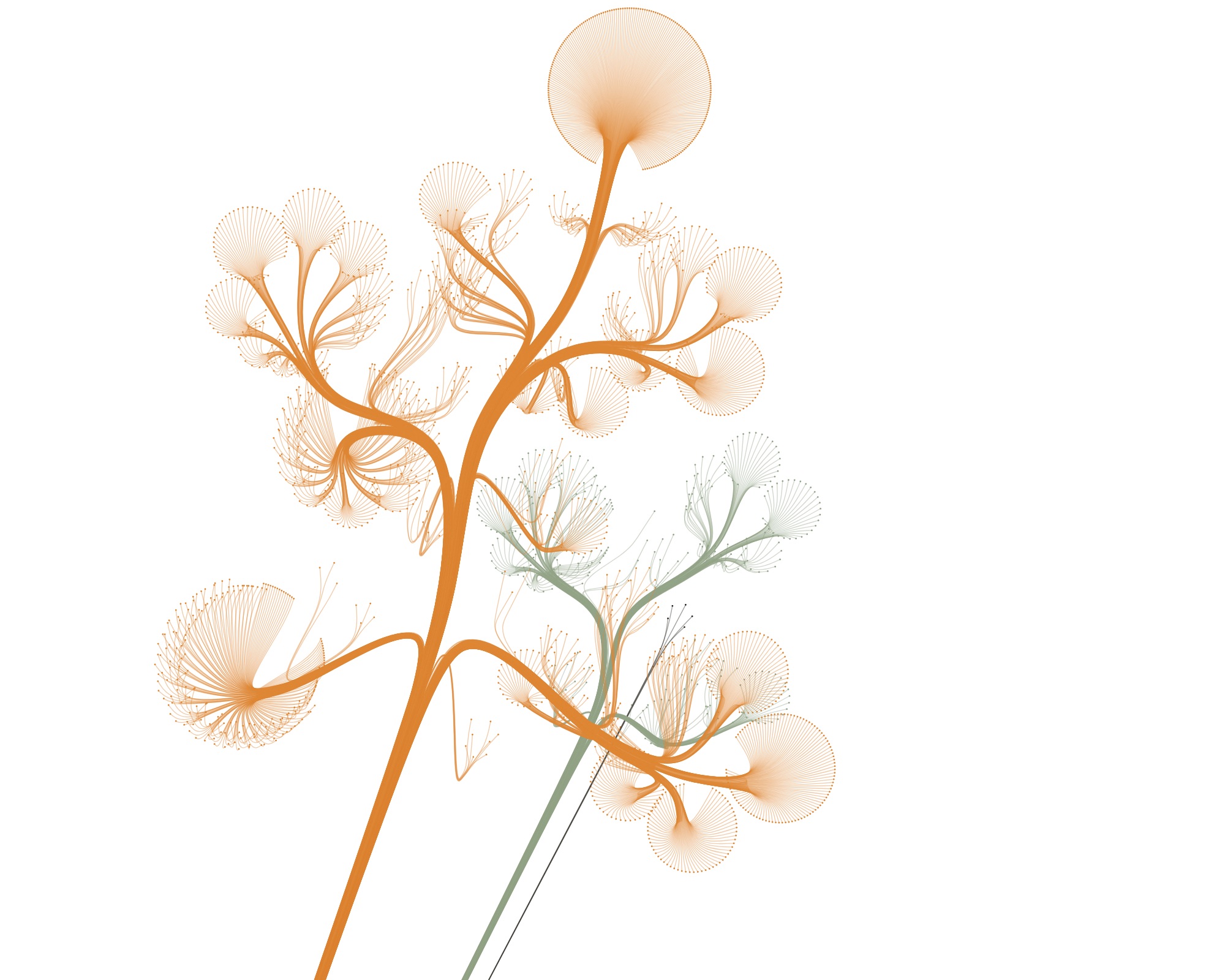
…and draw some curves from the root to the leaves…
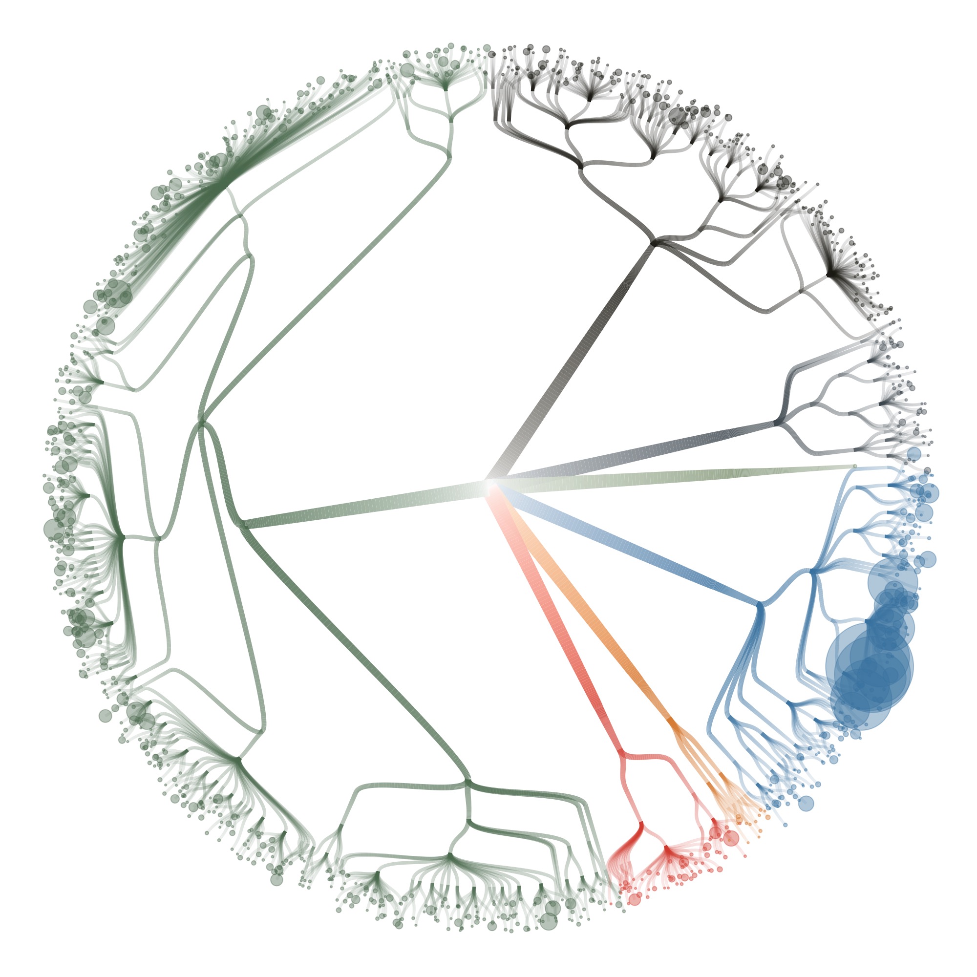
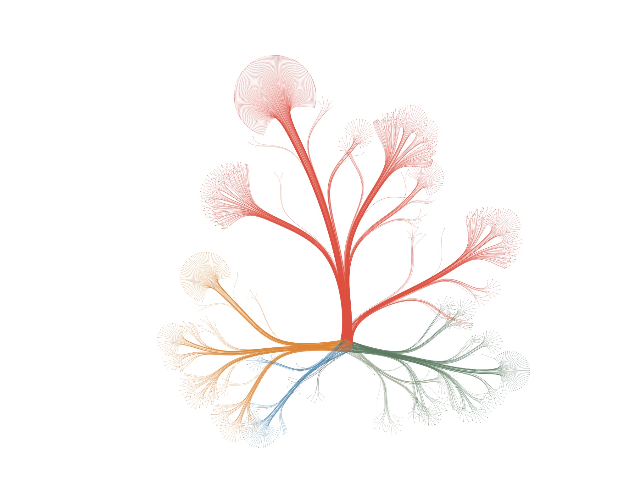
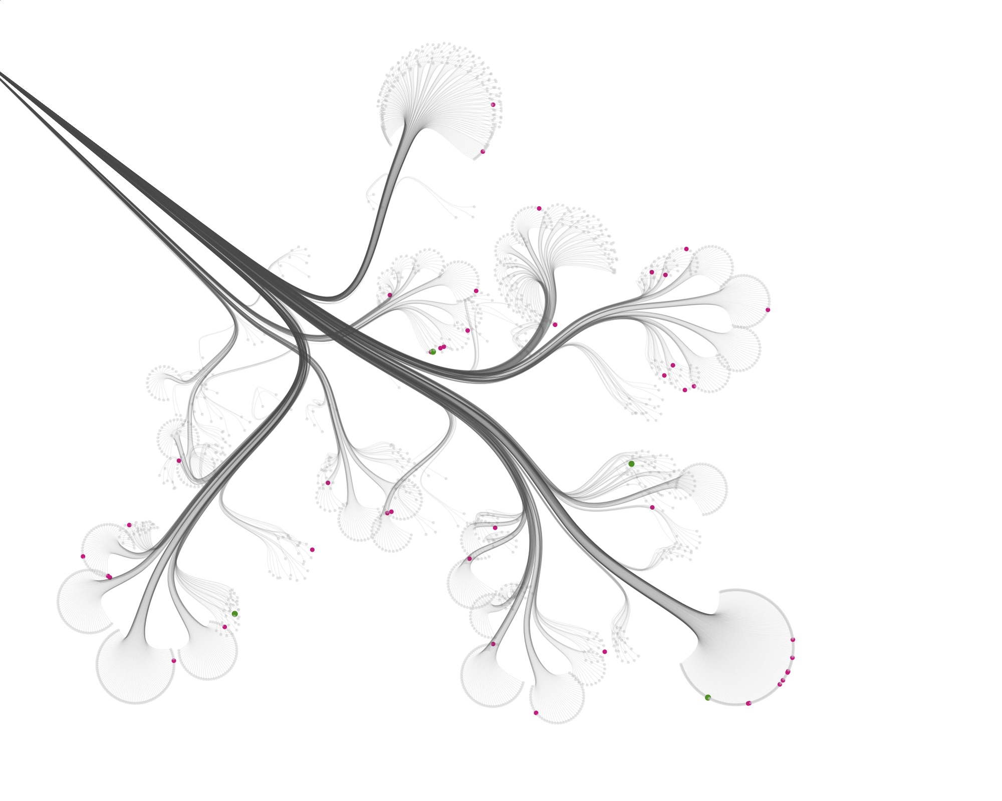
…and then leave out all the nodes, accept for the leaves, you get this:
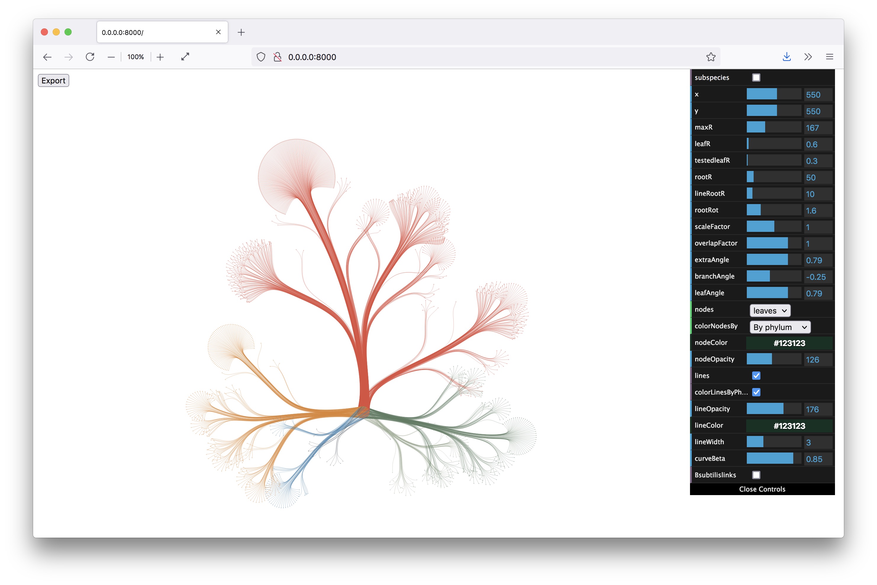
From here on, I knew I was on the right track. I built a little interface to control all the parameters of the layout (with dat.gui) and made the graphic zoomable and exportable. All quick and dirty, but the client wanted static images, so I really was the only one to use the interface and get the images out.
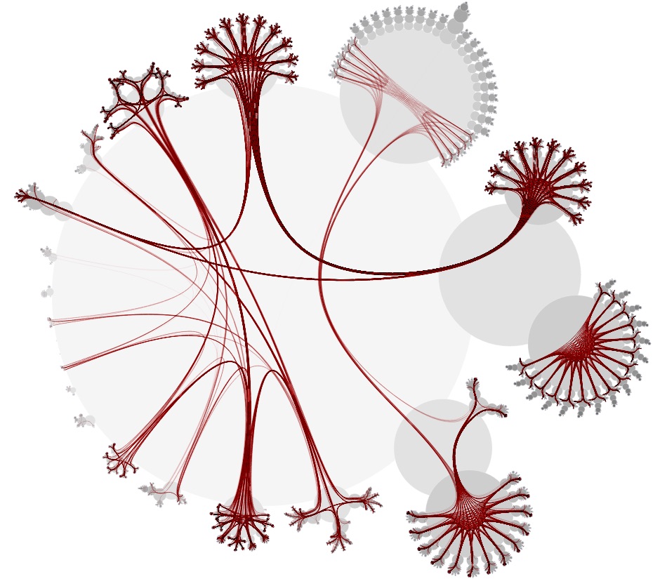
Then I started visualizing the data at the specimen level, and zooming in to show the specimens tested for bioactivity.
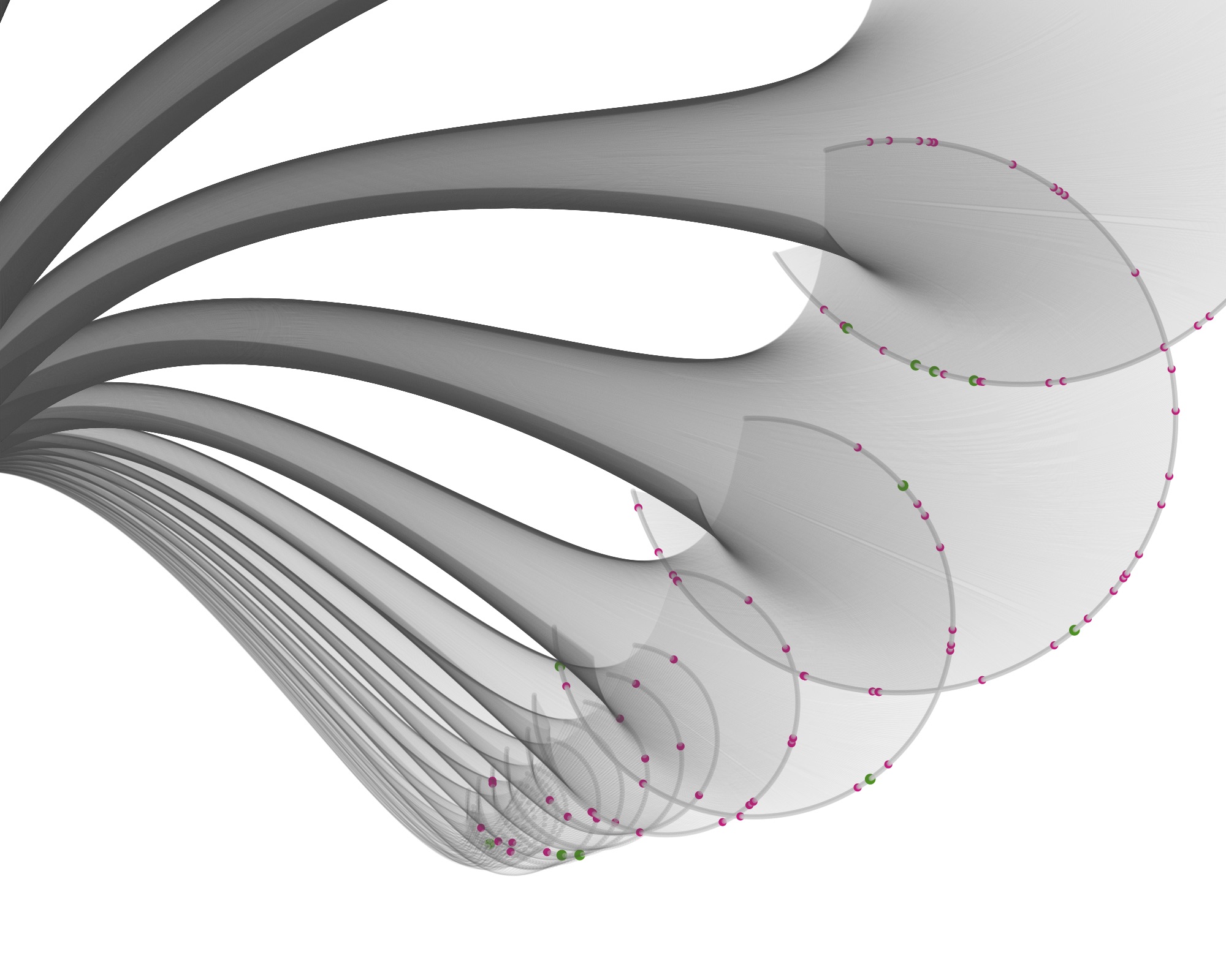
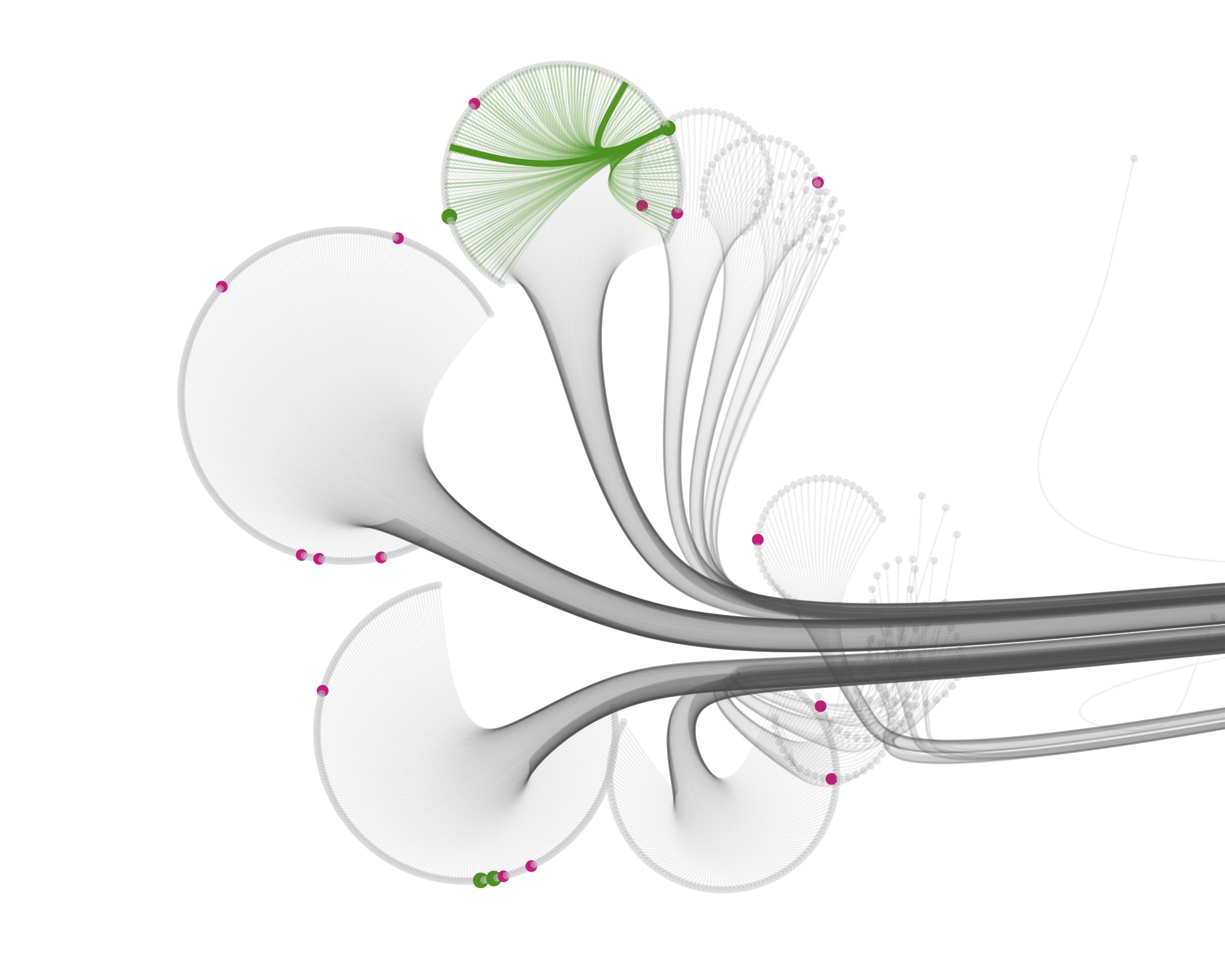
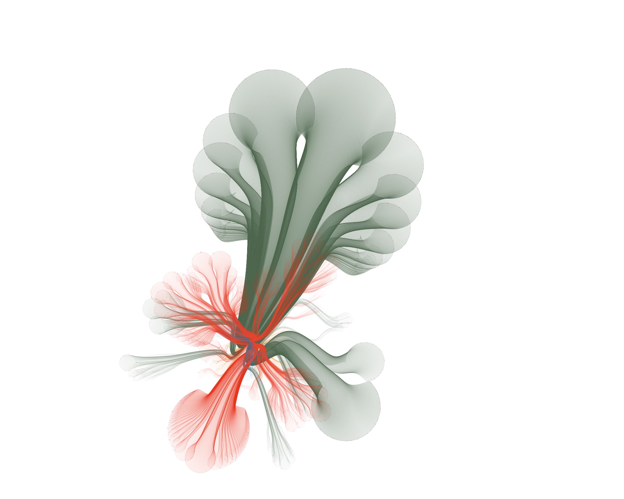
Playing with the parameters and zooming and panning around can get you nice results…
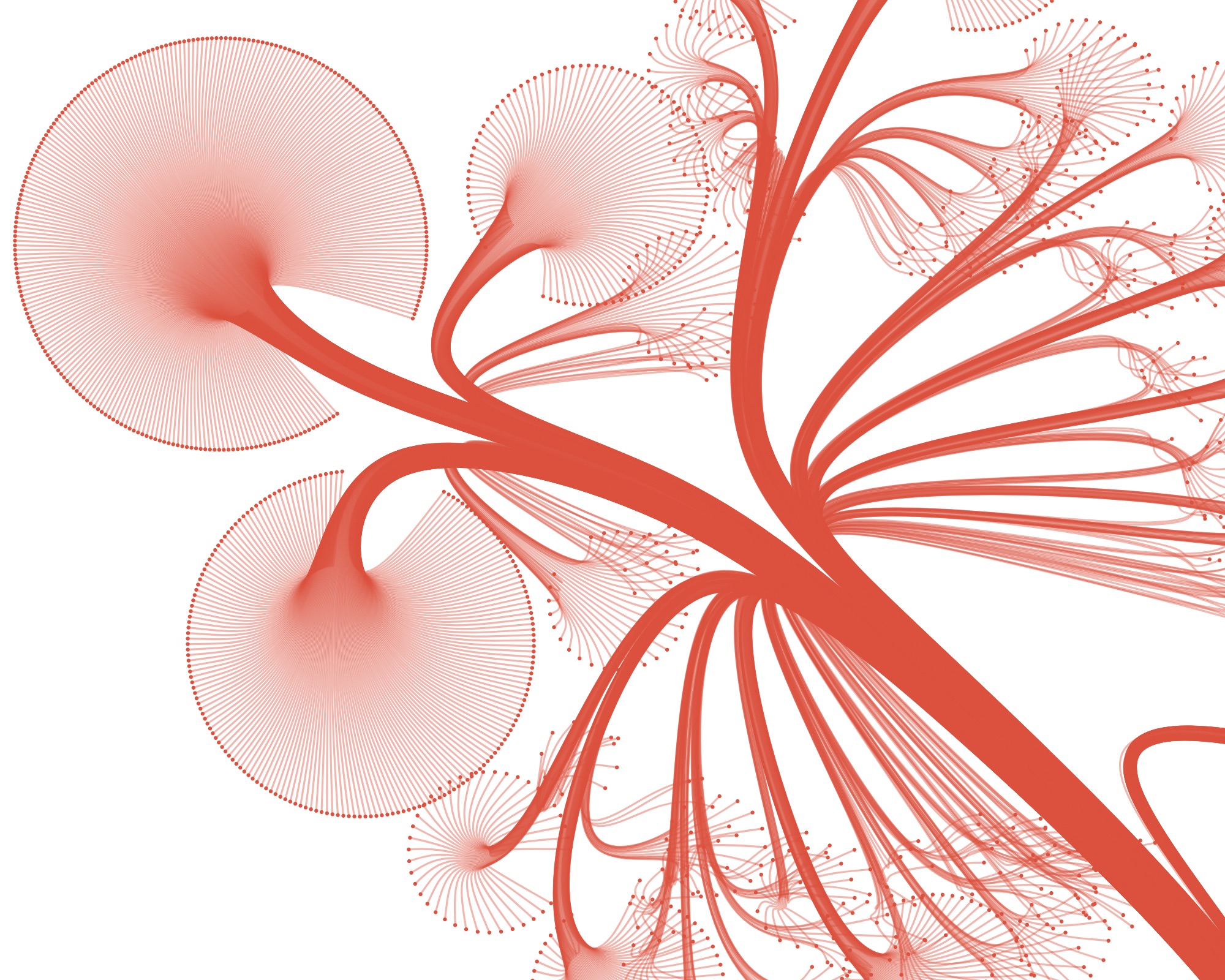
…but also funky ones :)
Wrapping up
This was one of the most interesting projects I ever worked on: a topic I was a bit familiar with, an interesting data set size, implementing a visualization technique from research and cool looking end results. It was a joy working with a client that put so much trust in me, and gave me the freedom to experiment and try and learn new things. Luckily, they were also happy with the end results.
I think CactusTrees are an elegant technique for visualizing big hierarchical datasets. And with so many parameters to play with, the results sometimes wander in the direction of art created from real data.
I learned a lot writing the layout algorithm, and at some point I would love to make the code generic, and turn it into a library or tool for visualizing these kind of datasets.