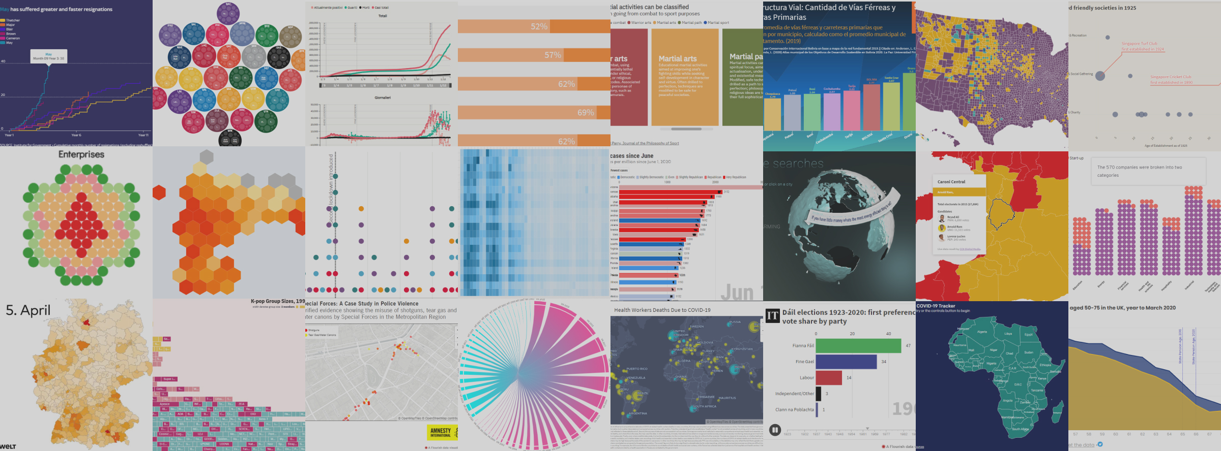
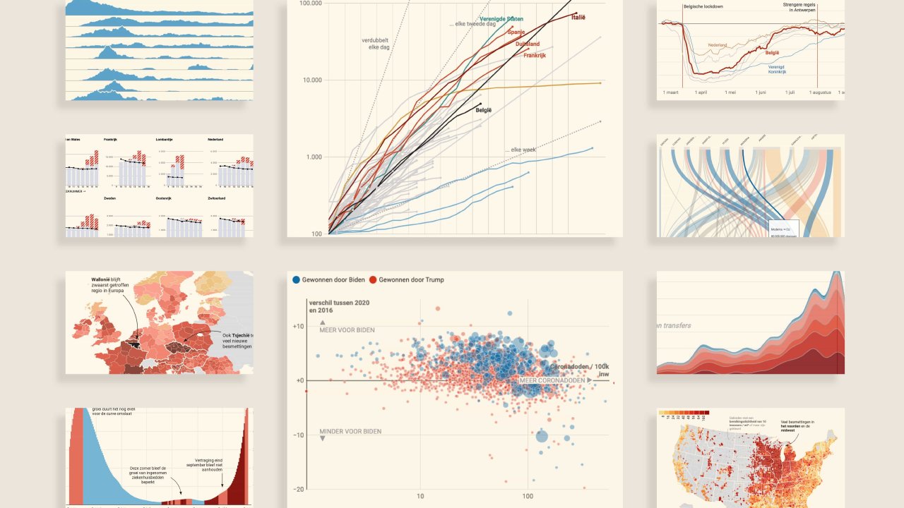
The list of 2020 visualization lists
December 22, 2020
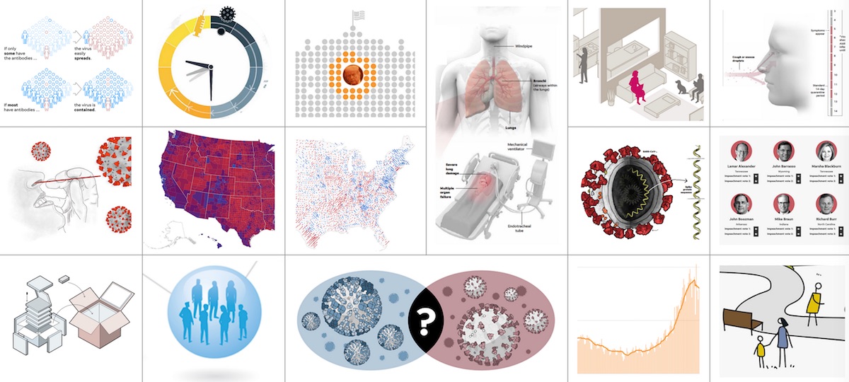
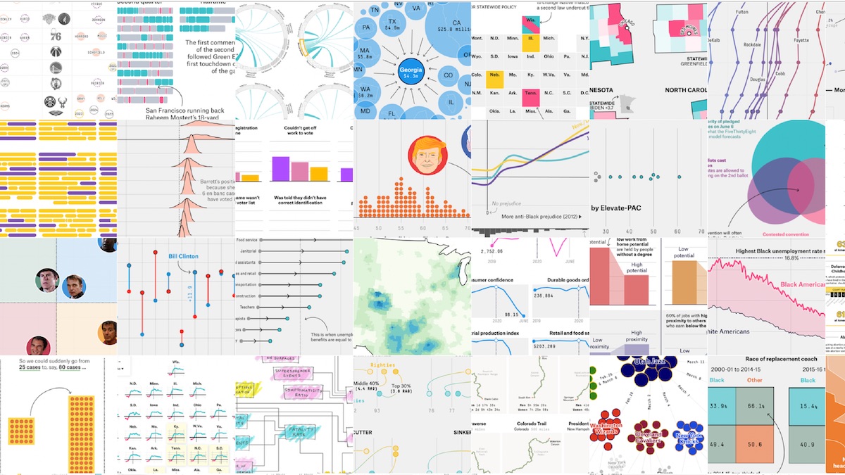
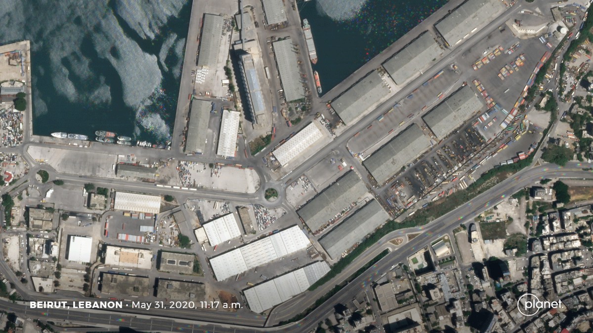
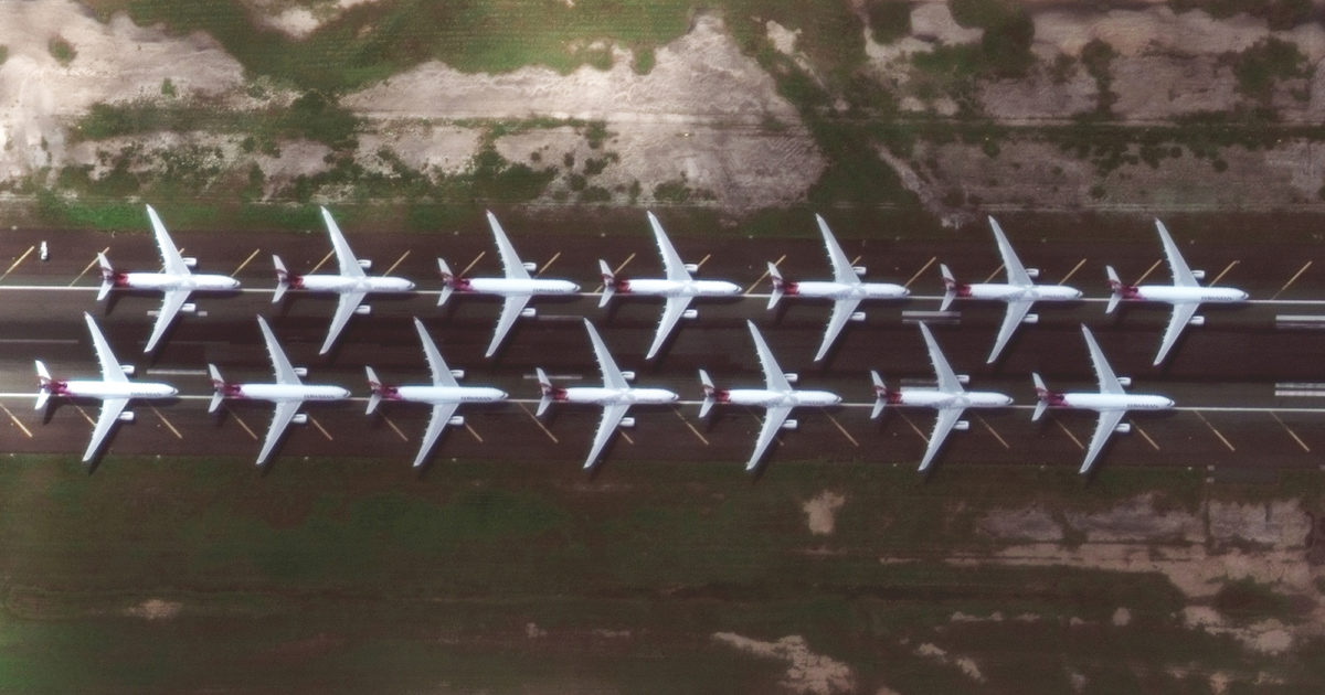
Never before people have been so exposed to charts than in 2020. Logarithmic scales entered the main stream and statistical time series will from now on always show the 2020 covid-19 scar. Now that there seems to be a little light at the end of the corona tunnel, focus should probably turn again to that other challenge humanity is facing. Satellite imagery if finding its way more and more to the news to show the impact of climate change almost in real time. Following a yearly habit: this is the list of visualizations, charts, graphics, maps, data and satellite journalism and science photography lists, version 2020.
Previous Lists: 2015, 2016, 2017, 2018 and 2019
Lists of favourites
@flowingdata: Best Data Visualization Projects of 2020
@TmarcoH: 2020 in graphics: My favourite little details
@kennethfield: Favourite maps from 2020
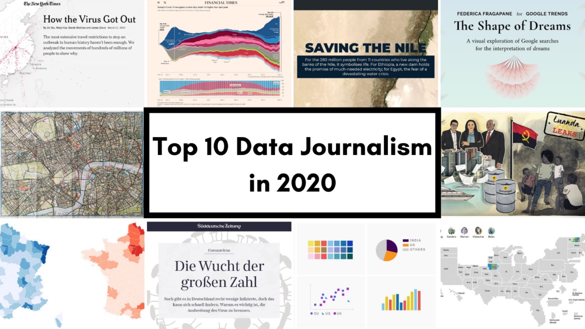
@gijn: Data Journalism Top 10 for 2020
@datajournalism: 10 data journalism projects that made an impact in 2020
@AlliTorban: The Best Data Visualizations of 2020
@observablehq: Observables Favorite Notebook of 2020
@FastCompany: How data designers helped us make sense of 2020’s chaos

@Nature: The best science images of 2020

@OrdnanceSurvey: Our GeoDataViz team’s favourite maps of 2020
Portfolios
@reutersgraphics: 2020: The Year in Graphics
@nytgraphics: 2020: The Year in Visual Stories and Graphics
@nytopinion: The Year in Charts

@WSJGraphics: The Year in Graphics
@usatgraphics: 2020: A year that needed a lot of visual explanation
@FiveThirtyEight: The 40 Weirdest (And Best) Charts We Made In This Long, Strange Year
@BBGVisualData: 2020 in Graphics
@ftdata: 2020: charts from a year like no other

@NatGeoMaps: The Maps and Graphics of 2020’s Events and Discoveries
@f_l_o_u_r_i_s_h: Flourish year in review 2020
@tijdgraphics: Het jaar in datajournalistiek
@sdbernard
MAPS OF 2020 THREAD 1/7
— Steven Bernard (@sdbernard) December 28, 2020
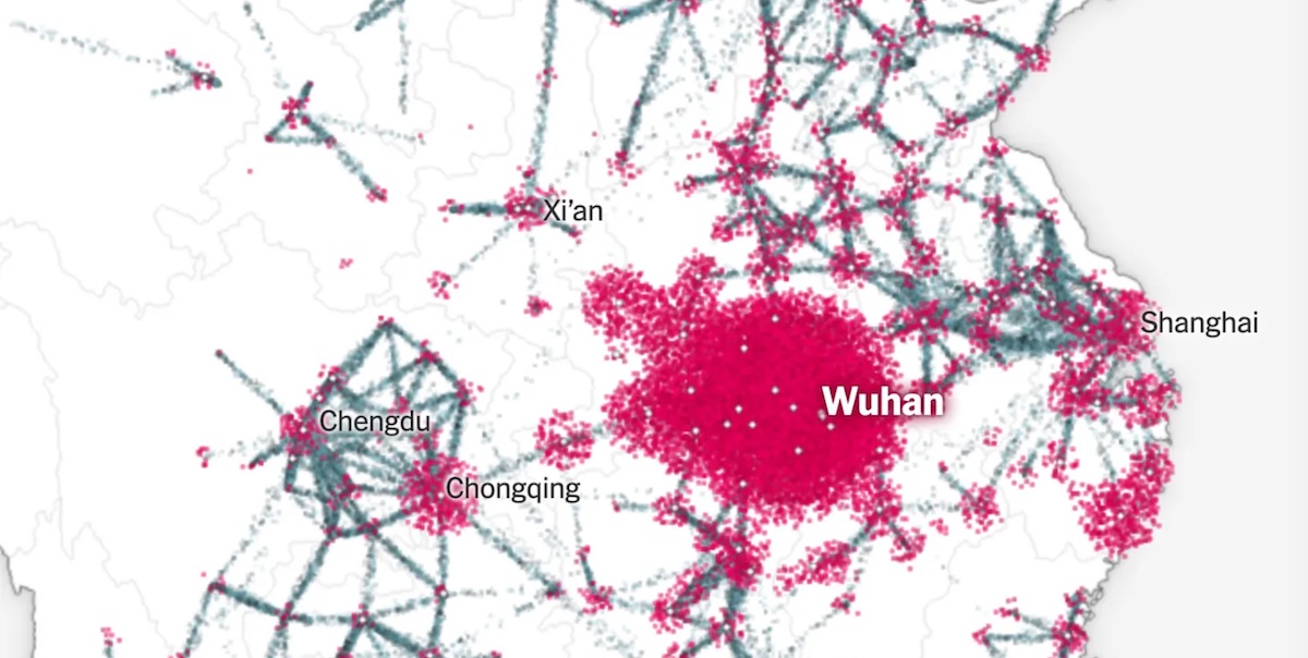
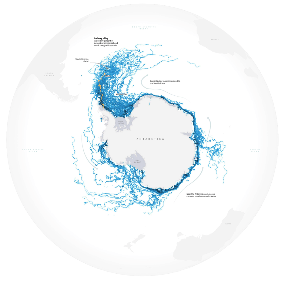
It's that time of year where I share my favourite maps. Kicking off with my top three... two from Antarctica and one showing pollution during the first lockdowns.
Antarcticahttps://t.co/kC9l630xy4
Pollutionhttps://t.co/eBrI8MylpI#dataviz #gistribe pic.twitter.com/Alz6ohU5Ii
@KashaPatel
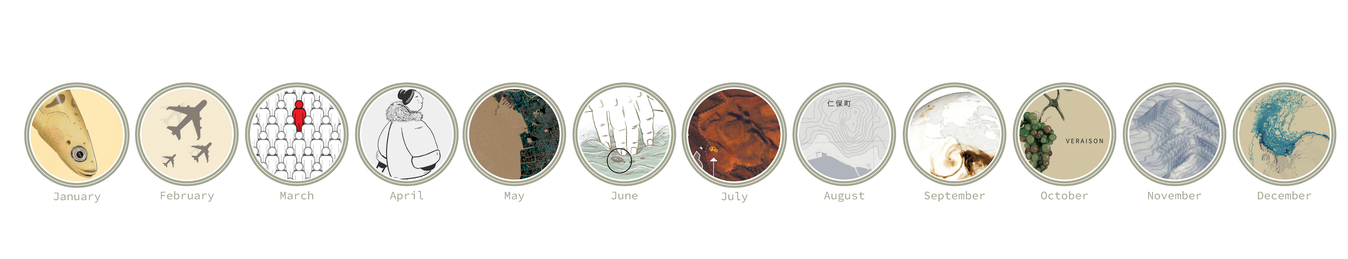
For the last 12 days of 2020, I'm posting a fav/notable story of mine from each month.
— Kasha Patel (@KashaPatel) December 20, 2020
First up from Jan 2020, I wrote abt Quadrantids meteors + aurora seen by @Space_Station. I learned a lot, like the chances of the ISS getting hit by a meteor are low: https://t.co/myKGmwYyM6 pic.twitter.com/pE9UDFR35X
@EconDailyCharts: A round-up of our favourite charts of 2020 (🔒)

@EconDailyCharts: A Year in Graphic Detail (40.3 MB pdf)

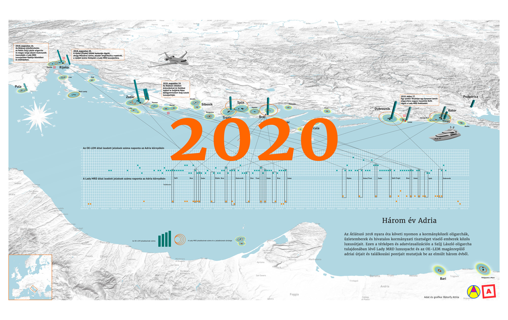
@AtloTeam: Több mint 500 adatábrázolás: az Átlátszó infografikái 2020-ban
@worldbankdata: 2020 Year in Review: The impact of COVID-19 in 12 charts
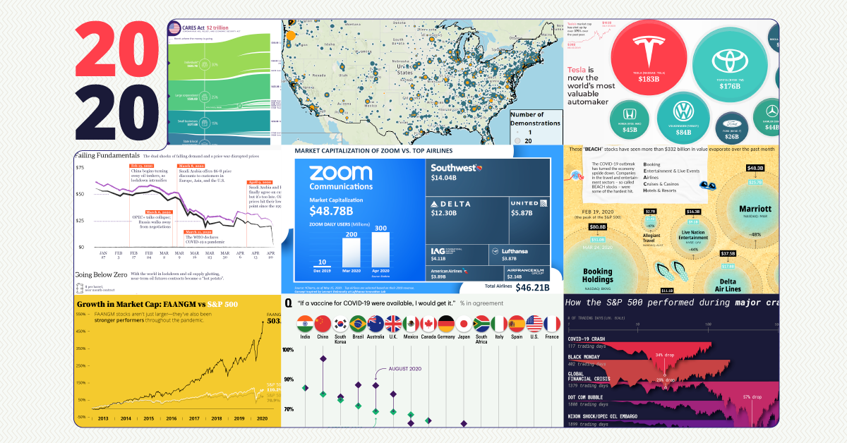
@VisualCap: The Year in Review: 2020 in 20 Visualizations
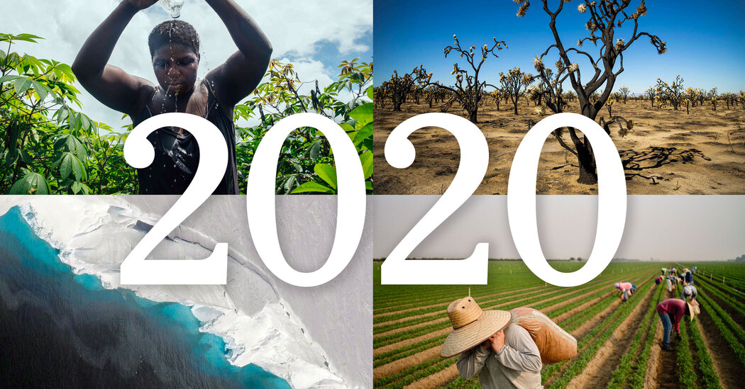
@: The Year in Climate
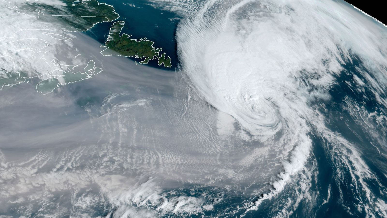
@cc_yale: The top 10 weather and climate events of a record-setting year
Awards
@Malofiej: The New York Times and National Geographic win the Endesa Best of Show Award

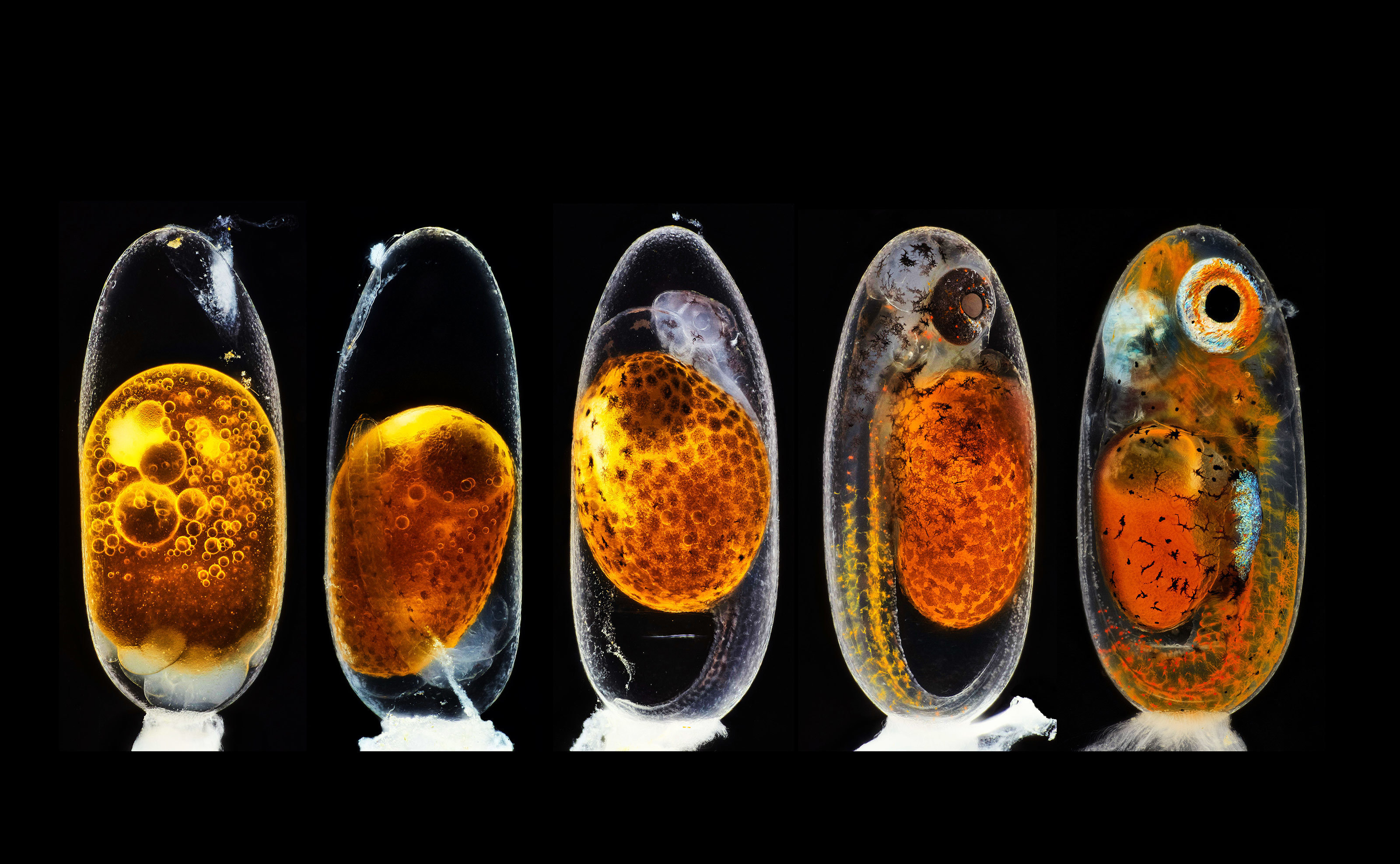
@nikonsmallworld: 2020 Photomicrography Competition
Remote sensing
@planetlabs: 2020’s Most Newsworthy Events Captured by Planet’s Satellites
@maxar: Year in Review: Maxar News Bureau Reflects on Biggest Events Seen from Space in 2020
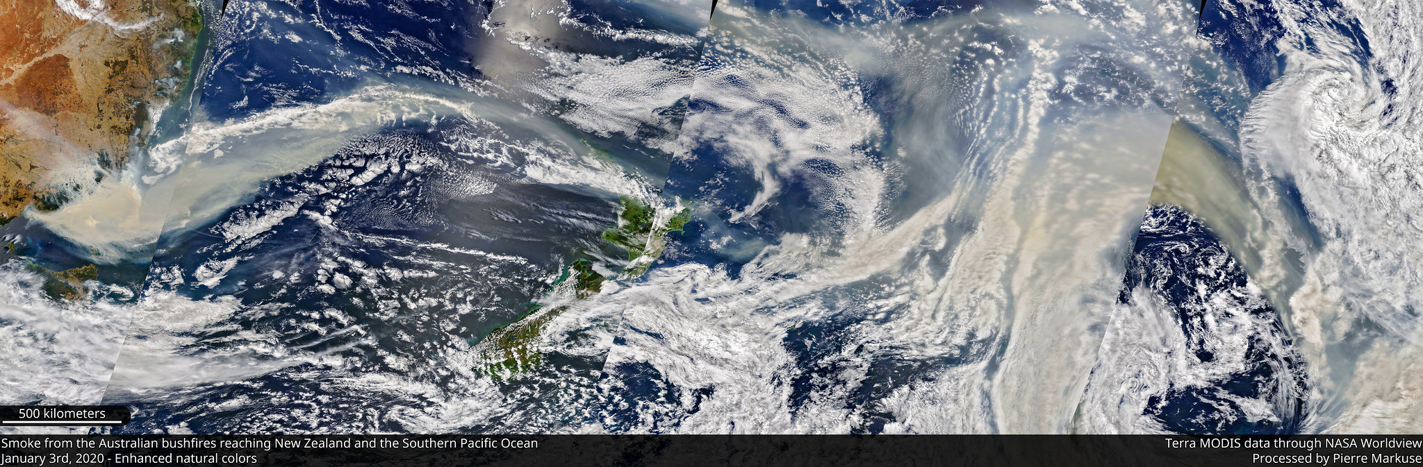
@Pierre_Markuse: Satellite images – Recap 2020